
This episode is a recording of a February 2024 WordPress Accessibility Meetup where Michaela Lederman, Senior Accessibility & QA Lead at Aten Design Group, explores the intricacies of Web Accessibility Initiative – Accessible Rich Internet Applications (ARIA), a critical tool for enhancing the web experience for users with disabilities. If you want to watch a video recording from the meetup, you may do so on the Equalize Digital website: Do More with Less ARIA: Michaela Lederman.
WordPress Accessibility Meetups take place via Zoom webinars twice a month, and anyone can attend. Learn more about WordPress Accessibility Meetup and see upcoming events.
Listen
Mentioned in This Episode
Summarized Session Information
In this session, Michaela explores the intricacies of WAI-ARIA (Web Accessibility Initiative – Accessible Rich Internet Applications), a critical tool for enhancing the web experience for users with disabilities. This session aims to provide web developers and designers with a deep understanding of how ARIA works and why it’s essential in creating inclusive web environments.
The session begins by introducing WAI-ARIA, explaining its purpose and significance in the realm of web accessibility. Michaela emphasizes the importance of using ARIA to bridge the gap between traditional web content and the needs of users with disabilities, particularly those who rely on assistive technologies.
One of the key focuses of the discussion is the ‘Five Golden Rules of ARIA’. These principles guide developers in the appropriate use of ARIA, ensuring that it benefits rather than complicates user experience. This part of the session underscores the importance of thoughtful implementation of ARIA in web projects.
Michaela explores the core components of ARIA – roles, states, and properties. This segment offers a comprehensive look at how these elements work together to make web content more accessible. The discussion includes examples and best practices, providing attendees with a practical understanding of how to implement these components effectively.
The session also addresses the practical aspects of ARIA, including compatibility with different browsers and assistive technologies. Michaela shares strategies and insights on effectively integrating ARIA into various web projects, considering the diverse range of user needs and technological capabilities.
Finally, the session is rounded off with real-world examples. These examples demonstrate the application of ARIA roles, states, and properties in common web elements and interfaces. This practical approach helps solidify the learning and gives attendees a clear view of how ARIA can be used in everyday web development to enhance accessibility.
Session Outline
- What is WAI-ARIA?
- The five rules of ARIA
- Role, states, and properties
- Most commonly used ARIA
- Wrapping it all up
What is WAI-ARIA?
WAI-ARIA, or Web Accessibility Initiative – Accessible Rich Internet Applications, is a technology designed to improve the interaction between assistive technologies and web pages. While it is technically referred to as WAI-ARIA, it is commonly known simply as ARIA.
This foundational technology enhances the web experience for users with disabilities by providing additional information that plain HTML cannot, especially in the context of dynamic content and advanced user interface controls that are prevalent in today’s web applications.
Purpose and functionality of ARIA
The primary purpose of ARIA is to convey detailed information to assistive technologies, such as screen readers, about what is happening on a webpage. This is crucial as web pages become more interactive and dynamic. ARIA does not alter the functionality for a user directly but enables users of assistive technology to understand and navigate content more effectively.
It’s important to note that visual elements like classes, IDs, and styling do not translate to users through screen readers. Thus, ARIA serves to communicate this information through alternative means.
Browser and assistive technology support
Support for ARIA across different browsers and assistive technology combinations is generally robust. However, given the vast array of ARIA features, browser versions, and assistive technologies available, some features may perform better than others. While ARIA is broadly supported, the effectiveness of specific features can vary, so its important to select carefully ARIA attributes in web projects.
Implementation and components of ARIA
ARIA can be integrated within CSS or JavaScript, allowing developers to target ARIA attributes similarly to how they would target HTML classes for styling. This approach can reduce code redundancy and complexity, for example, by using aria-current="true" instead of adding an active class to indicate the current page in a navigation menu.
ARIA itself consists of three main components: roles, states, and properties, which form the basis for its implementation. These components are essential for developers to understand and utilize effectively in order to make web content accessible.
The five rules of ARIA
The golden rule of ARIA
The cornerstone of using ARIA effectively is encapsulated in the rule: no ARIA is better than bad ARIA. This principle explains the importance of judicious use of ARIA, highlighting that incorrect or excessive applications can lead to a degraded user experience or even render a website completely inaccessible.
It’s a common pitfall observed in accessibility audits, where well-intentioned developers aiming to enhance accessibility inadvertently introduce problems by misapplying ARIA. This rule serves as a caution against overuse and misuse, emphasizing that a lack of ARIA is preferable to its incorrect implementation.
Rule 1: use native HTML first
The first rule advises that before resorting to ARIA, you should utilize native HTML elements and attributes, which inherently possess semantic meaning and accessibility features.
This is due to two primary reasons: ARIA can override the intrinsic semantics of HTML, potentially miscommunicating the role, state, or value of elements to assistive technologies. Additionally, assistive technology users have established expectations regarding the behavior and feedback of standard HTML elements, and deviations can disrupt their user experience.
By prioritizing native HTML, developers can ensure a more accessible and predictable interaction for users of assistive technologies.
Rule 2: do not change native semantics, unless you really have to
These changes can confuse assistive technology users, as they rely on consistent and predictable semantic cues for navigation and interaction.
An example given includes using ARIA in email templates, which may require semantic adjustments due to their reliance on tables for layout purposes. However, this practice is generally discouraged, and any exceptions should be carefully considered and tested for accessibility.
Rule 3: all interactive ARIA controls must be usable with the keyboard
The third rule mandates that any interactive element or widget introduced with ARIA must be fully operable through keyboard input. This ensures that users who rely on keyboard navigation or assistive technologies can access and interact with all elements on a page.
This rule highlights the developer’s responsibility to implement keyboard accessibility, as ARIA itself does not manage or modify element functionality. You have to adhere to standard interaction patterns to maintain a consistent user experience.
Rule 4: Do not use role=presentation or aria-hidden=true on a focusable element
Rule four emphasizes the correct use of ARIA roles, particularly cautioning against applying role="presentation" or aria-hidden="true" to focusable elements. These attributes can hide content or remove semantic information from assistive technologies, potentially leading to confusion or inaccessibility for users.
This rule highlights the necessity of aligning visual presentation with accessibility semantics to ensure a coherent experience for all users, including those with varying degrees of vision.
The role="presentation" attribute is used to remove the semantic meaning of an element without hiding it from the display. It tells assistive technologies to ignore the element’s usual role and treat it as decorative or non-semantic. This can be useful in situations where an element’s role in the document structure is purely for visual formatting, such as layout tables in email templates. Applying role="presentation" ensures that the element does not interfere with the semantic understanding of the page content by assistive technology users.
However, it’s crucial to apply this attribute carefully, particularly with focusable elements. When a focusable element (like a link or button) is marked with role="presentation", it could lead to a situation where the element remains operable or focusable visually but is ignored by screen readers, creating a disconnect between what is visually presented and what is available to assistive technologies.
The aria-hidden="true" attribute effectively removes an element from the accessibility tree, making it invisible to assistive technologies. This is particularly useful for hiding elements that are not relevant or should not be interactable by users relying on screen readers or other assistive devices. For instance, decorative images or elements that are only meant to enhance the visual experience without providing additional content or functionality can be marked with aria-hidden="true" to prevent them from cluttering the screen reader’s output.
However, using aria-hidden="true" on focusable elements can cause significant accessibility issues. If an element is visually focusable or interactive but marked as aria-hidden="true", it becomes invisible to assistive technologies but remains in the tab order. This discrepancy can confuse users who rely on screen readers, as they might encounter interactive elements they cannot hear or understand, leading to a fragmented and disorienting experience.
The application of both role="presentation" and aria-hidden="true" must be approached with an understanding of their impact on the accessibility of web content. It’s essential to ensure that the visual presentation of elements aligns with what is conveyed through assistive technologies. Discrepancies between visual and programmatic accessibility can lead to confusion and hinder the ability of users with disabilities to interact with content effectively.
For example, an element visually designed as a button but semantically presented as a link (or vice versa) can confuse users about its functionality and expected behavior. This highlights the importance of consistent and accurate use of ARIA roles and attributes, ensuring that all users, regardless of the technologies they use to access web content, have a coherent and seamless experience.
Rule 5: all interactive elements must have an accessible name
An accessible name is a programmatically determined name that assistive technologies use to communicate the purpose or function of an element to users. This name is essential for elements like links, buttons, form inputs, and other interactive components, as it directly influences how these elements are understood by users who rely on assistive technologies. The accessible name serves as the primary means of identifying the element’s function or purpose without relying solely on visual cues.
Accessible names can be derived from various sources, including the visible text within an element, attributes like aria-label or aria-labelledby, and the text associated with label elements for form controls. The method used to specify an accessible name depends on the context and the specific needs of the element in question.
- Content or Text within an Element: For many elements, such as buttons or links, the content within the element itself (e.g., the text between the opening and closing tags of a button) serves as the accessible name. This method is straightforward and ensures that the visible label and the accessible name are consistent.
aria-labelAttribute: Thearia-labelattribute provides a way to specify an accessible name that may differ from the text visible on the screen. This can be useful in situations where a more descriptive name is necessary for assistive technology users but where screen real estate or design considerations limit the amount of visible text.aria-labelledbyAttribute: Thearia-labelledbyattribute allows developers to reference other elements on the page to serve as the accessible name. This can be particularly useful for complex elements or when integrating an accessible name with existing content.
The alignment between the accessible name and the element’s visible label or function is crucial. Discrepancies between these can lead to confusion and usability issues for users who depend on screen readers or other assistive technologies. For instance, if a button visually labeled “Submit” has an accessible name of “Send your form,” users might be confused about the button’s purpose, especially if they use voice commands to interact with the page.
Practical considerations
- Clarity and Context: The accessible name should provide clear and concise information about the element’s function, ensuring that users can navigate and interact with content confidently and efficiently.
- Speech Recognition Users: Users who rely on speech recognition software to navigate web content may experience difficulties if the accessible name does not closely match the visible text. Commands like “click submit” may not work if the accessible name differs significantly from the visible label.
Rules, States, and Properties
The core of ARIA is built upon three crucial features: roles, states, and properties. These components are vital in defining the accessibility attributes of web elements for assistive technologies.
Roles
Roles are primarily used to identify what an element is or what it does within a webpage. They offer a straightforward way for assistive technologies to understand the purpose of an element, such as whether it functions as a button, a link, or a heading.
The need for explicitly defining roles for many elements has diminished over time, as modern HTML elements often come with default roles that are automatically recognized by assistive technologies.
There are six distinct role types within ARIA, each serving a specific purpose in enhancing web accessibility:
- Document structure roles: these roles define the structure of the content on a page, helping users navigate and understand the layout and organization of information.
- Widget roles: widget roles describe interactive component functionalities, such as buttons, links, and sliders, facilitating user interaction with these elements.
- Landmark roles: landmark roles provide points of reference that assist in navigating a page, identifying areas like navigation, main content, and forms.
- Live region roles: these roles inform users of dynamic content changes that occur without a page reload, crucial for real-time information updates.
- Window roles: window roles are used for elements that behave like application windows or dialogs, offering a more application-like experience.
- Abstract roles: abstract roles serve as base roles from which other roles inherit properties but are not used directly in code.
When implementing roles, it is essential to ensure proper nesting to maintain the logical structure and functionality expected by users. For instance, a role="tab" must be contained within an element with role="tablist", and similarly, role="menuitem" should be within a role="menu". This nesting ensures that the relationship and context among elements are preserved, aiding in navigation and interaction.
Common roles that developers might encounter include role="menu", role="menuitem", role="tab", role="tabpanel", and role="alert", among others. Each role serves a specific function, from indicating interactive elements to providing alerts and structuring content.
For example, in a tabbed interface, each tab is marked with role="tab", contained within a role="tablist".
The content associated with an active tab is designated as role="tabpanel". These roles work together to convey the structure and functionality of the tabbed interface, ensuring that users can navigate and interact with the tabs effectively.
States and properties
States in ARIA denote the current condition of an element, indicating whether it is active, disabled, hidden, or in other specific states that may change in response to user interactions. These attributes provide real-time feedback on the dynamic aspects of web content, enabling assistive technologies to convey these changes to users effectively.
Properties extend the semantics of standard HTML, offering additional information that can influence how an element is interpreted by assistive technologies. For instance, a property can inform a screen reader that a button, when activated, triggers a popup. This layer of detail enriches the interaction for users relying on assistive technologies by providing context beyond what is typically available through HTML alone.
States and properties provide insights into what to expect or what is currently happening with a web element, enhancing the user experience for individuals relying on assistive technologies.
There are four main types of states and property categories in ARIA, each serving a unique purpose in accessibility:
- Widget type: this category includes states and properties specific to interactive components or widgets, like buttons or sliders, indicating their interactive status or configuration.
- Live region type: live regions communicate changes in content dynamically, such as updates or notifications, without requiring the user to refresh the page.
- Drag and drop type: this type relates to elements that support drag-and-drop interactions, providing users with information about these capabilities.
- Relationship type: states and properties under this category describe relationships between elements, such as labeling or describing elements, enhancing the contextual understanding of content.
Many states and properties fall under global ARIA attributes, meaning they can apply to all HTML elements, irrespective of whether an ARIA role is applied. This universal applicability ensures broad support across various elements and roles, simplifying the task of making web content accessible.
Examples of frequently encountered ARIA states and properties include:
aria-haspopup: Indicates that an element may launch a popup when activated.aria-expanded: Shows whether a collapsible element is currently expanded or collapsed.aria-required: Identifies fields that are mandatory in a form.aria-live: Specifies that an element will update dynamically, informing assistive technologies to announce updates.aria-labelledby: Provides an element with a label by referring to the ID of another element that defines its label.aria-current: Indicates the current item within a set of elements, useful for highlighting navigation or progress in a process.
These attributes often use values like “true” or “false” to convey binary states, while others may reference element IDs to establish relationships or provide additional context. For example, aria-current can be used to denote the current page within a navigation menu or the current step in a process, adding semantic clarity without altering the underlying content structure.
Most commonly used ARIA
aria-label
The aria-label attribute is a string value that labels an interactive element, such as buttons or links, especially when they are represented by icons without text. It is also useful when the same landmark, like navigation or header, is used more than once on a page.
You should be careful not to override visible text with aria-label, as it takes precedence. For instance, using aria-label in a navigation element can help distinguish between different navigations on a page, like main, secondary, breadcrumb, and footer, providing a clearer context for screen-reader users.
Navigation
When navigating a webpage, a screen-reader user relies heavily on these labels to understand the structure and elements of the page. Without the aria-label attribute, a user might encounter multiple navigation sections (navs) but receive no specific information about each one. They would simply hear the announcement of “nav” repeatedly, with no differentiation. However, by implementing aria-label, each navigation section can be uniquely identified. For example, the screen-reader would articulate the distinctions by announcing “NAV main”, “NAV secondary”, “NAV breadcrumb”, and “NAV footer”. This clarity allows users to quickly and efficiently identify and navigate to the specific section they are interested in, greatly improving their overall browsing experience.
<nav aria-label="main"></nav>
<nav aria-label="secondary"></nav>
<nav aria-label="breadcrumb"></nav>
<nav aria-label="footer"></nav>
Social media links
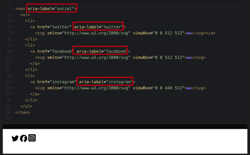
In this section, the focus is on enhancing the accessibility of a navigation section (NAV) that encapsulates a list of social media links. In the code, this navigation section is labeled using the aria-label attribute, specifically marked as “social.” Within this navigation, there is a list that contains various items, each representing a link to a social media platform. Icons for Twitter, Facebook, and Instagram serve as the visual elements for these links. To ensure accessibility, each link is further described with an aria-label.
For example, the link containing the Twitter icon is tagged with an aria-label that reads “Twitter,” similarly, the Facebook and Instagram links are labeled “Facebook” and “Instagram,” respectively. These aria-labels play a crucial role in conveying information to screen-reader users. They provide clear and recognizable names for each link, aligning with the commonly known associations people have with these social media icons.
aria-labelledby
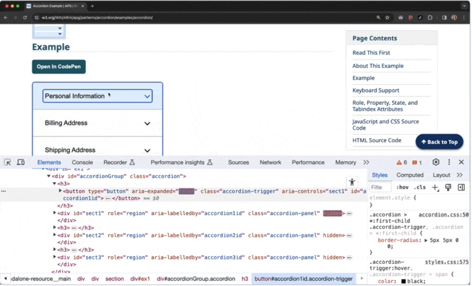
Aria-labelledby is another attribute that enables authors to reference other elements on the page to define an accessible name. It can target multiple IDs and takes precedence over aria-label if both are set on an element. This attribute is particularly useful in complex structures like accordions, tabs, or nested tables, where it can help maintain context and association between elements. For example, in an accordion, the open section can be labeled by the button that triggers it, thus adding clarity to the relationship between the button and the content it reveals.
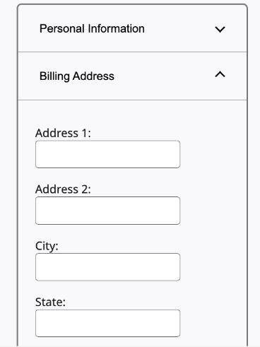
Accordions
The screenshot illustrates two sections within the accordion: “Personal Information,” which is closed, and “Billing Address,” which is open and contains a form. The key point is the use of the aria-labelledby attribute to improve accessibility and context understanding for users, particularly those utilizing screen readers.
The accordion element, as shown in the next screenshot, is part of a larger code structure referred to as the accordion group. The screenshot, marked with a red outline for emphasis, focuses on the division (div) that encompasses the form. This div, which can be toggled to show or hide content, is linked to a button that controls its visibility.
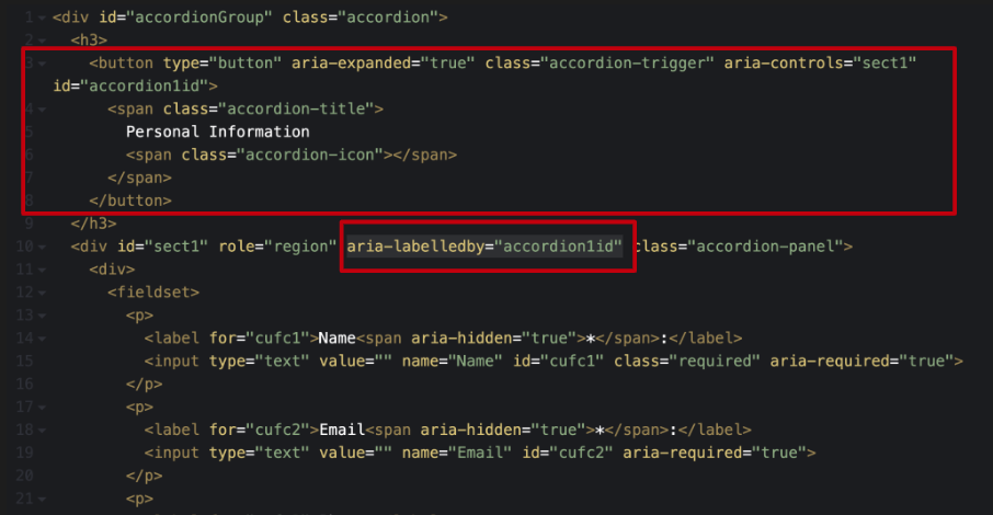
The use of aria-labelledby on this div is crucial. It points to the button that triggers the accordion’s expansion or collapse. This connection ensures that when screen-reader software reads the information within the accordion panel, it can reference the button and indicate that the content belongs to the “Personal Information” section.
This setup creates a clear association, helping users understand that the displayed content is part of the Personal Information area, thereby enhancing the overall accessibility and usability of the web page.
Tabs
An important aspect of this setup is the implementation of the aria-labelledby attribute on the tab panel corresponding to the active tab. This attribute is set to point towards the “Maria” button. The inclusion of aria-labelledby in the code is significant because it clearly associates the content within the tab panel with the active tab element, in this case, Maria.
Then we have the code behind this configuration. The focus here is on the tab panel that is active, and the code snippet shows aria-labelledby="tab2", where “tab2” is the identifier for the button corresponding to Maria.
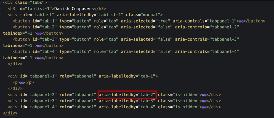
This setup ensures that users, especially those relying on screen readers, can easily understand that the content they are accessing is directly associated with the Maria tab, thereby making the navigation and comprehension of the tab structure more intuitive and accessible.
aria-describedby
Aria-describedby is a valuable attribute for providing additional descriptions to objects beyond their accessible names. It’s primarily used to establish relationships between widgets or groups and their descriptive text. This attribute is not meant for labeling but for offering a more detailed understanding of what’s happening, akin to a caption. The described content can be either visible or hidden, but it must reference content strings within the DOM.
while aria-describedby can be used for various elements, it should be applied judiciously to avoid complexity. For instance, when dealing with complex images or infographics, where alternative text or captions might not suffice to convey all the necessary information, aria-describedby can be used to point to more detailed descriptions. This can be particularly useful when the visual content contains a wealth of information that cannot be easily captured in brief alternative text or captions.
Tables and forms with multiple steps are other contexts that aria-describedby can prove beneficial. In cases where a table’s caption doesn’t provide enough information or there are crucial details in a multi-step form, this attribute can point to additional, important information.
This exampledemonstrates the practical application of aria-describedby.
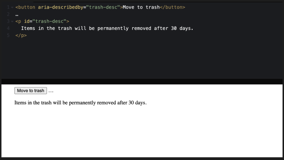
The example features a split-screen with code on one side and a visual representation on the other. The code includes a button with aria-describedby pointing to an identifier, which in turn is associated with a descriptive text.
In this case, the button is labeled “Move to trash,” and the aria-describedby points to additional helper text that explains, “Items in the trash will be permanently removed after 30 days.”
This setup ensures that when a user interacts with the button, they are also informed about the consequences of their action through the additional descriptive text, enhancing their understanding and interaction with the website.
aria-current
This attribute is especially useful in various web components such as navigation menus, breadcrumbs, multi-step flows, tabs, calendars, or events. The primary purpose of aria-current is to ensure that the visual cues indicating an active state are also accessible to screen reader users. For instance, in a breadcrumb or a main navigation, where one link might be visually distinguished to represent the current page, aria-current can be used to convey this information to those using screen readers.
The attribute can be set to values like true, false, page, step, location, date, or time, providing a range of options to describe the current state accurately. While true and false represent the most basic implementation, the other values offer more detail, allowing developers to specify the exact nature of the active item.
aria-current="page"
aria-current="step"
aria-current="location"
aria-current="date"
aria-current="time"
aria-current="true"
aria-current="false"
This example illustrates a navigation element (nav) labeled as “breadcrumbs” to give screen readers more context. Within this navigation, there’s an ordered list comprising three list items, each containing a link. The links represent different pages: home, parent page, and current page.
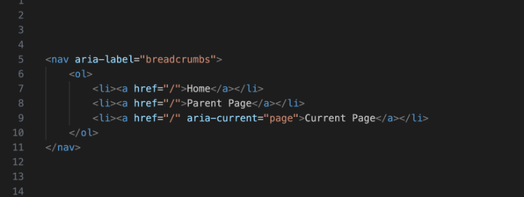
The aria-current="page" attribute is added to the last link item, identifying it as the current page in the breadcrumb navigation. This not only allows for appropriate styling but also makes it clear to screen reader users which page is currently active. By leveraging aria-current, the example demonstrates how web accessibility can be enhanced, ensuring that users, regardless of their browsing method, receive the same level of information and navigational context.
aria-haspopup
This attribute is particularly valuable for informing users that an element, such as a button, can trigger a pop-up like a modal, dialogue, or dropdown menu.
While aria-haspopup does not inherently involve any changes through JavaScript, it is important to note that JavaScript is often necessary for making the pop-up element keyboard accessible and managing focus correctly. This is a crucial aspect to consider for developers using aria-haspopup, as ensuring accessibility involves more than just declaring the attribute; it also involves implementing interactive features in an accessible way.
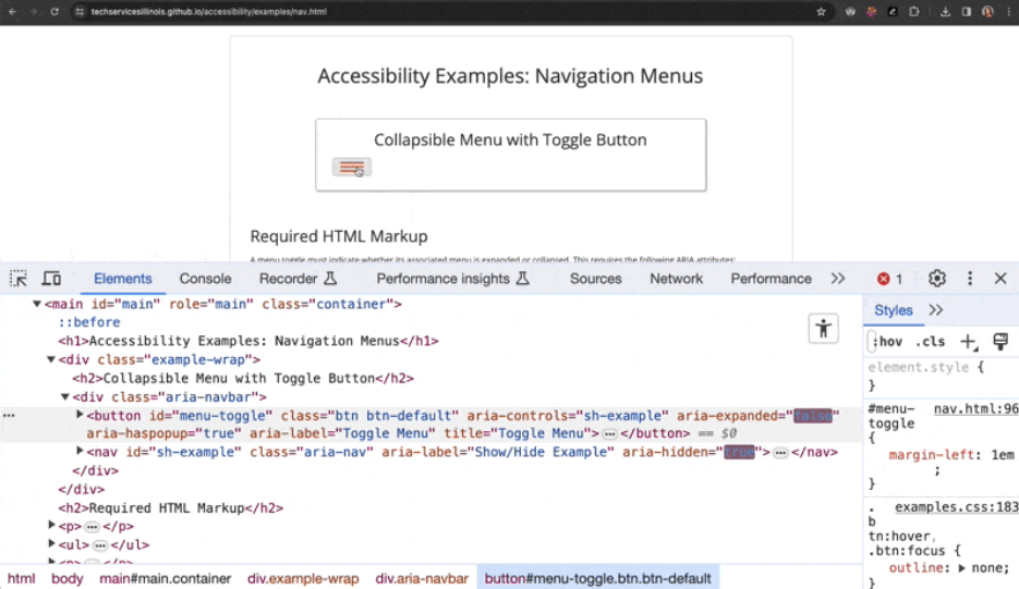
This example showcases a mobile menu icon. In the example, when the icon is interacted with, the code shows that the aria-expanded attribute toggles between “true” and “false”, indicating the state of the menu. Concurrently, aria-haspopup is set to “true”, which typically defaults to indicating a menu in most contexts.
This setting is crucial as it informs users, particularly those using screen readers, about the availability and state of a pop-up menu. The attribute provides an alert to users, indicating whether the menu is expanded and that a pop-up (in this case, a menu) is available.
aria-expanded
This attribute plays a crucial role in indicating whether associated content is currently visible or hidden. It’s typically added to interactive controls that are focusable, such as buttons, which are used to toggle the visibility of another element on the page.
The use of aria-expanded necessitates the implementation of JavaScript to dynamically update the attribute’s value. This update reflects the current state of the element it’s associated with, changing between “true” and “false”. When the control is activated, JavaScript is used to alter this value to represent whether the controlled content is expanded (visible) or collapsed (hidden).
In this example, we have a scenario where they interact with a button labeled ‘personal information’. As the button is clicked, the content associated with it either opens (expands) or closes (collapses). Correspondingly, the aria-expanded attribute on the button toggles between “true” and “false” to reflect this change in state.
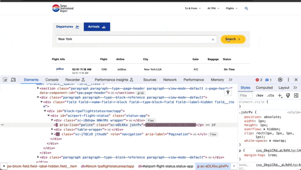
aria-live
aria-live is an attribute that, while useful, can be prone to misuse due to its complexity. Aria-live is instrumental in announcing changes on a webpage to screen-reader users, especially for updates that are visually obvious but not necessarily audible. This attribute is particularly relevant in modern web applications where dynamic content changes occur without full-page refreshes, such as auto-filtering in searches.
Aria-live is used to inform screen-reader users about updates on the page that are visually perceivable but might not be otherwise announced. It should be set on an empty element at the time of page load. The emphasis on starting with an empty element is crucial as it ensures the correct functioning across different browsers and assistive technology combinations.
Using JavaScript, text about updates on the page is injected into this empty element. The content announced through aria-live is read only once to the user and cannot be replayed, highlighting the importance of keeping the announcement short yet descriptive.
There are different values that aria-live can take, each serving a specific purpose. Aria-live="polite" is recommended for updates that are not urgent and can be announced at the next suitable opportunity, such as after the current sentence is finished by the screen reader. This setting is respectful of the ongoing screen-reader feedback and waits for a pause before announcing the update. On the other hand, aria-live="assertive" is used for immediate, time-sensitive updates that need the user’s attention right away, like a warning that time is running out on a form. Lastly, aria-live="off" indicates that updates should not be presented unless the user is currently focused on that region, which can be useful for controlling the flow of information.
aria-live="polite"
aria-live="assertive"
aria-live="off"
The examples illustrate the practical applications of aria-live. One instance describes an aria-live="polite" attribute on a visually hidden div, which gets updated with text like “three results showing” when a user applies a filter or conducts a search. This effectively informs screen-reader users that the page content has changed as a result of their actions. Another example features a search for flights, where the number of search results is updated dynamically and announced via an aria-live="polite" attribute, informing the user of the number of items in the updated list.
In summary, aria-live is a powerful tool for making dynamic web content accessible to users relying on screen readers, but it requires careful implementation to avoid overwhelming users with excessive or irrelevant information.
Wrapping it all up
In summary, Michaela comprehensively explores the essential role of WAI-ARIA (Web Accessibility Initiative – Accessible Rich Internet Applications) in enhancing web accessibility. ARIA serves as a critical bridge between dynamic web content and assistive technologies, enabling users with disabilities to navigate and interact with websites more effectively. She highlights the importance of understanding and correctly implementing ARIA’s components – roles, states, properties – and its most commonly used attributes, such as aria-label, aria-labelledby, aria-describedby, aria-current, aria-haspopup, aria-expanded, and aria-live.
The core principles of ARIA are encapsulated in its five rules, emphasizing the prioritization of native HTML, cautious use of ARIA to avoid altering native semantics unless necessary, ensuring keyboard usability, appropriate application of roles and attributes, and providing accessible names for interactive elements. These rules serve as a guideline for developers to create more inclusive and accessible web experiences.
Understanding and applying ARIA correctly is crucial in web development. It not only enhances the user experience for individuals relying on assistive technologies but also reflects a commitment to digital inclusivity. As the web continues to evolve, the role of ARIA in creating accessible digital spaces becomes increasingly vital. Developers and designers are encouraged to continually educate themselves on best practices and emerging standards in web accessibility to ensure their content is accessible to all users, regardless of their abilities or the technologies they use.
Transcript
>> CHRIS HINDS: Welcome to episode 057 of the Accessibility Craft Podcast, where we explore the art of creating accessible websites while trying out interesting craft beverages. This podcast is brought to you by the team at Equalize Digital, a WordPress accessibility company and the proud creators of the Accessibility Checker plugin.
This episode is a recording of a February 2024 WordPress Accessibility Meetup where Michaela Lederman, Senior Accessibility & QA Lead at Aten Design Group, explores the intricacies of Web Accessibility Initiative – Accessible Rich Internet Applications (ARIA), a critical tool for enhancing the web experience for users with disabilities. WordPress Accessibility Meetups take place via Zoom webinars twice a month, and anyone can attend.
For show notes, a full transcript, and additional information about meetups, go to AccessibilityCraft.com/057.
>> AMBER HINDS: We have a speaker, Michaela Lederman, who I’m going to pop up here real quick so everyone can see her as well, so welcome, Michaela.
Michaela writes and speaks about accessibility and inclusive digital experiences. She has completed a number of accessibility trainings, and is certified as an IAAP Web Accessibility Specialist.
Michaela uses her professional background and her passion for inclusivity to bring awareness and solutions to digital ADA compliance as Aten Design Group’s Senior Accessibility and QA Lead.
So welcome, Michaela. We’re really excited to have you here.
I’m going to stop sharing my screen, and then I will let you take over sharing.
We do have the Q&A panel available, so if you have any questions during the meetup, if you can please post those in the Q&A, we will take them all at the end.
>> MICHAELA LEDERMAN: Awesome. Well, thank you so much for having me today. I’m very excited to talk with all of you. I’ve been seeing where everybody is from in the chat, and it seems so exciting. Thank you for coming from all over.
I’m from the Boston area. I saw that there was another Bostonian around, so with that, I do apologize if I talk really fast because I do that when I’m excited, and I’m just an East Coaster. That’s just always on the go, go, go, but I will try to slow down, and if anything pops up and you need me to slow down even more, just let me know.
We can jump right into it. Welcome, everyone, to “Do More with Less ARIA.”
As mentioned, my name is Michaela Lederman, and I’m the Senior Accessibility and QA Lead at Aten Design Group. I am a certified Web Accessibility Specialist through the International Association of Accessibility Professionals. I’ve been with Aten for over seven years now, and over Aten’s 23 years in service, we have been providing strategy, design, and development to mission-driven organizations. We have been working with Drupal and WordPress for over a decade, and we contribute to the projects in every way that an agency can.
Since 2000, we have been working with some of the most mission-driven organizations in the world. We were founded to do work that matters. It’s how we attract the clients we want to work with. It’s how we attract the team that we need, and it’s one of the reasons I joined this team seven years ago as a front-end developer.
If you have any questions throughout the presentation, feel free to leave them in the Q&A or in the chat box. I’ll most likely just be addressing a lot of these at the end. I will have some time to do that. I’m actually hoping we can have a little bit of an open conversation, even if it’s through the chat, looks at more examples.
As I’m sure a lot of you know, ARIA is super in-depth. I’m sure we could do a week-long presentation on it and still not cover everything, so I am going to do my best to kind of cover all the high levels of what we’re going through today, and then ideally maybe have a few examples, and go from there, so let’s dive in.
So an overview of today’s presentation. We’ll be talking about, what is WAI-ARIA. We’ll talk about the five rules of ARIA. We’ll talk about roles, states, and properties, as well as some of the most commonly-used ARIA.
As I mentioned, today’s presentation is not a complete in-depth look at aria, as there is so much to learn regarding this amazing feature. However, it should absolutely help you understand why we have it, when to use it, some basics on how to implement it, and hopefully, a desire to learn even more.
So let’s jump right in and talk about the general basics and background knowledge of ARIA. Well, technically, we should be saying, WAI-ARIA. This is the technical name. However, as we all know, it is not the common name. Everyone knows what we are referring to if you drop that W-A-I. But the purpose of this first bit of information I do think it’s important to include.
So WAI-ARIA stands for Web Accessibility Initiative, Accessible Rich Internet Applications. ARIA enhances assistive technology interaction of web pages in ways that plain HTML just cannot do, especially with dynamic content and advanced UI controls of the websites of today.
It’s very important to remember that ARIA just conveys information to assistive technology. It does not change functionality for a user. It is solely made for users of assistive technology to gather more information about what is happening on the page, but what to expect, as websites have become more and more dynamic and more interactive.
Remember that classes, IDs, and visual styling is never conveyed to a screen-reader user, so we must convey this in a different way.
Support across browsers and screen-reader combinations is overall really great, mostly. However, as we know, there are so many ARIA features, and there are so many browsers out there, so many assistive technology combinations out there, that some things just work better than others, and some other ARIA features may not be the best to use nowadays.
ARIA can be targeted within your CSS or JavaScript, so similarly how you would target a class that you’re putting into the HTML so you could style it the way that you want, you can actually do that with ARIA as well, so it may be a good way to maybe instead of doing an active class on a main navigation, you’re using an aria-current=“true,” and you’re targeting that in your JavaScript or in your styling or anything of that sort, so you’re not adding all this extra code and extra bulk.
ARIA is made up of three main components: roles, states, and properties, which we will be going over a lot of this later in the presentation. But before we can really dive into more detail and specifics about ARIA, it is important to remember that when using ARIA, make sure you follow the five rules of ARIA according to the W3C. But even before we jump into that, it is very, very, very important for everyone to remember the golden rule of ARIA, that no ARIA is better than bad ARIA.
If you learn anything today, this is it. I know this sounds pretty counterintuitive, but too much or incorrect ARIA can actually create a worse experience, or even a completely inaccessible website. We will learn more about why it can be so bad, and how it can create such a terrible experience.
I see this all the time with our accessibility reviews – because at Aten, I do a lot of auditing and accessibility reviews from sites that were built elsewhere – where the developer was just trying to be good about digital accessibility. They know that they need to include alternative text, that contrast needs to work, and ARIA means accessibility, so they’re adding it everywhere on everything. When in reality, they’re doing that, and now they’re making a lot of functionality, and a lot of information just doesn’t make sense, and it doesn’t work as intended.
So definitely remember that no ARIA is better than bad ARIA. It is better to work without the extra context than it is to be completely unusable, where someone maybe can’t focus on the right element, or they can’t interact with an element, or they can’t check that checkbox, or submit that form.
OK, so I got that out of my system. You’re probably going to hear this at least three more times in this presentation, so like I said, if you learn anything today, this is it.
Since we’ve jumped into the background, now we can talk a little bit about the five rules of ARIA to help you implement ARIA correctly.
The first rule: Before you use and include any ARIA in your code, you must use native HTML elements or attributes first, and this is for two main reasons.
The first reason is because ARIA overrides original HTML semantics or text content that is being conveyed to assistive technology.
So I have this example on the screen. It’s a split screen between some code, as well as the visual side of what that code is outputting, and the code here is just a heading two with a role button on it, and the inside of that, it just says, “I am an H2 with a button role.” That’s the text within it. This is kind of an issue because the role=“button” is on the heading two element, so now this heading two is no longer being conveyed as a heading, but being conveyed as a button, so it’s being taken out of the natural hierarchy of the page, and is only being shown as a button when we want it to be a heading two.
Ideally, if you’re going to be overriding any HTML like this with an ARIA role, then we just want to make that element what you’re making the role.
So this new example here is that same split screen with the same content, “I am an H2 with a button role.” However, it’s a heading two with a button within it, so now it’s both within the heading two, normal hierarchy of the page. A screen-reader user can navigate and look at all heading twos on the page and this will appear. But it is also now a button element and it will fall within the button elements on the page, and the user can easily jump to that. It has the default styling, with the gray background and the black outline, and now it looks as if it should be a button, and so the visual side is following the programmatic side.
I have another example here as well with that split screen, so we have the code on top that is a link with an ARIA label that says, “Click this link.” However, there’s text within that link as well that says, “I’m a very important text that needs to be read to a user.”
If we look at the visual side, you can see it looks like a link. It’s blue and it’s underlined. A user would know that it’s a link. However, if you were to look at the accessible name here, a screen-reader user would actually only hear this as. “Click this link,” because that’s what the ARIA label is saying. It overrides the actual text within the element, so by adding that extra bit, you’re actually creating a worse experience in this instance.
The second reason is because assistive technology users expect consistent interaction patterns and audio feedback from components.
It is important to remember that assistive technology users require this technology to properly interact with your page. We must be following the expected patterns and audio feedback they were taught when interacting with components.
For reference, the general pattern is tabbing to all interactive elements and widgets, so you’re going to tab, tab, tab, tab, tab. But when you get to a widget, for instance, like a menu, a list of radio buttons, slider of images or tabs, it is now expected to use the arrow keys to navigate between each element within that widget.
Now, if someone is interacting with a checkbox, for example, they expect to hear if the checkbox is checked or not checked, which is automatically done with the native HTML. Going outside of these norms can be detrimental to the user experience.
Think of it as if someone sent you a webpage, and now you have to read it from right to left when you’re a left-to-right reader. Sure, you may learn to do this eventually, but do you really want to? Probably not. You will just go elsewhere to find that same information, and it’s a pretty similar experience.
Here is a simple example that I actually see quite often, so this is just a code example. It’s a link with an ARIA role button with text within it that says, “I’m a link with a button role.” It also has an href on there. That’s just the # symbol. A lot of times you’ll see #1 as well. But I see this one a lot because it’s being conveyed to a screen-reader user as a button, even though it’s a link, which you may not think of it as an issue. However, the way a user can interact with these is completely different.
Links use the “enter” key to interact with it via keyboard and other assistive technologies. Buttons must allow for the “enter” key and the spacebar to interact with it according to WCAG and W3C.
This can be detrimental to a user who always uses the spacebar to interact with a button, for example, and then they’re hitting the “space, space, space,” because they heard “button,” so they’re, like, “spacebar, spacebar,” and it’s not doing anything because it’s actually a link. It didn’t change the functionality of the link to a button. It kept it as a link. It’s just being conveyed as a button.
Just remember that links take a user to a new location, such as a new web page, or a new section of the current page from, like, a jump link, hence why it has that href attribute.
Buttons trigger some action, most likely using JavaScript, such as showing content on the page that was previously hidden. Maybe you’re playing a video or submitting a form.
A good rule of thumb, if you were putting an href on your link that is a # or a #1, it probably needs to be a button, because you’re not taking them to any location, and if you change the semantics to a specific role, like we talked about before, then it’s probably just an element to begin with, so this “aria role button” on the link should probably just be a button element as I have here in the code, which is now just a button element that says, “I am a button.” So if you find you’re overriding certain semantics, you should change that element.
Of course, don’t forget, no ARIA is better than bad ARIA. I’ll make sure you don’t forget this during the presentation.
I do want to say I saw someone ask for the presentation. I’m pretty sure the slides were sent out. They still need to have all the alternative text added to the images. I just didn’t want to leave everybody hanging if you didn’t want to follow along in the slideshow, so I did want to make note of that before we move forward.
The second rule of ARIA is: Do not change native semantics unless you really, really, really, really, really, really, really, really, really, really have to. I could have filled up this entire page with an infinity amount of reallys, so what exactly is that really, really have to in reference to? Well, almost never. Basically, you shouldn’t be doing this.
It actually took me a very long time to think of a good example for this. The only example I could even think of was an email template, and this is because email templates, for some reason, are still built in tables. That’s just how our email clients create them. That’s how they send them. That’s how they’re interpreted, so they have to be done in email templates. However, as we all know, tables are terrible user experience for most people using assistive technology, so it would probably be the only time that you’re going to be changing the native HTML.
I hate putting this one on here. However, I do think it’s important to say – just because I’m an agency and coming from the, like, of course, you need to balanced time, effort, money, and so on – when you’re retrofitting a site for accessibility upgrades, the ideal solution is always to start over and make the change as needed, but sometimes that’s just not in the card, so if you can override and make these things work correctly, and you get them approved and reviewed and user tested by an accessibility expert as well as actual users, and everything is good, then that’s fine. But if you do not have that capability, I definitely recommend not retrofitting the site, not overriding, and making sure you’re using the HTML semantics.
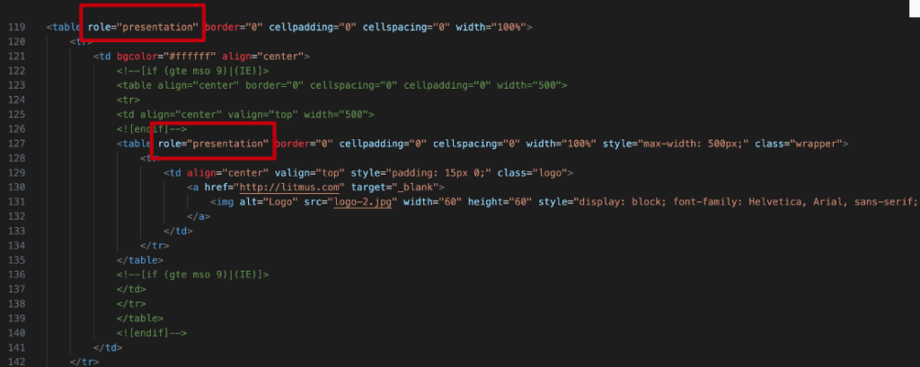
So I mentioned the emails as before, so here’s a screenshot of an email template that I have. It’s just from Litmus. It’s one of the basic ones that we use. Basically, what you’re seeing here is the code of a table, and then one thing with email templates is it’s always a table within a table. There’s always more tables within those tables, and it’s just a lot of nested tables.
Like I mentioned, they need to be built in this way, so there’s really no way around it, so the ideal solution with all these tables within tables, even looking at the code, if you’re able to see this, it is a lot to take in. I can’t imagine having to listen to every single table cell and everything going on. But by adding that role=“presentation” to each table element within your template, it then makes the table non-existent.
So basically, it’s just using the table as structure, and not conveying any of those semantics to the user so that they can focus on the content within, like the various images, headings, paragraphs, links, and so on.
This avoids forcing a screen reader to read each cell of your table one at a time, and then a table within a table, and then it’s just chaos, so it helps the subscriber get straight to the important information.
Like I said, I think this is the only time I would ever recommend overriding the overall semantics.
So the third rule is that all interactive ARIA controls must be usable via keyboard.
If you create a custom widget that a user can click or tap or drag or drop or slide or scroll or anything you can imagine, a user must be able to navigate to that same widget and perform an equivalent action and get an equivalent result using just their keyboard.
All interactive widgets must be scripted to respond to standard keystrokes or keystroke combinations when applicable. This is because all assistive technology actually uses keystrokes to interact within the back-end. Even if the user’s tech is not actually a keyboard input, they’re still using that code base in order to make it work in that way.
Of course, not only must it work for your keyboard, but it must also follow the expected patterns an assistive-tech user would expect, as we talked about in rule number one.
It is also important that we remember that ARIA has nothing to do with keyboard functionality. Again, I’ll say this one a lot as well. It just provides the semantics to the accessibility APIs. It’s just conveying information. It’s not changing the functionality. That being said, it is the developer’s responsibility to make any custom controls accessible with the keyboard by using JavaScript and other coding techniques, and that’s where rule number one comes back into play, and why it’s important to use native HTML elements.
I honestly have never come across, in any of my years of being a developer, having to create something so custom that I could not leverage native HTML and just make it kind of look slightly different.
So really even think of radio buttons, for instance, they can end up changing to a toggle. They look different, but they do the same thing, so a very simple example, but it’s one of those, like, try to leverage the HTML as you can.
>> STEVE JONES: This episode of Accessibility Craft is sponsored by Equalize Digital Accessibility Checker, the WordPress plugin that helps you find accessibility problems before you hit publish.
A WordPress native tool, Accessibility Checker provides reports directly on the post edit screen. Reports are comprehensive enough for an accessibility professional or developer, but easy enough for a content creator to understand.
Accessibility Checker is an ideal tool to audit existing WordPress websites find, accessibility problems during new builds, or monitor accessibility and remind content creators of accessibility best practices on an ongoing basis. Scans run on your server, so there are no per page fees or external API connections. GDPR and privacy compliant, real time accessibility scanning.
Scan unlimited posts and pages with Accessibility Checker free. Upgrade to a paid version of Accessibility Checker to scan custom post types and password protected sites, view site wide open issue reports and more.
Download Accessibility Checker free today at equalizedigital.com/accessibility-checker. Use coupon code accessibilitycraft to save 10% on any paid plan.
>> MICHAELA: Rule number four is: Do not use role presentation or aria-hidden=“true” on any focusable element.
This is another great example where ARIA is just conveying information to a user, but it doesn’t change how it functions.
If you add aria-hidden to an element, especially an interactive element, a user can still see the interactive element, but will not be able to interact with it because they’re not able to hear it, so it’s not within the screen reader DOM of what’s going on, the accessibility API. You’re removing a functional feature, but just remember that not all screen-reader users are non-sighted, so you want to make sure that visuals line up with what a user is hearing.
A lot of times it could be someone that may have low vision that still can see the screen fairly well, but uses that as just reinforcement to navigate.
It could be someone like my cousin, Emily. She had Duchenne muscular dystrophy and she had very limited mobility, and by using a screen reader, she was able to kind of navigate as she could, because a keyboard kind of stinks if you’re only using a keyboard to navigate, as you have to tab, tab, tab, tab, tab. There’s no easy way to skip around. But if you’re using a screen reader, you can jump to heading twos, to links, to buttons, to lists, and so on, so it’s a great way for other users just to be able to jump around and navigate a page quicker.
It could also be someone who maybe is dyslexic or maybe have some kind of reading impairment, so hearing it and seeing it at the same time just really reinforces what they’re learning, so you want to make sure if it’s hidden to the screen reader, it’s also hidden to a visual user. Otherwise, there’s going to be some kind of confusion in that instance.
So role=“presentation” versus aria-hidden=“true.” What exactly is going on with these two? What are they? Well, aria-hidden=“true,” it removes the entire element from the accessibility API. It makes it non-existent to the assistive-tech user, but is still visible to a visual user.
Great times to use this one is maybe dropdown menus, when the menu item is not open, so once the item appears, now it’s an aria-hidden=“false” because now it’s open and everyone can see it. Otherwise, it’s hidden=“true” because it’s no longer being seen.
Same with accordion panels. When it’s active and open, it’s great to have it there so you can see what’s hidden and what’s not. Or slideshow elements that are not currently visible. You want to make sure that no one is able to access those so there is no confusion.
When it comes to role presentation, this one’s different because it’s only removing the semantic meaning of an element, but it does not hide the element from an assistive tech user.
So think of it with that email template and table from before. It didn’t necessarily hide the whole element to the user. It just got rid of the meaning for it, so it is a great way, in that instance, where it would work.
It’s also helpful maybe if you’re hiding decorative images or banners that really don’t do anything except for maybe break up content or visually just to break up content or just to support content, but doesn’t necessarily convey important information.
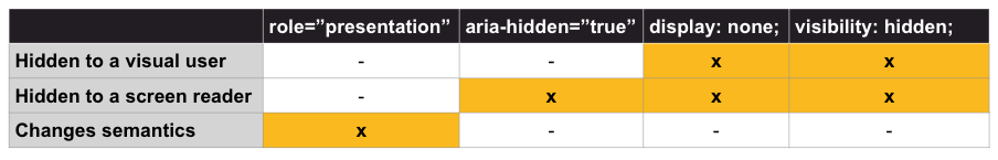
This one I do get a lot. I remember talking about this a lot from some of my developers early on. It’s like, “OK, so then when do I use role=“presentation”?” “When do I use aria-hidden=“true”?” “When do I use display:none?” “When do I use visibility:hidden,” and so on? So those were kind of the four big ones.
So I did create this little table. Very straightforward. It has four columns. There’s one for each one for role=“presentation,” aria-hidden=“true” display:none, and visibility:hidden, and then there’s three rows here for hidden to a visual user, hidden to a screen reader-user, and changes semantics.
There’s an X in each one that conveys what is actually happening.
So for role=“presentation,” it changes the semantics. It does not hide it to a screen-reader user, and it does not hide it to a visual user.
Aria-hidden=“true” does not change the semantics, but hides it to a screen-reader user. It keeps it visual. It does not hide it to a visual user.
Display:none and visibility:hidden both hide it to a screen-reader user and a visual user. It’s completely gone to all users. It does not change the semantics. It’s just not displaying it for anyone.
Then the main difference even then from display:none and visibility:hidden is that display:none completely removes the element from the webpage layout. However, visibility:hidden only hides the element, but keeps its position intact, so visibility:hidden is a great one, for example.
If you have animations on a dropdown or an accordion and you want it to have that up-and-down kind of animation, visibility:hidden is a great time to use that because then it still keeps that position, so it can use that animation.
The display:none will just not show it anymore, so it could be a little confusing on that side.
The final rule is that all interactive elements must have an accessible name.
So what does an accessible name actually mean? Well, an accessible name means that there is a label or name that the accessibility API property has a value.
I always say this as programmatic or name or something. You probably heard me say that before: programmatic and visual, and basically, it is what is conveyed to a screen reader or assistive-tech user when you’re interacting with this element.
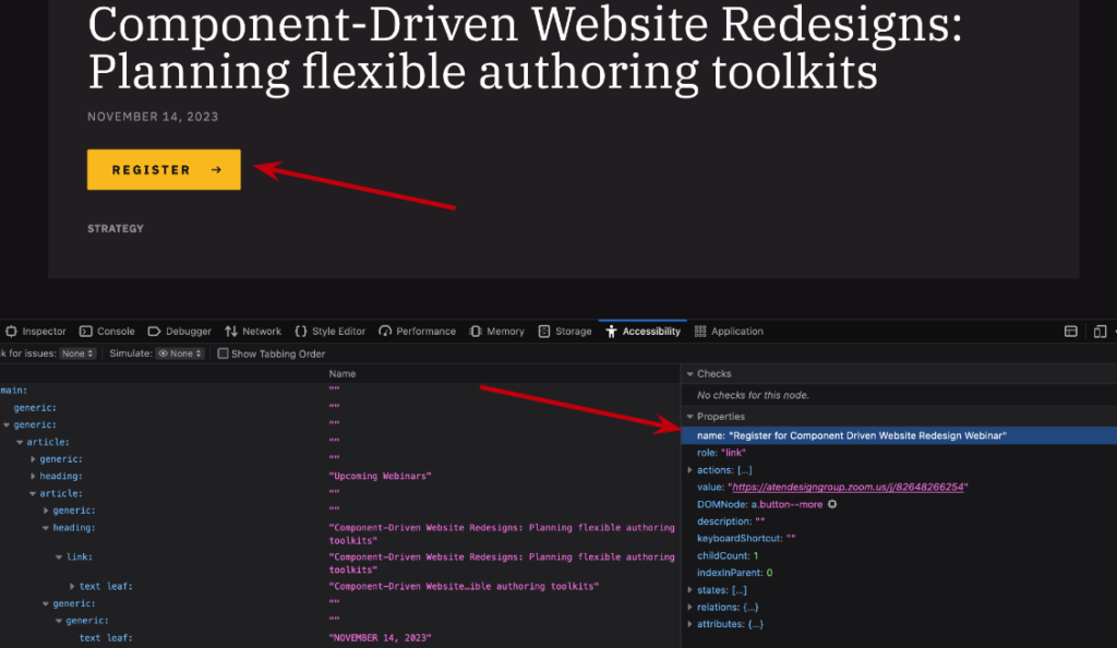
So you may be asking, “How do I know what the accessible name is, or see the accessibility API to confirm this?” I’ll explain the screenshot after. But before I explain anything, I do want to make note that I did make changes to the site straight in the browser in the Inspector tab, so this cannot be replicated. If you go to the Aten site, however, it is a great example to show exactly what I’m trying to convey here.
So to elaborate on what we’re looking at now, this is a screenshot of the Aten website. This is on the Firefox browser. I have the Inspector tab open, and we’re on the accessibility tab, so I’m looking specifically at the “register” button, and if we look under the accessibility tab under “properties,” it actually has an area that says “name.” So you can see the visual button says “register,” but the accessible name under “properties” is actually “Register for component-driven website, redesign webinar.”
Now you may be thinking, “This is cool, It’s very descriptive, but I don’t understand how we have that name versus what I’m actually seeing. There’s no real connection between what the accessible name is and the visual side.”
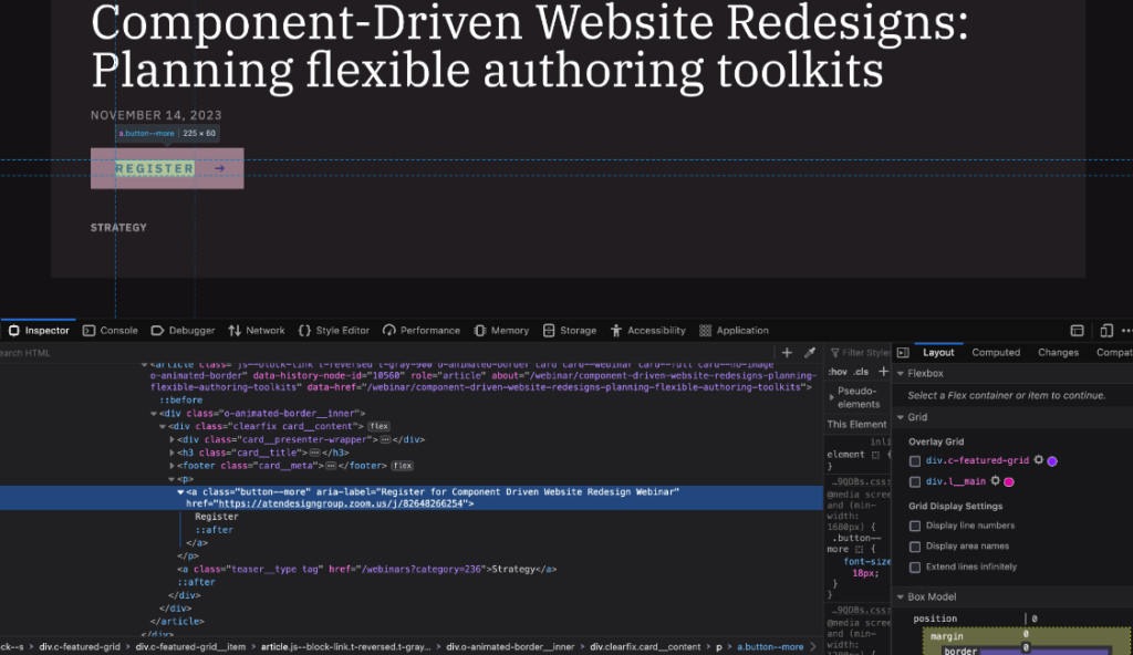
So this next screenshot is the same thing that we were just looking at, the Aten site on Firefox. We’re looking at that “register” button. The Inspector tab is open, but now we’re actually looking at the HTML of the page, and what I have here is that it’s a link with an ARIA label on it that says, “Register for component-driven website, redesign Webinar,” with text inside that that says “register.”
Now, as mentioned before, an ARIA label will override the text that is visual, so the accessible name came from that ARIA label that now says, “Register for component-driven website, redesign Webinar.”
You may think that this is a great idea because it’s giving a lot more context. You actually know what you’re registering for, and this and that. However, this can cause issues for those who require speech input to navigate, for example. They may say something like, “Select register button,” because that’s what they see. But now this has an accessibility link of “Register for component-driven website, redesign webinar.” And then this can be an issue because the accessible name and what they’re saying and what they’re seeing are not the same, and there could be some weird little bits there, so we just want to make sure that, ideally, the accessible name is what you’re seeing or what is being conveyed.
So examples of various types of accessible names. One is content or text within an element.
If you have a link or a button or anything of that sort, and the text is visible, and there’s text inside, that is automatically going to be the accessible name. Unless you have an aria-label which, as we know, will override the text within. Or if you have an aria-labelledby on that, it will actually override the aria-label, if you happen to have both on there, which is now overriding the text, so you need to make sure you’re following that kind of flow that, obviously, if you’re using ARIA, it’s going to be overriding the native HTML.
It could be the title with an SVG is also the accessible name.
Alternative text on images are considered their accessible name, and labels on inputs are also considered the accessible name.
A great example that I have here, it’s another split screen where there’s code examples, and then there’s also the visual examples of what we’re seeing here. These are checkboxes with labels that say, “Label texts.” I kept it very simple. I didn’t go anything crazy here. There’s three examples. They all look exactly the same on the visual side, but on the coding side, it actually is set up slightly different for each one.
The first one is a label that wraps the input and the label text, which is appropriate. That actually works. It will create the correct accessible name.
The next one is an input with an ID on it, with an associated label that points to the ID, so now we have that working as well.
Then the last option is surprisingly something I see a lot, which is an input, and then there’s a span that just looks like the label, or maybe it’s just a label, but there’s no four attribute on it. Those are two options that I see a lot that can obviously cause problems.
So as you can see, from a visual side, it doesn’t really create much of a difference. However, if we go to this next slide – well, I’m saying don’t use that one – I have this little video here that is displaying what it’s like as a visual user using your mouse interacting with the label text in the checkbox.
So what you may be seeing here is that we are hovering over each one of the labels, and two of them get that little hover change. One of them does not, and that was the one that was incorrect with the span.
Now, that’s important, because if it’s associated correctly with labels, then you can click on the label, which gives you a bigger click area, target area to interact with it, less chance for error, et cetera, et cetera. But if you can’t click on it, that should probably be your first notice that, “Uh-oh, I don’t think that this has an accessible name. This is not communicating directly with one another.”
So you want to make sure that this is kind of an ET test for the labels to input, so again, you can click on the label. It’s probably the accessible name.
Of course, I always recommend looking at the accessibility API. This is a screenshot of that same exact page and we have the code open. We went to the Inspector tab, opened up the accessibility tab, and we are now looking at the accessible names.
So for the first two inputs, the accessible name, as it is displaying in the accessibility API, is saying, “label text.” Great, it works. We have the accessible name. But if we look at the screenshot of the last one, which was the span that looks like a label, but it’s not actually done correctly, the accessible name is “null.”
So as you can see, there is no accessible name, which means it is missing. It’s not done correctly. It needs to be done correctly. You need to fix that.
Those were the five rules of ARIA. There’s a lot going on. I’m trying my best not to speed through it, so I hope you are kind of following, because there is a lot to take in. I see there’s a lot of discussion in the chat. Hopefully nothing you need clarification from me quite yet, but we’ll see.
Roles, states, and properties, the main three features that make up ARIA. Let’s talk about those.
So when I talk about roles, roles define what an element is or does. Most HTML elements have a default role that is presented to assistive technology, so a lot of times, you don’t need roles at all. Maybe back in the day before a lot of this was common practice, you would have to add, like, a heading two with a role, like a heading as well, or an input button with a role button, but that’s not necessary a lot of times nowadays.
States. ARIA states are attributes that define the current condition of an element, so it could be if it’s “true” or if it’s “false,” or if it’s “hidden,” if it’s not, and so on.
Properties define additional semantics not supported in standard HTML. This property extends the standard button to cause a screen reader to announce that it’s a button if activated, if it triggers a pop-up, and so on and so on.
Many times, you’ll actually be seeing states and properties grouped together because a lot of those actually just rely on one another, so as we move forward in this presentation, we’ll just be grouping those together. I’m not going to separate those ones out.
So when we talk about roles, as I’ve said a few times now, adding a role overrides the native default role semantics of the element, so if you put a role=“button” on a link, it’s going to be considered a button to assistive technology. We want to make sure that you are never overriding that.
There are six role types. Just note, I will not be testing you on these. I’m not going into the full details about these, so I’m just here to let you know that there are six role types, in case you want to test yourself later: Document structure, there’s a widget type, there’s a landmark type, a live region type, a window type, and an abstract type.
As I mentioned, I’m not going into details about these because a lot of them can be a little abstract, so they can kind of, like, “Oh, they kind of make sense to go here, but maybe not here.” And some of them are actually being removed because they’re in native HTML. You don’t really need them in there, and there’s just not a lot of examples for them, so I’m not too worried about it. Just remember that these are added to provide more context or more semantics to what the user would already expect with interacting.
Some good examples of roles that I would recommend or would look at… Or not even recommend, because I probably wouldn’t do a marquee very often…But these are the ones that I tend to see fairly often.
So for the example, it’s just a list of what we’re looking at here. It’s a role=“menu,” role menu item, role tab, a tablist, tabpanel, presentation, alert, marquee, so here’s just some examples of various roles that we might be seeing.
I do want to make it known that many roles needs to be nested correctly within other roles. For example, there’s the tab, tablist, and tabpanel here. You cannot have a role tab on your page without it being wrapped within a tablist. You cannot have a menu item without it being within a tablist, and it’s just one of those things, so if you are going to start using some of these things, it’s definitely worth looking into some of the more details about them. However, these are some of the common ones going on there.
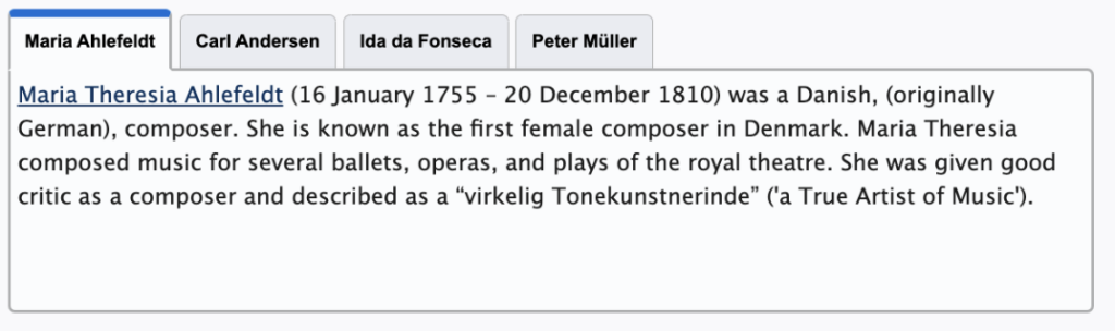
So if we’re looking, this is just a screenshot of some tabs from I think it’s the ARIA patterns website. That’s great for examples. I’ll send off that link later on, because I do think it’s helpful to take a look at some of those. But we have four tabs. It says Maria, Carl, Ida, and Peter, and Maria is active, and there’s a bunch of texts in there for the active state, so each one of those names: Maria, Carl, Ida, and Peter, those would all be tabs. They’ll each have a role tab, role tab, role tab.
The whole grouping of those buttons would actually be the tablist, and then the content that is displaying when active is the tabpanel, which you connect via, I think, aria-control so that there is something going on there.
I’m not going to go into too much detail about how to create a tablist like this necessarily, but overall, just know you can’t have that tab without the tablist, and the information that’s showing must be the tabpanel, so they are all associated together.
States and properties. States and properties convey information to the user about what to expect or what is currently happening with the interaction or relationship of the element.
There are four states and property types. There’s a widget type, live region type, a drag and drop type, as well as a relationship type, and again, I’m not going into detail about these. I’m not going to test you about them either, but I just do want to say it’s because a lot of them just fall under the global aria attributes.
Many states and properties just apply to all HTML elements, regardless of whether an ARIA role is applied, some can only be used on certain roles or certain things, so we just want to make sure that most of them are global ARIA attributes and they’re supported by all HTML and all roles.
Some examples of common ARIA properties and states that you may see are things like aria-haspopup, aria-expanded, aria-required, aria-live, aria-labelledby, and aria-current.
As you can see here, we have a lot of these here. There’s an aria-haspopup=“true”, expanded=“false,” required=“true.” We have aria-live=“polite.” We have a labelledby that’s pointing to an ID, and a current page.
Many of these, they’re all starting with “aria-,” which is important because it’s a distinction from the role, and many of them are “true” and “false.” And a number of them can also allow for element IDs, some of them can allow for pointing to multiple IDs, and they can even give more context that way.
Aria-current, for example, there’s, like, page, there’s steps that you can use for breadcrumbs, or steps in a form, time for current events, and so on, so it’s a great way to just give even more context to what’s going on without necessarily overriding anything important.
Oh, I think I saw someone put in the patterns website. I definitely recommend taking a look at that. It’s always very helpful, and there’s some great starting points for looking at some of those patterns.
So we went in a deep dive and tried to cover as much as we could about the basics of ARIA, so let’s jump into some of the more commonly used ARIA, and some of the more helpful to know.
As I mentioned, we’re not going through everything, and if you’re confused at all, just avoid it. Start learning more. Start coming to more presentations. Start learning a little bit more of this, so I do think it’s important, some of these are important, but obviously, if it’s kind of going above your head, then please learn a little bit more before you start using them. But I think these are some of the easiest ones to understand, and I think it’s important to talk about.
As I mentioned, these aren’t everything. These are just some of the important ones that I do think we should talk about.
So aria-label, which we brought up a couple times. Aria-labelledby is another common one that you may see a lot or use a lot. Aria-describedby. Aria-current isn’t one that you should leverage. Aria-haspopup. Aria-expanded, and finally, aria-live, which I really hesitated on adding to this one because that is like a whole presentation in its own. But I do think it’s important to at least touch upon so you can learn a little bit about it, at least the basics of it, so that if you are interested in it, then you can start learning a little bit more and kind of diving in that way.
So let’s talk about aria-label. Well, as we’ve talked about this a few times, it’s a string value that labels an interactive element. It can also be used when a landmark, like a navigation or maybe a header, is used more than once on a page. You want to avoid overriding any visible text with aria-label, as that takes precedence over it, as we have seen in some past slides.
Some examples of when you would use this is when multiple of the same landmarks are used on the page.
Navigations is a great one. A lot of times, headers can be used in article landmarks, and even sections, and if there are multiple of those, you want to make sure there is a little bit more distinction to them, as well as buttons or links that might be icons, so you want to be conveying a little bit more information.
So this screenshot here, it’s not super detailed code. I just want to do something very simple, but it is four different NAVs that you might find on a page. There’s a NAV, aria-label main; NAV, aria-label secondary; NAV, aria-label breadcrumb; NAV aria-label footer. This is great to just give a little bit more information, because if you’re a screen-reader user and you’re just navigating, you want to know about all the different navigations on the page. If you don’t have this aria-label, you actually are just hearing that there’s a NAV, a NAV, a NAV and a NAV. However, if you’re adding this accessible name to it with the aria-label, you will hear that it’s a NAV main, NAV secondary, NAV breadcrumb, NAV footer, so you can really jump to the navigation that you’re really looking for.
Although, a common example that I see a lot of times is this one, so this is another split screen. It’s mostly code with a little picture at the very bottom. I hope you can see it. I feel like it’s pretty small down there. But the visual side are just some social-media icons.
I also prefer the little Twitter bird still. I don’t know if I’m ready to go to the “X.” but we have a NAV that’s surrounding it in the code, so it’s a NAV, aria-label social, and then we have a list within that because it’s a list of items. Obviously, the Twitter icon is a link, the Facebook icon is a link, and the Instagram icon is also a link. There is an aria-label in each one of those links that says, like, “Link tag, aria-label Twitter.” “Link tag, aria-label Facebook.” “Link tag, aria-label Instagram.” And it’s a great way to convey that information. People already associate with those icons to confirm that there is an accessible name.
Another great example that I see all the time when using an aria-label is maybe the Hamburg icon, as we’ll call it for the mobile menu. That icon that’s the three lines. Usually, sometimes it’s a two, but that what opens the mobile menu on your mobile device for a website. That could have an aria-label on it, because it’s probably an icon that just says, “toggle menu.”
Some people get a little crazy and then they’ll inject JavaScript in there to be, like, “open and close.” And depending on what it is, they’ll add it. I don’t find that to be necessary because you’re probably going to be using some other ARIA that we’ll talk about in a second that also conveys that information. But it’s a great way to at least give a little bit of information about what’s going on.
It could also be like a “close” button on a modal window, or something of that sort, and that’s aria-label.
Aria-labelledby is another common one that we see. Aria-labelledby enables authors to reference other elements on the page to define an accessible name. The attribute can actually target multiple IDs.
I mentioned this before, but aria-labelledby takes precedence over aria-label if both are set on an element, so if you put both of them there, only the aria-labelledby would be read. It would not use the aria-label because that is a higher precedence there.
This is a great way to use maybe with accordions, tabs, in that tab example we had before, or even a table structure, so not like a basic table structure. Already, you should have table headers that are already giving that information. I’m talking about those complex tables that are a table within a table within a table, that you need that information, and sometimes you get lost. Having that accessible name will actually help with the aria-labelledby.
I have this screenshot, and all that it is, is an accordion element, so we have a personal information one that is closed, and a billing address that is open, and the billing address just has a form within there. This is a great way to maybe have the open area, so the form within it, labeled by the button that’s opening it, so that there is a little bit more context.
This next screenshot is of the code that is creating that. There’s a lot going on here. It’s just the accordion group. I did highlight a little bit more just with the red outline that we can see.
On the div that’s holding the form, which opens and closes, and hides and shows, there is an aria-labelledby that is pointing to the button that triggered it. That way, when it’s reading all the information here, it’s reading about the accordion panel, it can actually point to the button and say that it’s labeled by the personal information, so that there is an association that you know that this content is part of the personal information area.
Another one is related to tabs. We’ve looked at the same screenshot from before. It’s that same tab structure with Maria, Carl, Ida, and Peter, and Maria is active, and this is great that maybe on that tab panel, there’s an aria-labelledby pointing to the Maria button, so that we can know that all the content within there is associated with the active element.
I have a screenshot here of the code of that same thing as well, with it highlighted on the tabpanel that’s active that says, aria-labelledby, tab two, which is the button for Maria.
I also got this example for Mozilla, because I was trying to think of a good way to bring in multiple IDs so you at least have an example of how to do this, so this is just a heading two with an ID of ATTR. The heading two says, “13 ARIA attributes you need to know.” And it has some paragraph text, and a link within there, and an aria-labelledby on the link.
So it’s actually pointing to itself. It has the ID of the link. It says RM13 is the ID of the link, and then a space, and then the ID of the next element you’re looking for, so it has two IDs in there, so it’s pointing to that, and then this would actually end up being read as, “Read more, 13 ARIA attributes you need to know.” So it has an accessible name that’s a little more descriptive, and it’s all visual there.
What’s the difference between aria-label and aria-labelledby? And this is a common question that I get, so let’s break this down very quickly.
The important thing is they both provide an accessible name for an element. The main differences, though, is that aria-label is used where text that labels the element is not visible. If there is visible text, it should probably use an aria-labelledby, and you can point right to it.
The aria-label, of course, the accessible name is found directly on the current element, and the aria-labelledby is pointing to other areas for the accessible name, so those are really the two main differences between the two.
As I mentioned, if it’s visible, use aria-labelledby. If it’s not, use aria-label.
So aria-describedby is another great one that I’ve seen used a lot. It lists the IDs of the elements that describes the object more than just its accessible name. It’s used to establish a relationship between widgets or groups, and the text that describes them, so it’s not labeling them. It’s just describing what’s going on. Think of it almost as a caption. It must reference content strings in the DOM. It can be visible or not, but I’m emphasizing content strings.
If you want it to describe with other images and this and that, there’s other ARIA to use for that. But also, at the same time, it can be a little much to deal with that, so try to keep the aria-describedby fairly simple.
Some great reasons to use it might be complex images in infographics. Obviously, if it’s a complex image, an infographic alternative text isn’t enough, sometimes, the caption associated with it still isn’t enough because it could be a lot. Maybe you need to point it to some other kind of information that’s important or maybe a little bit more, so then you can also describe it in a different area as well.
Some other ones are tables. Again, if the caption just isn’t enough that goes with the table, you can obviously point to other important information that could be there.
The last one I also wrote with steps in a form is also a great one, so if there’s something important there, then we definitely want to be focusing on that.
The example I have here is another split screen. There’s some code and there’s the visual side. The code has a button with an aria-describedby, and my ring light is in the way to see what’s going on. The describedby label it’s pointing to is trash, D-E-S-C, and it says “Move to trash.” That’s what the button says.
However, there’s also the helper text that says, “Items in the trash will be permanently removed after 30 days.” That’s important text that a user should probably know about before they move whatever they’re using to the trash.
So by adding this aria-describedby and pointing to that paragraph text, it can be read as, “Move to trash. Items in the trash will be permanently removed after 30 days.” So it’s an announcement that’s very important that will be read to the user out loud so that they actually also know that if they do this, there’s going to be complications or they’re going to be saved or whatever you need to do.
Another good one that we see here is aria-current. This is great to announce an active state in a group of related elements, so I already talked about this one a little bit, because I do think this one’s a great one to use on your site. It’s great on your navigation on breadcrumbs if you use them, maybe a multi-step flow, or even tabs, or even a calendar, or events.
So like I said before, when a group of related elements such as several links in a breadcrumb or a main navigation, one of them is usually styled slightly different because they’re active, so we want to make sure that visual active state is also being conveyed to a screen-reader user, so by doing that, you can use an aria-current=“true” or aria-current=“page.” And now it’s also going to be conveyed of what is actually current.
As I mentioned before, you can also target that in your CSS or your JavaScript, so you don’t have to add that class. You can just target the current state, and then go from there.
So I did bring up a few other examples that there was more than just “true” and “false.” So for example, we have an aria-current=“page,” aria-current=“step,” aria-current=“location,” aria-current=“date,” aria-current=“time,” aria-current=“true” or “false.” So it’s a really great way to be able to just say kind of what’s going on, and giving a little bit more detail. Obviously, “true” and “false” is the bare minimum, but you can get a little bit more detailed if need to.
I have a code example up on the screen here, so we have a nav element that says aria-label=“breadcrumbs,” as we mentioned there, because we want to make sure that nav has a little bit more information there. There is an ordered list within that, and then three list items. Each list item has a link within it, so there’s a link, home; a link, parent page; and a link, current page, and I have added the aria-current=“page” on that last link item, so now I can style it as needed, but also, it’s being conveyed to the user that this is the current page that you’re on within the breadcrumbs.
Another one that I see pretty often is aria-haspopup. It indicates the type of a pop-up that can be triggered by the element on which the attribute is set. It does not use JavaScript to inject any attribute changes, but JavaScript is probably needed to ensure that the pop-up element is keyboard accessible, and has correct focus after the fact.
So it’s not necessarily directly related, but I do want to mention, if you are using this, you will probably be needing JavaScript in some way. It’s great for when you’re going to be triggering modals or dialogues, as well as menus with dropdown menus.
I have this little screencast here on this next screen, and this is just an example. I don’t even remember where I got this example from, honestly. I think it’s just GitHub, like, pages or something. But on the mobile menu icon, when you’re clicking that, on the visual side in the code element, I have it highlighted on the button that the aria-expanded=“true” and “false,” you can see it’s kind of toggling back and forth, but the aria-haspopup is just “true.”
“True” defaults to menu in most instances, so if you do want to get more details, you’ll have to add the different types that are there. However, it’s giving an alert that’s telling the user that it’s expanded or not, and that it has a pop-up, and the pop-up is a menu that will be coming forward.
The next one is aria-expanded. Aria-expanded tells a user if a control is expanded or collapsed, and whether or not the elements are displayed or hidden. It is added to the focusable interactive control that toggles the visibility of an object.
You must use JavaScript to inject the boolean changes and perform the “expand” or “collapse” function, so you must be using it to change from “true” to “false” or “false” to “true.”
Great examples of using aria-expanded is an accordion. It could be a dropdown menu or a mobile menu, for example.
In this next example here, we have a little screencast. This is, again, just a screen recording from the patterns website so that you can kind of see at least what’s going on there, and the visual side is showing that I’m clicking on personal information, and it opens, and then it closes, so then I click it again and it opens, and I click it again and it closes.
In the coding aspect, you can see on the button that I am clicking. I have it slightly highlighted. I know that the zoom might make it not as great quality or anything, but the button has an aria-expanded on there that is toggling from “true” to “false,” to “true” to “false,” depending on if it’s open or not, so this one’s saying you need to use the JavaScript to inject that change depending on what is happening there.
Finally, aria-live. Again, I kind of hesitated talking about this one today, as it can definitely be abused. There’s a lot to it. It’s a lot. However, I do think it’s important to at least bring up, because it’s something that I feel like a lot of websites probably need because they’re probably not doing page refreshes with searches, they’re doing, like, auto-filtering, and this and that, and they’re causing all of these major changes on a page that we can see as a visual user looking at the page. However, someone who’s relying on just sound to navigate, they may not know of all of these changes happening on the page. They’re not going to notice an update, so this section is probably a whole presentation in itself, like I mentioned, but I do think it’s important to talk about.
So aria-live, it’s used to announce to screen-reader users of changes on the page that are visual, but does not announce it to a user, so we’ll go into some examples with that, but it’s something that I could see as a visual user. However, not everyone will necessarily know if they can’t hear that change.
This is very important to remember that aria-live must be set on an empty element on load. You cannot have it on a random element that’s, like, capturing an entire page or an entire this or an entire that. It has to be empty on load. Yes, you may test it out on something like Safari Voiceover and be, like, “Oh, this works perfectly on this whole thing.” Yes, sure, maybe it works, but it doesn’t necessarily mean that it works in all instances, in all browser, and assistive-tech combinations, that it’s not going to work for everyone, that it might be an overload of information, so this is best practice to make sure it is empty on load.
You must use JavaScript to inject text about the updates on a page in the empty element, so like I said, it’s empty on load. When something changes, you’re going to put in some text in there to announce to the user that something has changed.
You want to keep the notice short and succinct, while also still describing the page. Kind of sounds like that balance with alternative text, like, how much content do we put in there? How much do we do that? But it’s important to remember that this content is only read once to a user, and they cannot replay that information.
I think I saw someone wrote in here, like, what’s the difference between a live and alert? They’re all pretty similar, and I kind of mentioned that in the next slide, but it’s still the same thing. It’s only read once to a user. It cannot be replayed, and it will not read very, very long strings. It kind of just cuts off at a certain point, because at that point, the user probably just wants to keep going, kind of figure out their next steps, so you want to keep it nice and short, nice and succinct, but still give the information that you’re looking for.
So a couple examples that you might see with aria-live is aria-live=“polite.” That is my recommended one. It indicates that updates to the region should be presented at the next graceful opportunity, such as the end of the speaking of the current sentence or when the user pauses typing.
This is the recommended setting, as it says, because it’s polite. Who doesn’t like a polite person, a polite dog, a polite baby, a polite screen reader? It waits for the screen reader to finish talking before announcing the next change.
Aria-live=“assertive” indicates that the updates to the region have the highest priority, and should be presented to the user immediately because it’s time sensitive. You want to avoid this unless absolutely necessary.
A great way to maybe use this or similar to an alert as well is kind of… Anyway. The aria-live=“assertive” is saying, like, “Your attention needs to change to this now.”
So a great one is maybe your time is almost up in a form and it pops up, and it’s going to say, “You have one minute left.” You’ll want to hear that because you’ll want to know your time is almost up, or anything like that. Like, that’s the time you want to use it, is when someone needs to know.
Then finally is aria-live=“off”. This indicates that updates to the region should not be presented to the user unless the user is currently focused on that region.
So if you’re making other changes on the page, and you’re higher up, but you’re not in the section that is also changing something else, then we don’t want to know about that. If the focus is within that container, then you want to know a little bit more.
It’s also a way to just turn it off. If, for instance, you maybe have a lot of aria-live on there and it’s super annoying, maybe you offer a button to turn it all off so a user can kind of just pay attention to what they want. It could be a good way to do that.
Keep in mind, there are plenty of other things like aria-atomic, which is kind of like aria-live=“polite.” I honestly don’t really know the difference between the two. I just kind of stick with the tried and true, and even certain elements that have their own announcements, like I said, that role marquee automatically alerts as you go on. But for the sake of this presentation, I did want to bring up these main ones.
So here we have an example of ARIA on a visually empty div. It’s a div. It says it’s visually hidden. A lot of times, we do it visually hidden just because it’s kind of being replicated elsewhere, and it has an aria-live=“polite.” And once something changes on the page, we insert some quick text in there, so now this is still nothing about the ARIA has changed. It still says aria-live=“polite,” but now there is text in there that says there are now three results showing.
I love using this for searches and filters for that instance, so that a user who will click the button to filter, and then if it’s not a page refresh, [inaudible] if it’s using, like, ajax or JavaScript, this way, a user will actually be alerted that something has happened. Otherwise, they could just click the button and kind of just wait, like, “What’s happening? I don’t know what to do.” And you have to kind of explore to see if things have changed, so this is a great way to announce that.
I have an example of aria-live in action, so we have the visual side of what’s going on and the code side as well, and this is just a simple search, so you’re just searching for your flights, departures from Tampa, so we have an aria-live=“polite.” And hopefully, it starts over. It’s currently empty on load, and my mouse is displaying that and highlighting that. I’m typing in Boston into the search bar, and I search that, and now the aria-live=“polite” has list updated with six items.
So I’m going to change it to New York and search by that, and now the list is updated with 14 items, so this will be announcing to the user that things have changed on the page.
Of course, that was quick. Like I said, we can go into a lot of detail about all of this, some of it could be overwhelming. There’s a lot to talk about. Just remember that no ARIA is better than bad ARIA.
If you have any questions or concerns, maybe take a step back and read a little bit more. Maybe you can get it tested or anything like that. But try to keep it simple.
Honestly, a lot of the ARIA isn’t necessarily needed unless you’re doing something super custom, which, again, not sure is a very common place for most websites out there.
Now, of course, if you find yourself still confused, or asking what your next steps are, remember, myself and Aten are here to help. We believe in giving back to the community, like doing informative webinars, like the one I’m doing today.
I also do free consultations, which you can sign up for on our website, and then I just kind of go through 30 minutes, and we talk about your website together. We look at automated reviews. We do some manual testing together, and we come out with a couple actionable items, and next steps, if that’s something that you’re looking for.
We also do a lot of webinars for ourselves, not necessarily all accessibility based, although I find I’m doing a lot of them. There are also developer-heavy ones, Drupal, WordPress. It could just be more back-end-y, front-end, design, marketing. We just like to talk, I guess, so we have a lot of those.
Then, of course, I have included a few of the webinars that I really liked from the past, so this is a great resource that if you’re looking to learn about anything, there’s some good ones, I think, in there. It’s usually good for more beginners, which I’m sure many of you don’t really need, but it might be helpful to have.
So thank you for having me today. If you want to chat after this, my email is “Michaela@aten.io.”
With that, I’m hoping we have some time to chit-chat or go through questions or whatever, so I’m going to not share my screen anymore and go from there.
>> AMBER: Sounds great. Well, thank you. That was fabulous, Michaela. I don’t know if you can see that, but we’re getting lots of party emojis and hearts and clapping, so good job.
>> MICHAELA: Yes, I can see a bunch coming through, and I did see a lot of chats coming through, and I tried to look, but it was kind of hard, and I don’t want to give up too much time.
>> AMBER: Yes, no problem, so we’ll run through some of the questions, and if anyone does have them and you can put them in the Q&A module, that’s where I’m going to reference first. I think mostly there wasn’t too much in the actual chat, but we’ll look at that if we need to.
>> MICHAELA: OK.
>> AMBER: So you may have answered the first question. David had said that he would love to see your other accessibility trainings. Is there a location where they’re all published? And I guess the reference would be checking in your slides, which we shared, the chat.
>> MICHAELA: The slides help, or you can end up going to the Aten YouTube channel, because we record all of them and they’re on there. I will say not all of them are professionally transcribed or anything, so there’s auto-transcripts that are added with it, but there’s that, and then, obviously, if you need something more from me, I’m happy to send anything else.
>> AMBER: Great. Well, thank you. OK, so someone asked a question, which I think this is going back to when you were talking about semantics for elements, so CTA buttons that take you to a new page, “learn more” or whatever should be categorized as a link in ARIA, not a button, which I think is a common mistake we see, especially in some page builders in WordPress. They do that, where they add role button because it visually looks like a button, so could you talk a little more about that?
>> MICHAELA: Yes, so the general rule is that when you’re going to a new page or going to a new location, whether it is a page or it is an on-page link, so if you’re adding an href of any sort, that should always be a link. (For) buttons, just use JavaScript.
So I know that it looks like a button. We have this from the design side as well, because people love the look of buttons so much, but it does cause some confusion, so best practice is still ideally to use the link because you’re going to a new page and you obviously want it to work as needed without JavaScript.
Let’s say JavaScript just didn’t work that day, you want to make sure it’s working correctly, so using the link, don’t override it with a different role, and obviously, that’s going to cause some confusion, and ideally, make it look like a link over a button. But I’m also a designer, so I understand why buttons are just way more appealing from a CTA standpoint, so it’s kind of like fighting that weird battle there. [chuckles]
>> AMBER: Yes. From a design standpoint, do you ever do anything where your CTA link buttons are slightly different in design from literal buttons? Do you feel like that’s important to do or not really?
>> MICHAELA: So it doesn’t look like a button? A lot of times, we’ll do like a [crosstalk ].
>> AMBER: Like, maybe some of them are rectangular and some are round or pill-shaped or something like that. Do you ever do that kind of thing to maybe distinguish them?
>> MICHAELA: So we kind of keep things somewhat consistent. However, we do have some patterns, so CTA buttons a lot of times will add, like, an arrow or an icon, but it still looks like a link. You know what I mean? So you have a slight variation, so there is some kind of consistent pattern. However, it’s not necessarily, like… In design, you always learn it needs to be like a drastic change, kind of, otherwise it looks like a mistake, so having square to round it isn’t necessarily enough to indicate enough of a change, so hopefully, that helps to answer that question.
>> AMBER: Yes. OK, so Alice had two. The first one says: “When using an automated checker, I see that ARIA is used. How do I, as a non-code person, know if it was used incorrectly? Besides, obviously, the things that you’ve presented here, do you have any other resources for someone who’s not a developer to know if the ARIA is right or not?”
>> MICHAELA: That’s always a tough one, and honestly, if someone else has a great answer or an easy one for that, I would love to hear it.
I love to look at the accessibility API, and I know Firefox has the great option there. Chrome has a good one as well. But some other automated tools do a better job at calling out some ARIA, so I know Axe does a great job with calling out like, “Oh, this ARIA looks like it’s not right.”
>> AMBER: [crosstalk ].
>> MICHAELA: Yes, yes, so it won’t tell you it’s wrong, but it might give you a better direction. But like I said, if there is something that someone else knows about that they want to tell me, I’m all in. But that’s the only one I can really think of, where it’s at least saying like, “Hey, this doesn’t look right.”
>> AMBER: So I would say, on my end, I would always recommend turning on a screen reader and listening to it beyond just reading the HTML.
One thing that came to mind when you were talking about different roles and things like that, which we could maybe, if there’s time later, look at it, is I was thinking about how in the WordPress block editor, the settings panel, some of the different ARIA attributes that have been added to buttons and things to group them, like, as radio elements, and I was testing a third-party plugin, and I noticed that they’re basically groups of settings, like, you could choose the heading level that you want for your heading.
So they should function as a radio, because you can only have one heading level, right? But they had added ARIA to it to make it like a toggle button, and then they were toggling aria-pressed. But I was listening to it and just thinking, logically, this doesn’t make sense because this implies that on the H1, you could press it or not, and on the H2, you could press it or not, because it’s not saying that these are all related.
>> MICHAELA: Yes.
>> AMBER: But until I really turned it on and listened to it with a screen reader and thought about it, you know, I was like, “This seems suspicious. I don’t think this is right.” And then I was listening to it, and I was like, “No, this doesn’t make sense.” So I feel like using a screen reader is probably really important beyond reading the HTML.
>> MICHAELA: Yes. I always recommend, if you can, because I know a screen reader can be very overwhelming for some people, and there’s definitely a large learning curve, especially if you know someone that’s using a screen reader. They are obviously professionals, and can whip through it and tell you exactly what’s going on.
So if you have access to someone that is a frequent user, that’s always helpful as well, if it’s overwhelming for you, because it can be a lot. That’s why I didn’t include any noises today because it could be a little overwhelming for some people.
>> AMBER: Yes, so then the follow up question, I think, that Alice had on that was: “What resources do you have for learning more about HTML accessibility? Are there courses that you’ve recommended or things that you found helpful when you were learning all of this?”
>> MICHAELA: Sorry, I think I just need clarification. When I think of HTML accessibility, I’m thinking more like semantics and hierarchy and stuff. Does that sound about right?
>> AMBER: I’m guessing maybe that’s what Alice is referencing, because she had said that she wasn’t a developer, so she was trying to learn more about the behind the scenes code.
>> MICHAELA: I definitely recommend looking at a couple of the webinars that I have, because they are a lot of times geared towards some of our clients who are not very dev-heavy, and they are looking for, like, creating an accessible hierarchy, creating accessible content, and just some of those very basic ones. That might be a good start.
There’s a lot of resources out there that I’m actually blanking on any of them, because I feel like there’s so many. I feel like I have a bookmark full of so many things. But if you have one in particular that you’re thinking of, I would love to hear it, or anyone really. But there’s just so many: Mozilla, W3C. The patterns that someone’s put in there for me is always helpful.
>> AMBER: I think if anybody has them and they want to throw them in the chat, we can definitely include links when we post up the recording.
I would say, if you go on the IAAP website for the certifications, they have different courses that you can take that are independent of them, like some from DQ and some other places, to prepare for those certifications, and even if you’re not planning to get the certification, I think on the CPAC one and the WAS, there’s going to be some courses that might teach you more about the HTML, not expecting you to be a developer, but knowing how to evaluate the HTML.
>> MICHAELA: That’s a good recommendation, actually. I forgot about that. The DQ one was really good, honestly. [chuckles]
>> AMBER: Yes. You did the DQ course?
>> MICHAELA: Yes. Yes, it was good.
>> AMBER: Yes, and on that note, I totally forgot, during events, to call out – I’ll put a link in the chat – that Axcon is DQ’s free conference, and it’s happening this month. February 20th, I think, is the first day of it. It’s virtual, it’s going to have sign language, and live captions, and all that kind of stuff, and it has many tracks, design, development, everything, so if you go to “Deque.com/axe-con,” then you can get information about it. I highly recommend that, too, as a learning resource.
Gary asked: “What should be the best practice for a semantic JavaScript/React native component using ARIA?
>> MICHAELA: This is a fun one that I’ve actually been pushing for a webinar with one of my developers for a while, because this is something that comes up all the time, so overall best practice is you’re wanting to try to still import the normal semantics and try to keep with that. But obviously, with React, it’s everything is happening fast, and it’s all JavaScript is moving in real time. That’s where, like, the aria-live becomes fairly important.
I know that we implemented page refreshes in some instances that will still help announce some changes if it becomes a little too much. But I think part of it is you may have to take a step back and see how much is changing and what is changing, because it can be a lot, and then making sure, obviously, that your aria-live is being done correctly, and announcing what is needed and not.
I remember looking at one that had it right on the entire React element, and it would just like say so many changes all the time, all at once, and it was not helpful, so I would say, take a step back, take a look at what you have, make sure you’re actually keeping it as simple as possible without going too crazy, and then implement page refreshes and/or aria-live correctly.
Although, please look more into aria-live. Like I said, I hesitated even talking about it, but I did, so here we are.
>> AMBER: It’s important, especially for that, and any sort of searching or filtering kind of thing. Or things like “add to carts,” where you don’t change the page, like, telling someone, “OK, it got added to your cart.”
>> MICHAELA: That’s very true.
>> AMBER: OK. Winnie [phonetic] asked: “Which is some of the best scenarios to use role=“group”? Is it acceptable to use it on static elements, interactive components, or both?”
>> MICHAELA: I honestly don’t know. I don’t think we use a lot of role groupings very often. I’m trying to think, because a lot of time, groups of elements are probably within other groups, so lists, or like a field set, with radio buttons, or form elements and stuff, so per usual, I always try to use more of a list element or a native element before going to ARIA in general.
Sorry. I wish I had a better answer, but I tried it. Stay away.
>> AMBER: [chuckles] Well, that ties in with what you said, right? Which is that it’s better not to always use ARIA.
Deneb asked: “How do you balance the need for the visible name to be the same as the accessible name, with the best practice of not having a link in the middle of the page with standard text like ‘read more,’ where there are other links of similar texts going to different articles, for example?”
>> MICHAELA: So I want to make sure I’m answering this correctly. You’re saying best practice to avoid having, like, multiple of the same links all saying “read more,” and so on and so on?
>> AMBER: I think, specifically, what he was asking was.., because you were talking about sometimes, for voice control, if the visible name doesn’t match the accessible name, it can cause problems, so how do you balance that out?
>> MICHAELA: Well, I personally always push as the accessibility person, not necessarily a designer. I’m sure I’d fight back as a designer, but a lot of times, we actually implement a bunch of CTAs instead of having the heading teaser text, and then a link that says “read more,” “learn more,” and “go here,” or whatever that final button is.
We actually end up having the title itself be the link, then we don’t actually have that “read more.” Otherwise, if we have it there, it’s not the true link, but we use JavaScript to make the whole thing clickable. That makes sense, but the link itself is the heading. That way, we can keep it simple. It’s a little less work. We know the accessible name, and honestly, it’s better for SEO. It’s going to be better for a lot of other instances as well. It’s just one less thing to think about.
>> AMBER: Yes. I don’t know if you know Rian Rietveld from the Netherlands. She’s an accessibility consultant there. But she’s going to do a presentation for us in June on voice control. Yesterday, I was talking to her about it. I don’t know a ton. But one of the things she told me was that she recently discovered in different voice-control assistive technologies, that you can actually have it number all the focusable elements. Instead of having to say that, you could say, “Go to four” or “Click four.”
>> MICHAELA: which is definitely helpful. Yes.
>> AMBER: In the instance where it doesn’t match, I don’t have experience with this, so that is what I heard from her. But I’m hoping we’re going to learn a lot more about that in June, which will be very neat.
>> MICHAELA: Yes, that will be a good one to go to, because, again, I don’t have a lot of experience with it. My cousin used it a little bit, but, I mean, that was also like… I don’t know. I don’t even know what year it is. Probably 10 years ago, so things have definitely changed since then, so yes.
>> AMBER: James asked: “When you add an ARIA label to the “register” button…” Oh, this might be along the same way. “…What’s the actual register now for the component?” He said, “I might have missed this. What is the alternative approach to making register, provide context while meeting a reader and speech experience?”
I think this is kind of related to what we discussed.
>> MICHAELA: Yes.
>> AMBER: OK. Let me skip down to Simon’s question. Simon asked: “Do you know of a way to code or style the select native HTML dropdown element so that it’s layout and usage are consistent across desktop and mobile web browsers? Mobile browsers like iOS Safari don’t respect some styles on select tags.” And Simon has had to build ARIA widgets to make them look and behave the same across browsers, but he’d rather use HTML.
Do you have any thoughts on this, on the styles and how they look?
>> MICHAELA: We always have thoughts about this one. This is always a big one, so part of this is, unfortunately, sometimes, consistency. As long as it still works the same and at least look somewhat the same, it doesn’t have to be perfectly exactly the same browser to browser, so that’s an important thing to remember. I know from a design standpoint, that is like one of the biggest icks that you can have out there.
We are able to usually style, like, the main “select,” but we’d never styled the actual dropdown itself. We let the browser default do that. We’ve used other plugins and stuff in the past, like I know Chosen was out there, and it’s very inaccessible. Do not use. Maybe they’ve changed since then, but I’m not really sure.
Select a11y, I believe, was another one that actually was very good for making it a little bit more consistent, so I would look at that plugin. But overall, just basic styling, and sometimes some JavaScript to override some of that. Well, it’s like you’re clicking this label, but it’s actually clicking, like, behind the scenes.
I could definitely get more information from one of my developers to share some of the stuff that we do to make sure that that works correctly. I just wouldn’t have that on hand at this exact moment.
>> AMBER: OK. It’s interesting, talking about consistency across browsers on the same website. First thinking about it this way, which is being consistent across all websites in the browser, so maybe it’s not a problem that they don’t all look the same in different browsers. If the user is used to using a certain browser and they’re used to dropdowns looking in this way, and you were to make the Firefox one match the Chrome one, it might look odd to them because they expect it to look the way they see it everywhere else.
>> MICHAELA: Exactly, and that can throw off a lot of other users with, again, like, cognitive issues, perhaps, and may be expecting certain patterns, and now we’re no longer following those patterns, so overall, we like to use browser defaults, maybe add some tweaks if need be. But overall, let the browser run with it.
>> AMBER: So we have just a few more minutes with our captioner, so I’m going to try and do, like, lightning round and see if we can get through these quickly. [chuckles]
>> MICHAELA: I’ll try my best. [chuckles]
>> AMBER: All right. Iris asks: “Is changing a role=presentation a good fit for an iframe with poor accessibility?”
Can you put role=presentation on an iframe?
>> MICHAELA: I would probably not do that. I would probably have a note that this isn’t accessible, or a skip link of some sort to skip right over it, or maybe not include it at all.
>> AMBER: OK, someone asked: “On ARIA label for icon links, would alt text on the icon be sufficient?”
>> MICHAELA: So alt text for an icon, if you have the title on the SVG or you have the alt text on an image, those also count as that.
I just like to clean it up sometimes for the aria-label to have consistency, or so a content editor can inject what they want for that label as well.
>> AMBER: OK. James asked: “When you use aria-describedby on a button, does that have any impact to speech? Or does the aria-describedby only compliment the button text?”
James has heard that aria-describedby has an impact on speech. Is that right?
>> MICHAELA: I’m not sure what the impact on speech would mean, if maybe you’re saying it overrides it. From my knowledge, it would…
>> AMBER: Voice control, maybe? Yes, actually, I don’t know. Maybe they mean speech of the screen reader.
>> MICHAELA: I wish I had more clarification. I can’t do a rapid-fire answer for this one without knowing exactly what that is.
Please put it in there [crosstalk ].
>> AMBER: It will impact how the screen reader reads it.
>> MICHAELA: Yes. Yes. OK, and of course, it’s different screen reader depending on the order and stuff. Describedby is just a good option to have, but not necessarily something to always rely on.
>> AMBER: OK. Simon asked: “How do you deal with content reference by aria-labelledby and aria-describedby being announced to assistive-technology users multiple times, once when they focus on the item with the ARIA attributes, and again, when they focus on the reference element themselves?”
Do you think that’s a problem?
>> MICHAELA: I don’t think it would be a problem, because I feel like… I’m not a user, but some of this screen-reader users, for example, that I have worked with and are friends with, they tend to just go quickly through the site. They’re not looking at everything altogether, so they’re just trying to get the information that they need.
Of course, every user is different, so maybe that doesn’t matter. But I feel like a little bit of redundancy would be fine, because that labeling is going to be important to make reference to what you’re currently working on. Hopefully that made sense?
>> AMBER: Yes. I think so. OK, I like this next question, and we had a little bit of chat, so maybe we can go slightly longer on it if you want, your answer about it, so I’m going to preference this.
So Simon asked specifically about your opinions on the details and summary elements, and whether that can be a replacement for accordions that have, like, aria-expanded and things like that?
I don’t know if you saw it, because it was while you’re talking. There was some conversation in the chat about using this, and, in fact, in WordPress’ 2024 theme, there was a pattern which I’ve opened an issue and I want it removed that uses the details, stacked multiple of them as an accordion because there’s no heading support, which I think is important for screen-reader users.
So I would love your thoughts on this. I think Simon would, too. Do you have thoughts on that details in summary? And what would need to happen to them? Or can they be used as accordions?
>> MICHAELA: Yes, that’s a great one, and that’s been something we’ve talked about as well in some other platforms.
Details in summary, I mean, it gives the appearance. It’s a native accordion, basically. However, the main difference is that the summary… You had mentioned, like, I don’t even know if you can put headings in there as well in general, but I…
>> AMBER: I think you can in the summary, but not in the details tag. Yes, sorry, the summary is the one that opens it.
>> MICHAELA: Yes, yes, yes. OK, so the details part, that is only technically allowed to support text elements, so if your accordion elements are going to be holding images or videos or anything like that, then this technically should not be used at all.
So that’s kind of my big thought. We like to use accordion solely because we can give that flexibility. I think details in summaries are great for certain things, but not necessarily all instances of accordion elements.
Hopefully that… Yes.
>> AMBER: Yes, and I think that was all of our questions.
So thank you so much.
Can you remind people again if there’s a place on social media they can find you, or the best way to get in touch?
>> MICHAELA: The best way to get in touch is probably my email because I’m a millennial woman. But for some reason, I’m not very good at social media, so I would not do that.
I do have a Twitter account. I look at it once a year, so, again, I wouldn’t worry about it.
I would probably email me, and then that way, I do have a list of resources, and then if you had any specific questions, especially if you want me to talk to some of my devs and get a couple code examples, I’m happy to do so. We would love to share some of that.
Also, a lot of that has been reviewed. We’re partnered with a Blind Institute of Technology, and they’ve been reviewed there, so that we know that they are working appropriately, and obviously, if there’s feedback, we’d love some feedback.
>> AMBER: Great. Well, thank you so much.
Thank you, everyone. We will be back in two weeks on Monday evening to talk about trends you should be avoiding this year.
I am going to wait to see the transcript update, so feel free to sign off, but I’m going to wait before I end the thing.
Everyone, have a wonderful Thursday.
>> CHRIS: Thanks for listening to Accessibility Craft. If you enjoyed this episode, please subscribe in your podcast app to get notified when future episodes release. You can find Accessibility Craft on Apple podcasts, Google podcasts, Spotify, and more. And if building accessibility awareness is important to you, please consider rating Accessibility Craft five stars on Apple podcasts. Accessibility Craft is produced by Equalize Digital and hosted by Amber Hinds, Chris Hinds, and Steve Jones. Steve Jones composed our theme music. Learn how we helped make 1000s of WordPress websites more accessible at equalizedigital.com.