
This episode is a recording of a February 2024 WordPress Accessibility Meetup. In it, Danielle Zarcaro, founder of Overnight Website and Kinetic Iris, reviews current website trends we should avoid for accessibility and other reasons. If you want to watch a video recording from the meetup, you may do so on the Equalize Digital website: Trends to Avoid in 2024: Danielle Zarcaro.
WordPress Accessibility Meetups take place via Zoom webinars twice a month, and anyone can attend. Learn more about WordPress Accessibility Meetup and see upcoming events.
Listen
Mentioned in This Episode
Summarized Session Information
This session provided a comprehensive overview of web design trends for 2024, with a focus on discerning which trends to adopt and how to implement them effectively. Key areas covered included the main theme of animation, the secondary trend of retro/Y2K aesthetics, practical examples of these trends in action, and strategies for thoughtful implementation.
Additionally, the session highlighted trends to be cautious of, such as Bento grids and unconventional typography, and applauded positive trends like accessibility and dark mode.
The overarching message emphasized the importance of testing, considering user experience and accessibility, and integrating trends thoughtfully into web design.
The session concluded with a reminder that while staying current with trends is valuable, functionality and user-centric design should remain the top priorities.
Session Outline
- Introduction
- The main theme of 2024: animation
- Biggest secondary trend of 2024: retro/Y2K
- Practical examples of animations and retro/Y2K
- What to do about it
- Trends to be careful of
- Great trends: accessibility and dark mode
- Conclusion
Introduction
Danielle explored the prevailing trends of the year, delving into various roundups across different domains, such as design, print, and advertising. The research revealed a common thread running through these trends, where they focused on identifying key patterns and discerning which aspects might be best avoided and which could be adopted with careful consideration.
It’s important to use proper discernment in adopting trends, underscoring that the ability to do something does not inherently justify its execution. This approach sets the stage for a deeper exploration of specific trends in 2024, examining them not just for their popularity or ease of implementation but for their practicality and appropriateness in various contexts.
The main theme of 2024: animation
The cornerstone of the 2024 trends is the resurgence of animation in various digital platforms. With this trend, we see the reemergence of elements like marquees, a once deprecated feature in web design. We are now witnessing what was considered an outdated element making a comeback in modern web design.
The marquee, once a staple of early internet aesthetics, though no longer supported in its original HTML tag form, has been revived in a new guise. Modern platforms seem to have embraced this trend, finding it engaging and easy to implement across various websites. This ease of implementation, however, does not necessarily align with best design practices or user experience considerations.
The accessibility of tools like page builders and plugins across various platforms, including WordPress, has made adding animations to websites remarkably straightforward. This ease of use often tempts designers to incorporate more animated elements into their designs, driven by a sense of novelty and fun.
Drawing a parallel with the enthusiasm of their millennial generation for overloading presentations with flashy effects, Danielle likened the current trend in web design to a similar phase of experimentation and excitement. They recalled how, during their youth, presentations were often packed with excessive animations and effects, which, while amusing to create, may not have enhanced the actual content or message.
What are the actual benefits of animations?
This begs the question: what are the actual benefits of these animations? While trend roundups often praise these animated elements for increasing engagement and time spent on websites, Danielle expressed skepticism about these claims, citing a lack of concrete evidence supporting the effectiveness of animations in genuinely engaging users. In reality, users tend to leave websites overwhelmed by excessive animations and question whether these elements truly enhance user engagement or merely cause delays and distractions.
When thinking about accessibility and user experience, we have to be cautious when including animations because they can be distracting, annoying, or trigger motion sensitivity, especially in the context of different devices like phones and desktops. It’s important to have thoughtful and reasoned use of animations.
Types of animations
Some specific animation types prevalent in 2024 include marquees (both horizontal and vertical,) JavaScript animations that type out or switch words, scroll-based animations, excessive hover effects, and the return of splash pages. You have to be cautious with the overuse and unnecessary complexity of these elements, questioning their practicality and impact on the overall user experience. For instance, marquees with links, which require precise timing to interact with, or splash pages used on every page of a website are examples of trends that, while easy to implement, may not add real value and can be detrimental to user experience.
When implementing animations, it’s important to assess with critical thinking and a balanced approach. While acknowledging the allure and ease of adding these elements to websites, designers should consider the actual utility and impact on users.
The pursuit of trendy designs does not overshadow the essential principles of usability and accessibility in web design.
Biggest secondary trend of 2024: retro/Y2K
We also have the resurgence of retro and Y2K aesthetics. This trend, which aligns closely with the revival of marquees and similar elements, represents a broader wave of nostalgia in digital design. There’s an increasing presence of these retro elements, corroborated by various trend roundups, which highlighted a return to styles reminiscent of the early 2000s and late 1990s.
This resurgence is not limited to a singular style; it manifests in various forms, often referred to under different names such as “Y2K” or “modern brutalism.” This revival of old trends is more than just a simple rehashing; it involves reinterpreting and renaming these styles, infusing them with contemporary sensibilities. This convergence of retro aesthetics and modern design philosophies has led to a unique blend in the digital design world.
We can see the interconnectedness of the animation and retro/Y2K trends, noting how they inform and influence each other in current design practices. However, those elements bring the potential pitfalls of this combination, particularly concerning accessibility and usability. The addition of animation to already complex retro designs can exacerbate these issues, leading to websites that are not only stylistically dense but also challenging to navigate and use. Thus, it’s important to balance aesthetic trends with practical considerations in web design, ensuring that the pursuit of trendy visuals does not compromise the functionality and accessibility of digital platforms.
Retro/Y2K elements
This trend is characterized by a revival of older design elements but with a contemporary twist through the use of advanced animations. Key elements from this trend include:
- Retro elements with modern animations: retro trends, which were once thought to be left behind, are making a comeback. However, these trends are being refreshed with complex animations, going beyond simple GIFs or static visuals.
- Unintuitive layouts and accessibility concerns: many of these retro-inspired websites feature layouts that are unintuitive and often have text that is difficult to read due to busy backgrounds. There’s also a notable lack of screen-reader support, indicating a gap in accessibility.
- Auto-playing and paused videos: the trend includes the resurgence of auto-playing videos and introduces paused videos (moving thumbnails) that draw attention but can be challenging to interact with.
- Use of bright, bold colors and patterns: while these elements can pass color contrast tests, they might not always be pleasant to view. There’s a need for an alternative experience that tones down these vibrant elements for better usability.
- Innovative scrolling effects: this is where we see atmospheric scroll, animation stimulation, and loop scrolling, indicating a push towards more dynamic and engaging scrolling experiences.
- Extravagant loading screens: loading screens have evolved from simple animations to complex scenes with multiple moving elements, which can be overwhelming for some users.
- Adaptive cursor designs: cursors are being redesigned not just for aesthetics but also to indicate interactive elements like scrollable or draggable areas, reminiscent of earlier web trends where cursors had trailing effects.
- Reduced-motion needs: when implementing these, it’s important to consider users who might be overwhelmed or negatively affected by excessive motion and animations.
Practical examples of animations and retro/Y2K
Slider
This slider doesn’t function smoothly. The slider requires the user to go back and forth to view the content properly. This example illustrates that while animation is a major trend, its implementation can sometimes lead to usability issues.
Despite the focus on animation, sliders are a long-standing web element that continues to be prevalent. Designers should critically assess whether sliders are necessary, as they can complicate the user experience.
Marquees
In this example, we can see problems with focus and navigation, finding it hard to track where they are on the page due to the repeating and continuously scrolling elements in the marquee. This can be particularly challenging for users with OCD or those who rely on screen readers.
Instead of using distracting elements like marquees, a more user-friendly approach could be a simple grid of items that enlarges upon hovering. This would make it easier for users to engage with the content without unnecessary distractions.
The use of shaking or moving elements to draw attention is found to be distracting. It’s important to consider all aspects of these dynamic elements, including how they might affect users with different needs or preferences.
Moving icons
This example shows a hero area where two icons are in perpetual motion, one behind the text and one in front. This constant movement can lead to confusion for users, as it’s unclear whether these icons are interactive elements (like buttons) or just decorative. Users might wonder if clicking these icons will lead them to another page or if they are meant to focus on reading the text and scrolling past.
The moving elements make it difficult to concentrate on the site’s content. This distraction underscores a key challenge with animation: while it can be visually engaging, it can also detract from the user’s ability to focus on important information.
The website appears to be trying to convey a sense of fun and passion with its design choices, including a fun purple background and animated icons. However, while aiming to be engaging and dynamic, websites still need to be functional and usable. Overemphasis on “fun” elements can compromise the site’s practicality and accessibility.
Continuous movement can be distracting, disorienting, or even distressing for some users, especially those with certain cognitive or visual impairments.
Animation typing out words
In this example, the animation involves typing multiple lines of words, causing the screen’s content to shift downwards. This can be disorienting or frustrating for users, especially if they are reading lower on the screen and the content keeps moving. It’s unclear whether the website accounts for this movement in its design, which could affect readability and user experience.
Users are required to read the content quickly before it disappears, which can be challenging. This imposes a cognitive load on users who must process the information at the speed dictated by the website rather than at their own pace. This can be particularly difficult for users with reading difficulties or cognitive impairments.
Website content should be easy to access and understand. Users typically scan website content, so it’s crucial to present information in a clear, accessible manner. Animations like this, which require extra effort to read and comprehend content, can be counterproductive.
Load animation
The website alters the user’s scroll speed due to its animation implementation. This can be disorienting or frustrating for users, as it takes control away from how they typically interact with web pages. Scroll hijacking can lead to a disjointed and uncomfortable browsing experience.
The site features a box with words in a loopy line that becomes unreadable when it overlaps with an image in the box. This design choice affects readability, as the text is hard to follow, especially when it moves at the same speed as the user’s scrolling.
The website includes sliders and accordions, but the user experience is not intuitive. For example, having to scroll up to see how the slider worked because the navigation arrow did not indicate whether it was an infinite slider. This lack of clarity can lead to confusion and a less efficient navigation experience.
The website seems to aim for a “fun and exciting” aesthetic, possibly using a variety of illustrations, icons, and a scrapbook-style design. However, the implementation of these elements detracts from the site’s usability and accessibility. While aiming for a playful and branded look is fine, it’s crucial to ensure that these design choices do not hinder the site’s readability and ease of use.
Retro vibe
The website has a video playing in the background of the header area, with text overlaid. While this can be visually appealing, it can also be distracting and make the text hard to read, especially if there’s a lot of movement in the video.
The site features two marquees, which seem to be competing for attention. This can be confusing for users as it divides their focus and makes it hard to concentrate on the content.
When using a screen reader, the layout and elements of the site do not translate well. This indicates poor accessibility, as visually impaired users rely on screen readers to navigate and understand web content.
The website has a feature where hovering over an item (like a scented candle) changes the color and tab in a key section of the screen. However, this interaction is not clear or intuitive, adding to the confusion.
Despite these issues, the retro vibe of the site has potential, and some problems could be fixed with careful consideration of user experience and accessibility.
Auto-playing thumbnail video
Users have no option to pause the moving thumbnail. This can be particularly problematic for users with motion sensitivity or those who prefer a static browsing experience.
The animation does not respect the user’s reduced motion settings, which is a significant oversight in terms of accessibility and user preference. Users who do not wish to be distracted by continuous motion have no way to opt-out, which can lead to a less comfortable browsing experience.
Load screen animation, excessive animation, and cursor animation
The website features a loading screen with a logo that cycles through twice on every page load, accompanied by colors folding in and additional animations. This prolonged and repetitive nature of the loading screen can be frustrating for users who expect quick access to content.
As the user scrolls, the logo continues to animate in various ways, becoming an unavoidable element on the page. This constant animation can be distracting and may hinder users from focusing on the actual content.
At a certain point, there’s a screen where multiple elements animate simultaneously. This can be overwhelming and visually cluttered, making it difficult for users to process information or determine where to focus their attention.
Additionally, when hovering over certain elements, they move, and the cursor changes. While interactive elements can enhance user engagement, in this context, they seem to add to the overall distraction and may not contribute positively to the user experience.
Animated and interactive cursor
The site has a unique cursor animation. This feature, intended to be visually appealing or interactive, becomes a distraction, especially for users who use the cursor to track text while reading, a common practice when dealing with small or dense text.
The cursor changes to different icons, which are indistinct and unclear in their purpose. This creates confusion about whether the user should click, drag, or perform some other action. Interactive cursors can be beneficial when they clearly indicate their function, but in this case, they add to the user’s confusion.
The site includes interactive elements like a draggable color feature, which, while fun, might lack a clear purpose. This raises the question of whether these elements are added for meaningful interaction or simply for novelty.
The design choices, particularly the cursor animations and unclear icons, might not just be distracting but also problematic for accessibility. Users with certain disabilities or those who rely on clear and consistent navigation cues could find such designs challenging to interact with.
What to do about it
For anyone looking to incorporate animations and a retro vibe into web design, it’s important to ensure that the site remains user-friendly and accessible. Here are some key points and strategies:
- Intentionality in design: before adding any element, especially animations or retro elements, it’s crucial to have a clear reason why it’s being included. The design should not just be about aesthetics but also about enhancing the user experience.
- Modernizing and accessibility: While embracing a retro vibe, it’s important to modernize these elements and make them more accessible. This involves considering how these designs can be adapted to current web standards and how they can be made accessible to all users, including those with disabilities.
- Sensible and unobtrusive animations: animations should be sensible and unobtrusive. They should guide and help the user, rather than creating barriers or distractions. This means considering the animation’s purpose and its impact on the user experience.
- Iterative design and testing: starting with a static version of the site and then gradually adding animations one at a time can be an effective approach. This allows for extensive testing of each element to ensure it adds value to the user experience. Testing should be done with a diverse range of users, including those with and without disabilities, and in different conditions (e.g., different lighting, devices, etc.).
- Respecting user preferences: it’s essential to respect user preferences, especially regarding motion and color. Some users may have motion sensitivity or other needs that disrupt certain animations and colors. Providing options to toggle animations or adjust color settings can make the website more inclusive.
- Excessive motion and color considerations: the design should consider the potential impact of excessive motion and vibrant colors. Offering options to reduce motion or alter color schemes can enhance accessibility and user comfort.
- User control and customization: allowing users to control their experience, such as turning off excessive animations or adjusting colors, can significantly improve the user experience. This is especially important for users who might want to maintain certain motion settings on their devices while disabling them on specific websites.
Overall, the emphasis is on thoughtful, inclusive, and user-centered design. The goal is to create a website that is visually appealing but also practical, accessible, and enjoyable for all users. This requires a balance between creative design elements and a deep understanding of user needs and preferences.
Trends to be careful of
Bento grids
A Bento grid is a layout consisting of rounded-corner boxes (resembling the compartments in a Bento box) that often contain minimal content. Here are the key points and challenges associated with this design trend:
- Proper markup and accessibility: appropriate HTML markup is crucial to ensure accessibility and semantic correctness. This includes decisions about whether content should be presented as lists, plain text, headings, or images and how these elements are organized within the grid.
- Content hierarchy: the design should carefully consider the content hierarchy within each grid box. This involves deciding the order and prominence of different elements, like text, images, and videos, to convey the intended message effectively and ensure easy navigation for users.
- Card-based layout considerations: bento grids can amplify issues common in card-based layouts, especially when it comes to linking. If an entire box acts as a link, using a wrapper link correctly is important, rather than wrapping the entire content in a link. This approach can improve accessibility and user experience.
- Text over image contrast: ensuring sufficient contrast between text and any background images or colors in the grid is essential for readability. This is especially important for users with visual impairments.
- Testing and usability: thorough testing of the site is necessary to ensure that the grid layout works well and makes sense from a user’s perspective. This includes checking for usability, accessibility, and overall coherence of the design.
Example of bento grid
In a Bento grid layout, each piece of content is typically enclosed in its own box. It’s essential to ensure that the content within these boxes is accessible and readable. This means paying attention to how screen readers interpret and read the content and ensuring that the layout doesn’t hinder the understanding of the information.
Many Bento grid designs are created using drag-and-drop site builders. While these tools are user-friendly, they can introduce problems with content order. When elements are moved around on the page, it can affect the Z-index or tab index, disrupting the logical order of content. This can be particularly problematic for keyboard navigation and screen reader users, who rely on a logical flow to navigate and understand a page.
Ensuring that the tab order (the order in which elements are focused when using keyboard navigation) follows a logical sequence is crucial. This means paying attention to how moving elements in the grid affect this order. The headings and links should follow a logical and predictable pattern, reflecting the visual order and content hierarchy.
The website features scroll marquees and animations that can be disorienting. These elements, especially when moving in different directions, can make content difficult to read and strain the eyes. This questions the value these elements add to the page, suggesting they might detract more than they contribute.
The website seems to have unconventional click interactions that are not compatible with screen readers or keyboard navigation. This can create a barrier for users who rely on these accessibility tools.
When tested with a screen reader, the site presents multiple issues. Marquees repeat sentences several times, and due to the order in which they are added, they are not read correctly. This can be confusing and overwhelming for screen reader users.
The layout causes content to be read in a non-intuitive order, such as jumping from the bottom to the top of the page. This disrupts the logical flow of information, making it hard for users to navigate and understand the site.
Not all screen-reader users are blind; some may have other disabilities that require them to follow along with the content in a specific order. The design of the website should cater to these diverse needs.
Combining Bento grid layouts with other trends like animation and retro styles can compound accessibility and usability issues. For example, the site mentioned has problems where each icon is read out as an image without context, indicating a broader issue with how elements are implemented.
While not all Bento grid layouts will inherently have these issues, careful consideration is needed when incorporating additional design trends. Designers should be mindful of how different elements interact and affect the overall user experience and accessibility.
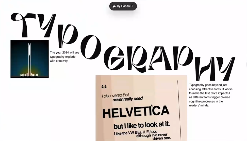
Weird typography
The use of unusual or unconventional typography can pose readability issues. While such typography might be visually interesting, it’s crucial to ensure that it doesn’t compromise the legibility of the text. The text should be easy to read and understand.
When using unique or artistic typography, it’s recommended to treat it more as a design element than as functional text. For instance, if the typography is essentially an image (due to the lack of a corresponding font,) it’s important to include alt text for accessibility.
Light and script fonts
Light and script fonts have been a long-standing trend in design. However, while they may add a decorative touch, their use should be carefully considered, especially in terms of readability. These fonts can be particularly challenging to read for users with visual impairments or dyslexia.
These types of fonts should be used sparingly and ideally reserved for large headings or decorative purposes. They should not be used for body text or any critical information that users need to read.
Great trends
Accessibility
The mention of accessibility on trend lists is a positive sign, indicating a shift in the industry towards more inclusive web design. This recognition suggests that accessibility is becoming a more integral part of the conversation around web development, which is a step in the right direction. The goal is for accessibility to become a standard practice in web design, rather than a transient or optional feature.
Adding an overlay to a website does not necessarily make it more accessible or usable. Overlays are often used as a quick fix to address accessibility issues but can sometimes fail to address the underlying problems effectively.
Including accessibility statements on websites is encouraged. These statements inform users about the accessibility features available and provide a way for them to contact the site owners if they encounter issues. This enhances transparency and accountability regarding a site’s accessibility.
Building accessibility into the web design and development process is essential. This means considering accessibility from the outset rather than as an afterthought. When designers encounter clients who insist on incorporating certain design elements, they should have processes to ensure these elements are tested for accessibility and do not hinder the site’s usability.
Dark mode
Dark mode has become increasingly popular and is recognized as a beneficial trend in web design. This feature is particularly relevant in the current trend towards vibrant and bright designs, as it offers a visually comfortable alternative for users.
Implementing dark mode involves more than just inverting colors or changing white elements to black. It requires a deliberate design approach, considering how various elements, colors, and contrasts will translate in a dark environment to maintain readability and aesthetic appeal.
Deciding how to implement dark mode is crucial. Options include providing a toggle for users to switch between light and dark modes or relying on user system settings to apply dark mode automatically. The choice may depend on the specific design of the website and the target audience.
Thorough testing of dark mode designs is essential to ensure they function well across different devices and environments. This involves checking color contrasts, the readability of text, and the overall visual experience in the dark mode setting.
Dark mode is not only a stylistic preference but also a feature that can enhance user comfort and accessibility. For some users, particularly those sensitive to bright light or with certain visual impairments, dark mode can significantly improve the usability of a website.
Conclusion
Before implementing any trend, whether it’s animation, a particular layout, or typography, thorough testing is crucial. This ensures that the implementation of these trends does not negatively impact user experience or accessibility.
In addition to personal testing, getting feedback from others is valuable. Different perspectives can help identify potential issues or areas for improvement that may not be immediately obvious.
While staying up-to-date with trends is desirable, it’s important to balance this with functionality and user experience. Trends should be incorporated thoughtfully and should not detract from the primary purpose of the site.
Simply following a trend for the sake of being trendy is not advised. Instead, the focus should be on how these elements can enhance the site in a meaningful way.
Lacking a particular trend (like animation) is unlikely to significantly impact a business’s integrity or sales (e.g., affecting the sale of socks). This suggests that while trends can add value, their absence is unlikely to be a critical issue for most users.
If resources or time are limited, make trendy features a part of “phase two” of the website development. This allows for more time to be spent on thoughtful implementation and testing.
In summary, the presentation underscores the importance of a balanced, thoughtful approach to web design trends. Testing, feedback, and careful consideration of the impact on user experience are key to successfully integrating these trends. The ultimate goal is to create a website that is not only visually appealing and trendy but also functional, accessible, and user-friendly.
Transcript
>> CHRIS HINDS: Welcome to episode 059 of the Accessibility Craft Podcast, where we explore the art of creating accessible websites while trying out interesting craft beverages. This podcast is brought to you by the team at Equalize Digital, a WordPress accessibility company and the proud creators of the Accessibility Checker plugin.
This episode is a recording of a February 2024 WordPress Accessibility Meetup. In it, Danielle Zarcaro, founder of Overnight Website and Kinetic Iris, reviews current website trends we should avoid for accessibility and other reasons. WordPress Accessibility Meetups take place via Zoom webinars twice a month, and anyone can attend.
For show notes, a full transcript, and additional information about meetups, go to AccessibilityCraft.com/059.
>> AMBER HINDS: I’m excited to welcome Danielle Zarcaro back to speak with you all.
Danielle has spoken previously, and also was part of the WordPress Accessibility Day organizing team last year and this year, so I’ve gotten to know them pretty well, and really appreciate their contribution to accessibility.
Danielle partners with agencies, entrepreneurs, large and medium business owners in complementary fields to implement their marketing plans and strategies specializing in custom WordPress websites.
Along with developing websites for agencies and small businesses, Danielle has a passion for helping entrepreneurs finish their websites so they can start making money. Danielle also has an amazing website that I love that has, like, neon on it, and I noted behind you – I’m just going to say this in case anyone can’t see it – that you have, like, your neon of your logo on the wall behind you, so I feel like before you dive in – and I’m going to stop sharing and let you take that over – I want to hear how you got someone to make a neon of your logo, because that’s really cool.
>> DANIELLE ZACARO: Yes. I sort of really liked the aesthetic of neon just in general, so it wasn’t like I was, like, “Hmm, I want a neon sign, so let me make my branding neon.” It was definitely, like, “I really like this.” And my fiancée is a graphic designer, and so she was the one who sort of put the whole brand together. It was really nice, and I was, like, “How can I not make this into a neon sign?”
There’s places online that you can get custom ones done, and it’s not like real neon. It’s like little plastic, sort of like tubing. I have a fancy one that adjusts the brightness of it and everything, and so it’s pretty cool because I can turn all the lights out and sort of have this really nice bright neon. Or I can have it really bright, turn it nice and bright behind me.
It’s is difficult to light, though, because I have to adjust the different lighting around me so that I’m still visible while the neon is still visible. But yes, there’s places online that you can go and get one made. It’s on the expensive side because you’re not getting just a random word that somebody put together for you. It is custom. But I was, like, “I can’t not have it.”
>> AMBER: Yes. I love it, so it’s like a moon and a circle?
>> DANIELLE: Yes, yes, so it’s the “O” for the Overnight Website, and then it has that moon around it. Yes.
>> AMBER: Cool. Well, we are very excited to have you here. I’m going to let you share your screen.
For everyone who is watching, if you have questions, if you can put those in the Q&A panel, then we will address those at the end.
>> DANIELLE: Yes, so I’m just sharing the whole screen because I took some screen recordings earlier. I do have my whole desktop as the Overnight Website logo as well. I just love it so much. [laughs]
Anyway, I’ll go ahead and start presenting now. It’d be helpful if I started from the first slide. There we go.
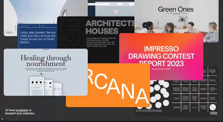
So we’re talking about trends to avoid in 2024, and I set out on a quest to read as many roundups as I could. There’s quite a few, some of them are more design focused, some of them are print based or advertising based. But there seems to be a consensus between a lot of them, and so I tried to distill that down into the main trends that we’re seeing, and so some of the aspects of them are better avoided, and some of them, as we’ll go over, can be done with a little bit of care, and so we’ll dive into these.
I think sometimes trends are like fashion, right? You have these runways and fashion shows and things, and they’re these outrageous, crazy things that people are wearing that are not practical. You’re not going to see somebody walking down the street wearing them, but it’s then distilled down into sort of the general trends that are meant for overall consumption by us as the general public. But I think because things have gotten easier and easier to implement, there’s not as much distilling going on, and the platforms that we’re all using to build our websites are making it easier and easier to do these things, which means that we have to use even more critical-thinking skills when we go to implement these, because just because we can do something doesn’t mean we should.
Now, I’ve used this slide before in a previous presentation I had, but it just fits so well. It says, “Your scientists were so preoccupied with whether or not they could, they didn’t stop to think if they should.” And that is by Dr. Ian Malcolm from “Jurassic Park.” It’s just so applicable to everything that we do. We just have to put a lot of thought into what we’re doing, and just because we can, does that mean we should? I think if you can answer that question honestly with a yes, then you can go about implementing things in a nice, accessible, easy-to-use way.
So if we jump right in to the main theme of 2024, that would be animation, and that’s what sort of prompted my need to dive deeper into this, because I started seeing more and more of these, like, marquees. I was, like, “Wait, we stopped this. Marquees deprecated. Why is this happening? Why are we here? We’re back to Marquees, really?” And even though the HTML tag of a marquee is not in use anymore or not supported, it seems that a lot of the platforms feel that this is something that is fun and should be used, and can be implemented so easily on so many sites.
So I ended up doing this YouTube video on trends that should be avoided, which is what, again, started this whole thing. But, yes, I’m seeing a lot of marquees, and that then made it make even more sense when I read into some of these roundups about how retro and Y2K and all of these sort of nostalgic aesthetic that was coming back. Well, OK, so that makes a little bit more sense, I guess.
So these are the two trends that are coming together that I’m seeing more and more of, and that these roundups seem to be mentioning a lot, and the retro thing is sort of showing up in a lot of different ways. They’re calling it Y2K. They’re calling it, like, modern brutalism. There’s all kinds of old trends that are coming back that people are giving creative names for, and so I think it’s important to look at these two things together because they’re informing each other about how they’re being used, and it’s almost like we’re taking things that were retro and (making it) slightly problematic in terms of accessibility and being able to use the site, and then making it even more complex by adding an animation to it.
So if we dive into our animation summary overall trend, like I said, it’s so easy to add animation to sites now. We have page builders, plugins. All kinds of platforms, even outside of WordPress, just make it so easy to do these things, and it makes it more likely that people are going to add things to the site. “Oh, you can do this and it fades in? That’s fun.”
I don’t know what generation everybody’s a part of. I don’t know if they still do this now, but when I was growing up as a millennial, it was, “Oh, we can have slideshows that have spinning animations, and sounds come in, and things blow up, and all kinds of stuff happening?” And it was, like, “How many things can I shove into this five-minute presentation on, you know, microorganisms?” Or whatever in biology class.
So if you think about somebody getting their hands on the Microsoft PowerPoint for the first time, seeing all these things you can do and shoving it all in there, that’s what starts to happen with some of these sites, because it’s fun, right? I’m putting the site together and I get to do all these things that I wouldn’t be able to do without it. But when you think about people who are actually using the site, is it just as fun for them to use a site that is flying all over the place?
When you grew up a little bit and realized that, “I need to put together this presentation for my weekly meeting with my coworkers. Am I still throwing in all of these random animations?” So it’s just when you grow up a little bit and start to use a little bit of critical thinking about these things. It’s fun to add, but is it really necessary? Is it actually bringing things to the table?
A lot of places that are doing these trend roundups tends to talk about how great they are. That’s just sort of the vibe that they take with it, and so they talk about time on site, and it makes it more engaging, and I still am yet to find any actual evidence that that’s the case. I am super open to being proven wrong, and I’d love for somebody to bring me some kind of evidence that these fade ins and scroll journeys that you’d get taken on and all these things that are happening on these sites, do they really actually make people more engaged? Or do they just sit on the page because they have to wait for your words to load? Most of the time, I just leave. I just can’t take it, so I’d be really curious to have more data on this stuff.
As we know, flashing and blinking should be avoided for all kinds of reasons. But the animations that can be distracting or annoying or trigger motion sensitivity, things that when you’re scrolling on a phone, that’s a different experience than when you’re on a desktop computer that’s a foot away from your head, and not on this tiny screen, any of that stuff should really be well considered and should be well thought out with some kind of reasoning behind it, right?
So the slides that I’m using on here have a really subtle animation between the slides. I think that eases you into this really giant, you know, if you’re watching this full screen, to have a really abrupt switch. Maybe that’s a little jarring, so I have this really subtle animation. That’s something that could be useful, and you can at least argue that it’s doing something.
So if we head into a little bit of a list here, we have, in terms of animation, what are we talking about? I mentioned marquees. You have horizontal and vertical. I’ve seen the marquees that scroll up and down on a site that are sort of automatically scrolling, especially ones that have links inside of them, where you’re trying to hover at exactly the right time or follow along and click on stuff, and then it pauses when you hover over it. It’s just so complex, and is it worth it to make it move?
Then you have those JavaScript things that’ll type out words or switch them out. I am guilty of that on, I think it was maybe my first website that I built custom. I thought it was the coolest thing because it’s like I’m typing it out and talking to you. But, again, that’s the perpetual motion idea that, you know, is it really bringing something to the table, or is it just confusing things and muddying your message?
Scroll-based animations, as I said. You have those things where you’re telling a story with it, or you have things that are in the background. It’s like sort of this parallax. Again, we’re mixing that retro with this animation. It’s like a resurgence of parallax, and then we have scroll-based animations. Really excessive or unnecessary hover effects that are happening that can be really disorienting, and then, again, splash pages are coming back too.
It’s one thing if it’s a web-based program, like a progressive web app that you have, where you’re actually loading a ton of stuff, and you have to have somebody pause to load some stuff before they can do something. But I’ve seen sites that on every page of their site, they have the splash page and it stays there for the same amount of time. Now, I know that it’s not going to take that long to load what you have on that page. There’s just no way, and so it’s just this really easy-to-implement splash page that somebody’s added to every single page of their site for really no practical reason.
Then again, as I’m mentioning these retro things, these are things that we thought we left behind, things that I sort of celebrated at the time, and then you’re, like, “Oh, yes, the world is cyclical, and trends come back.” And so these are all things that are really hard to turn off, based on existing user preferences.
A marquee, you can turn it off, you can respect all that stuff, but, like, words are going to get cut off. Or I’ve seen sites that sort of jump around because they’re just not well implemented.
The animation part of this seems to be the main way that these retro trends become new, as well as just sort of replicating that look and feel. That animation seems to be the way we’re updating these things, so it’s no longer just this really simple GIF that’s blinking or making lightning or things. It’s just this really complex animation that we’re adding on to these retro feelings.
I find the layouts to be very unintuitive. They tend to have really hard-to-see text over something that’s really busy. Almost every retro site that I tested has a pretty deep lack of screen-reader support, some of that is going to be the biggest issue, so some of that can be mitigated by providing an equivalent experience. But just as with the return of the marquee, anything retro needs to be seen through that accessibility lens, so we have… [crosstalk ] Yes.
>> AMBER: You might be going to do this, but I just wanted to [inaudible]. There’s a couple of people that were wondering if you had visual examples of some of the animations, because they couldn’t quite picture what you were saying, and I don’t know if you had something to show.
>> DANIELLE: Totally.
>> AMBER: In just a little bit?
>> DANIELLE: Yes, yes. I wanted to go over some of the concepts first, and I know it’s a lot upfront, but I will re-mention a lot of this as I go over the examples, so you don’t have to remember all this to recall it necessarily, but I want to just introduce the concepts so that you at least are familiar with them, so we will totally, after this slide actually, go over some of the few examples for it.
>> AMBER: Great. Thanks so much, sorry to interrupt.
>> DANIELLE: Yes, no problem, so some of those retro Y2K things. Auto-playing videos, for a while there. I don’t know if this is technically a retro thing or if it’s just an animation thing, but for a while there, we sort of had auto-playing videos everywhere, and I thought that we had kind of moved away from that, but it’s coming back, as well as now this new thing about having these paused videos. It’s basically just a thumbnail, but it’s this moving thumbnail. I guess that it’s to draw your attention to play it, but, again, those are really hard to pause because it’s not a video, so you have to put in a specific query to do that, so it’s just these really complex things that you’re having to do.
Again, that bright, bold, vibrant colors, and patterns, and shapes, you have to use them smartly, and you have to make sure that just because something passes a color contrast test doesn’t mean it’s pleasant to look at. You have these really bright colors that you need to provide an alternate experience for, because sometimes I just can’t look at it, and so I need something that’s not just a dark mode, but like a tone-it-down mode, so yes, you have these bright, bold colors.
Again, I mentioned that parallax scrolling, but now we have moving parts, somebody called it an atmospheric scroll, so again, we’re creating new names for things that were once old trends. We’re just giving them new names and calling them retro.
I’ve also heard animation stimulation and loop scrolling, so all of these things are all just fancy names for things that we’ve already seen, somebody used the phrase, “Extravagant loading screens.” Again, that’s those splash pages. But they’re no longer just this animated logo or a quick little load bar. There’s just so many moving elements.
I’m sort of a situational reduced-motion user. I’ll turn that on and off as I need it. But I haven’t even gotten your site yet to determine if I need to turn it off and you’re already sort of assaulting my eyes and my brain, and the way that the sites handle that, a lot of times, like, a screen reader will start reading the site before it’s even done with the loading screen, so I’m not getting that same experience. Is that OK? Is that not OK? I don’t know. It’s just a lot that needs to go into these testings.
Again, what do we have now? Changing the cursor. But we’re not just changing the cursor to some cute, little picture of Bumblebee or something. We’ve now changed the cursor to try to be helpful, to indicate that you can scroll through something or drag something around or be pretty and fancy. Kind of like when you would move your cursor around and it would have those sparkles that would follow it. We’re sort of doing this “changing the cursor” on this whole new level.
So with all of these examples and all of these things, we’re going to go into some practical examples. I want to preface this by saying these all have motion. If that’s something that bothers you, I would look away, and I will say when we’re done with these examples so that you can head back into the slideshow with us. But these are all things that I did beforehand so that I can describe to you what’s going on with them and what’s the issue with them.
>> STEVE JONES: This episode of Accessibility Craft is sponsored by Equalize Digital Accessibility Checker, the WordPress plugin that helps you find accessibility problems before you hit publish.
A WordPress native tool, Accessibility Checker provides reports directly on the post edit screen. Reports are comprehensive enough for an accessibility professional or developer, but easy enough for a content creator to understand.
Accessibility Checker is an ideal tool to audit existing WordPress websites find, accessibility problems during new builds, or monitor accessibility and remind content creators of accessibility best practices on an ongoing basis. Scans run on your server, so there are no per page fees or external API connections. GDPR and privacy compliant, real time accessibility scanning.
Scan unlimited posts and pages with Accessibility Checker free. Upgrade to a paid version of Accessibility Checker to scan custom post types and password protected sites, view site wide open issue reports and more.
Download Accessibility Checker free today at equalizedigital.com/accessibility-checker. Use coupon code accessibilitycraft to save 10% on any paid plan.
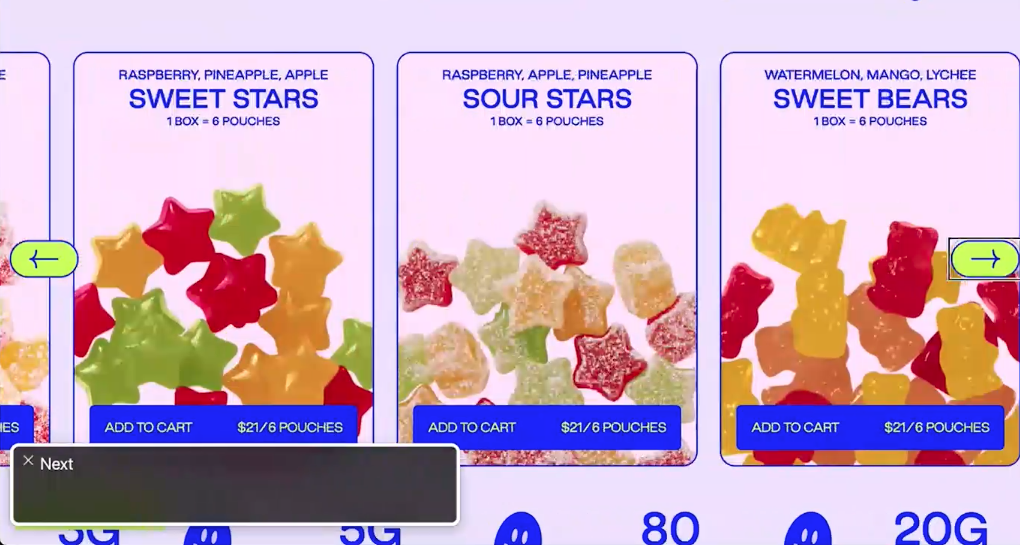
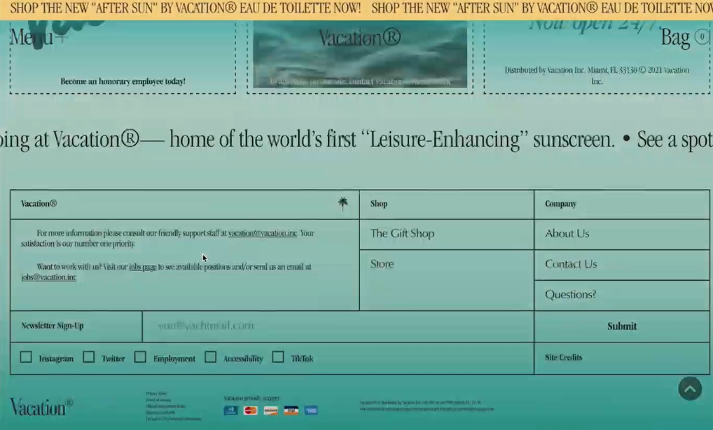
>> DANIELLE: So the first one up that we have here is a marquee. One thing I did notice with a lot of these sites is, oh, yes, they have a skip-to-content link, but it doesn’t actually work.
So first, we’re on this site, which I think it’s called Behave [phonetic], and we’ve reached this slider that doesn’t totally work. You can go to the next arrow, but then you have to go back to be able to see the stuff on the slide.
Animation isn’t just the only dynamic thing that’s a trend. Obviously, we’ve had these sliders. They don’t seem to be going anywhere, so I don’t know if that can be considered a trend for 2024, but consider if you actually need it. It just complicates things.
Anyway, so we’re heading down this page, we’re going down because, again, I was on a piece of the site and it brought me back to the top, so we’ve finally reached our marquee and we’re going through the elements, but I don’t see my focus anywhere. OK, so I’m going to keep going. I’m going to keep going.
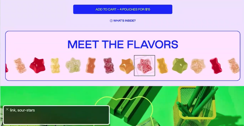
Every so often, one of these little gummy flavors jumps out at you, so I’m, like, “Is that where my cursor is?” Oh, no. Here we go. I’ve made it to what I’m assuming is the middle of the marquee, and it’s just going through… I can’t even see if I’ve done this one yet because the marquee isn’t taking into consideration repeated elements, and so I’m totally stuck on this marquee.
Am I ever going to get past it? Yes, there are shortcuts to be able to go to a different element on the page, right? We have, like, “skip to the next heading,” “skip to the next link.” We have all these things, but if I’m, like, OK, maybe I like this heading, “Meet the flavors” totally. What flavors do you have? And now I’m stuck in this marquee that is just repeating elements, and that’s one of the most common issues that I’ve seen with the marquee.
Although, if you notice, as I’m going through those elements, it’s still scrolling, so there’s tons of considerations that you have to take into account when you have these marquees, and just because it is something that maybe isn’t as integral to the site and maybe it’s like a decorative element or it’s something that is just fancy that you’re scrolling across the screen, you still have it on the screen for a reason, so you have to provide some kind of alternative thing, and at that point, would it just be easier and more user-friendly if I just had a grid of those flavors, and then when you’ve hovered over it, maybe it zoomed in at you?
I don’t think it needs that shake. I’ve never been a fan of that little shake thing that it does to draw your attention to something. I find that really distracting, and I’m, like, “But I’m over here reading about this little red gummy bear. Why are you shaking this green star at me?” So you have to consider all of the angles of these marquees, and then not only that, but it’s scrolling. There’s just so much going on.
So that’s an example of the screen reader having a ton of trouble with a marquee. But also, just me as a person just having trouble with this marquee. There is no way that I am looking at that going, “Oh, yes, that totally makes me want to explore all these things.”
I’m someone that has OCD, and so when I look at this, I want to make sure that I get all the flavors. How many do we have? So now I have to sit here and try to figure out, “OK, so there’s the red gummy bear, and the red gummy bear, and then the orange one comes after the orange one.”
There’s this stuff that my brain does without me intending it to that I just, in order to conserve brain energy, I’m just scrolling past that. I’m like, “Give me a page that has a list of flavors or something.” So again, that’s one of the more functional marquee elements, sometimes it’s just this scrolling sentence that we’ll see as well, which, again, I don’t think has any value, and I find it really distracting.
I did sort of a really informal poll with not very many respondents, where I had one person say that they liked them out of probably a dozen, so again, very small sample size, so I think we need to do more research on these things before we just start using them because somebody said that they’re neat.
So we have another one. This is sort of a hero area with these two icons that are just constantly moving around. One is behind the text, and one is in front of the text. Are those things that I’m supposed to try to click on? “Is that going to take me to a page? Or should I just read this and scroll on?” “OK, I’m having a really hard time focusing on what you’re saying because these things are moving.”
So again, it’s these things that people implement because it seems really fun, right? You’re like, “Oh, cool, so we’re fun and passionate, and we have this fun purple background, and let’s show everyone how fun we are.” OK, but people still have to use the site, so that’s another animation side of things, that perpetual motion, that is just really problematic.
This is an example of a website that is typing out words. Now, not only is this typing out words, it’s typing up multiple lines of words that is pushing the screen down. Now, if you’re lower on the screen, is that going to push down everything up and down as you’re reading it? Or is it accounting for that in this area? There’s about three or four different problems I can see with this without even having to scroll down the page, and I have to not only read this, but I have to read this fast enough to be able to see it before it disappears, so that’s just all kinds of cognitive speed.
I don’t want to have to work to read the content on your website. We’re already only scanning the content of websites anyway, so you want to make it really easy for people to do things, and a lot of times, these animations will end up delaying that.
This next example is a load animation, but also on scroll, so these scroll animations tend to need to be scrolled at a certain speed in order to see all of the content before you scroll away, if you know what I mean? So this one has a marquee that I didn’t even see because I just scrolled. I’m trying to just read your products, so we load on the page here. It’s starts loading in boxes. We scroll right past a marquee that I just don’t have time to sit here and read, and then we have, like, boxes that are fading in, and as long as I pause, the background color will come in and I can see the content. There’s all these conditions that I have to do in order to properly use your site.
Here’s another site that may be one that does it slightly better. You can’t really tell here, but it did hijack my scroll speed a bit because however it’s implementing its animation, it’s also decided to scroll me slower, which I don’t enjoy. [chuckles]
So we’re scrolling down and they have this box here with words in a weird loopy line that I can’t read once it goes over this image that’s in the box, but it’s moving at the speed at which I’m scrolling. They also have sliders and accordion, and I had to scroll up to even see what was working. The arrow didn’t get grayed out, so it’s not, you know, an infinite rotating slider. We’ve scrolled down now, and at the very specific spot that I had stopped it, there was an icon with an image that was over the text.
This is all just complicating people being able to use your site all in the name of, like, “This is fun and exciting”? I guess. With all of these, you’re sort of missing out on the fun playfulness of this site and the vibe and the brand because you’re making it harder to use. All of these icons and stuff, that was another one that was brought up, the use of of illustrations and icons and scrapbook-type feel for things. But you have to do it in a way that people are going to want to read your stuff.
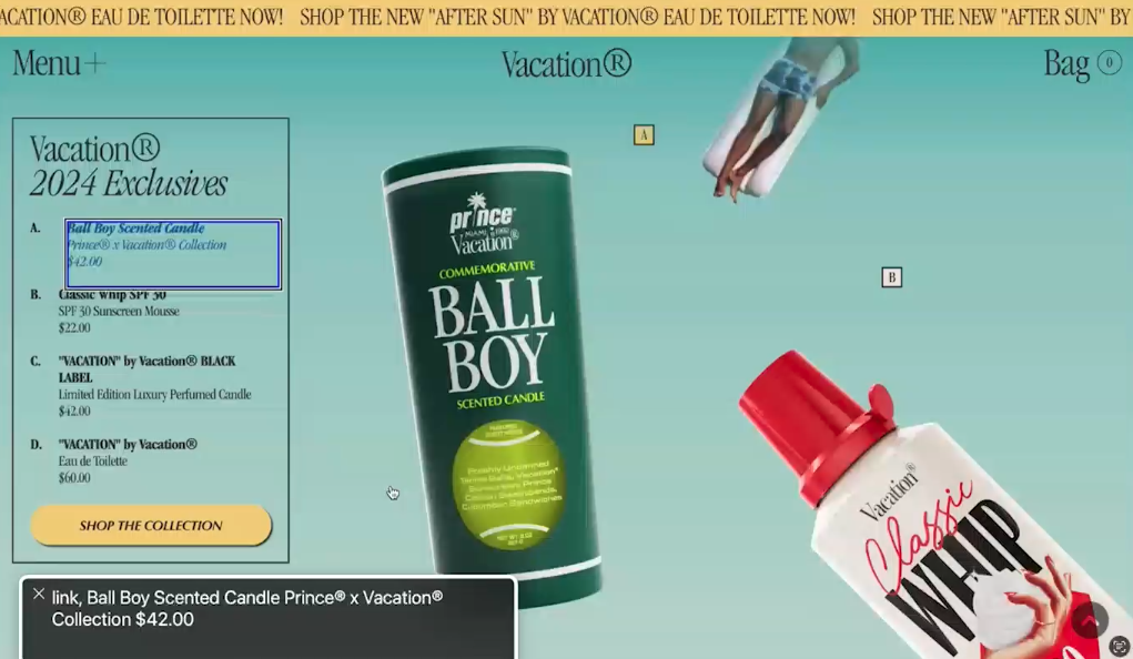
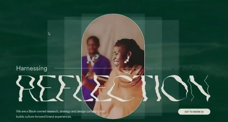
This next one is a really common pattern. It’s got a video playing in the back of the header hero area, and then it’s got words on top of it. It’s going for the retro vibe.
Now, the really disappointing thing is this really could be a great retro vibe, right? We’ve updated it with a more updated layout. It doesn’t look all shoved into this tiny screen. It’s updated the vibe of the retro-ness of it. It feels retro, but new. But it’s got this stuck marquee at the top. It’s got this video in the background, and it’s very busy, and now you have a second marquee that’s now competing with the top one, maybe?
So if we go back and turn on the screen reader and I try to go through this, a lot of it just doesn’t translate well because of the layout. Obviously, the items that I’m going through using the screen reader indicate that they’re using some kind of overlay, which is obviously hindering things, and it’s sort of a proof of concept of, just because you have this overlay does not mean that the site is accessible in any way.
All of these stars for their rating have image, there’s no alt text, or it’s not hidden. This is just, like, “figure one, figure two, figure three.” Well, what are you talking about? “Person in swimsuit.” So now we’re going on these weird, tipped things.
So when I hover, it indicates on the left the one in the key that I’ve clicked on, so I’m hovering over this scented candle, and then the little key part of my screen is changing its color and its tab to indicate that that’s what I’m hovering over. But you’re not showing me that. I have to go through these images and then go through this key. Nothing is aligning with each other.
I found this to be kind of a really awkward experience in the screen reader. Again, they have this marquee thing that wasn’t scrolling on its own, and so it’s skipping over some of those logos. It started off screen, so I didn’t know where I was. Again, with this figure thing. There’s just this really cool retro vibe that could have been good, and some of this stuff really actually probably could be fixed, too, but you’d really have to take into consideration that experience of those things, and we’re going to go into one of the layout issues in a quick minute.
This is a quick example of Squarespace having that thumbnail that’s moving on its own, but I have no way of pausing that, and if I click on it, maybe that’ll pause it. It just takes me to that page, and it’s got things that are scrolling inside of it, so the ultimate thing here is that thumbnail that I have no way of pausing and obviously doesn’t respect my reduced motion settings. But what if I’m just a person that doesn’t want to be distracted by this thing?
We have four more quick animation examples. This is just a quick parallax example, where you have bubbles scrolling, but then the.., so this is very retro in that it looks almost exactly like those old parallax things that we got rid of for a reason. People were just scrolling through because it was fun to scroll through, and they’re not retaining or looking at anything that you’re actually doing with your content or your calls to action on the site.
This one here is the load screen. It’s taking forever. They have this logo that cycles through twice on every page no matter what, and then you have these colors that fold in, and then an animation at the top, and then when you scroll, this logo does all kinds of animation things, and you can’t get past it. There’s no way to get past it, and now we’re on a screen where all of the things are all animating at the same time, and then we finally get to a place where I can not look at that anymore. Oh, but look, when I hover over it, it moves, and my cursor changes, too.
So this one probably should have been a showcase thing that we don’t actually implement on a site that we’re intending people to use with any kind of full intention.
This one is an example of the cursor changing, so sometimes I’ll read and use my cursor to follow along what I’m doing, especially when the text is small or big like that. It’s got this weird string thing that’s following my cursor around, so I can’t use my cursor to read the words without having this thing follow me, and I find that really distracting, and then they have this cursor thing that is attempting to help me, but it’s got these sort of indistinguishable icons, so do I click? Do I drag? I don’t understand, and then it tells you to click on… Well, yes, I’d hope so. It’s a cursor. It already tells me when to click on something.
So again, it’s got color issues, and it has this thing that you drag, which is fun and nice, but is there a purpose to that? Or is it just a fun thing that you threw in that people can’t always use? I don’t quite understand why these things are there.
Our last one is animation load scroll, with another thing that does icons, so it’s got all these icons that all load independently and it all shakes around and does whatever, and then they move when I scroll, and then the rest of the site.
Oh, wait, I scrolled too fast and I missed all of that words that were just there, and now these icons are here.
If I use a screen reader to try to go through this, I don’t know if this one does it. Let’s see. It might go through each one of the icons. OK, so rather than provide an alternative thing or, like… What is the purpose of these icons? What are you trying to convey with that? There’s something that a visual user has this whole hero area to look at. But I’m just skipping right past it as a screen-reader user.
I’ve also seen the opposite of that, where people are just going “image, image, image,” and they have to go through every single image that’s in there, so these scrapbook icon things that have these scroll, it all makes it really complicated.
I’m talking about all these things, right? So if we go back to our slideshow here.., and you can rejoin us if animation is an issue for you, so we’re avoiding that, right?
Now, what if we want to include some of that? We want a retro vibe. We want some animation. How do we do that? OK, well, let’s just think a little deeper about it. Why? Give a good reason why you’re adding something like that to the site. What can you pull from those things and make these types of designs modern, improve upon them, make them more accessible? How can you include these sensible, unobtrusive animations and micro interactions that are actually guiding your user, that are helping them, that is making it more pleasant for them, rather than throwing up all of these roadblocks and giving them just tons of issues? Those retro things are super fun to look at, but what’s going to keep somebody there?
I get that you’re going for branding and that’s nice. But if everything else that you’re doing is just making it more complicated, that’s not helping your ultimate goal of getting people to buy products. I get that you want it to look like an old catalog, but how can you make that experience more engaging? So what do you do about it? Well, just try harder, I guess? But not that you’re not trying hard, but that you need to put way more thought into these things, and have version one be a static version of these things without the animation, without the things that are causing problems.
Then add the things in one at a time. If you wanted to animate this thing or create this grid or do this thing, add it at one at a time. Do extensive testing. That’s what is going to be the key here. When you consider if it’s necessary or adds to the experience, like, those loading animations or falling objects, you absolutely respect user preferences and do extensive testing with preferences on and off, as well as finding people to use the site, both people with disabilities and people without disabilities, because people who don’t say that they have disabilities may still have different needs.
Somebody who has ADHD maybe might not consider themselves disabled, but when they’re using a site, they’re going to get distracted by all your stuff, right? Or if it’s just somebody who’s sleepy or who’s in the sun or who’s doing all of these things, and they’re scrolling on a phone and it’s just disorienting, and so you do some user testing as well.
Then just as a call out for this excessive motion stuff, I think it’s really important to consider what the most important thing is to toggle on and off.
I have one where I have these animations on my site, and I do plan on adding in some gradient motion and sort of other things, and I want people to be able to turn that off, whether they want their entire computer to stop the excessive motion or not. There are certain things that I like about having my motion on, on my computer switching between apps, switching between windows, and when I turn that setting to reduce motion on, that then makes everything less feedback-y on my computer itself, and so I want the option to be able to stop the motion on a website that is doing too much motion.
So that’s an option to think about, at least. Think about if it’s too much color and you have a ton of really just vibrant, abrasive colors. Maybe you turn on a different color setting on your header. You don’t want these accessibility widgets, but you do want to give your user the option if you’re going all in on one of these things.
So really quickly, we’re going to just motor through some of these trends to be careful of. They’re not quite trends to avoid. Those are our two main focuses for 2024. We’re going to see that retro vibe with that animation, and it’s going to go nuts.
Some things to be careful of. Bento grids is sort of an unsuspecting thing that will have an issue. It’s basically a grid of a bunch of rounded-corner boxes, and it seems to have minimal content within those boxes, so the issues here are you have to make sure you have proper markup. Should things be in a list? Should it just be text? How many headings should there be? How many images? Is it an image with a video playing in it?
You have to think about that content hierarchy, and then one of those “got you’s” is that, you know, card-based layout kind of thing just amplified, because everything’s in these bento grid boxes, so if you’re trying to link an entire box, you have to consider that pattern of having a link inside, and then using it as a wrapper link rather than wrapping the whole thing inside of a link, and then keeping your eye on that text over image contrast, and then test the site to make sure that the page works and makes sense.
So we’re going to go out really quickly and take a look, so again, another example video. This one doesn’t quite have a ton of animation, so it shouldn’t be as much of an issue. But it’s got that retro vibe of really, really, really, really bright colors and that bento box thing, and so you have to have, again, another overlay. But you have to have consideration for the way that the content gets read out in these things, so just because it’s in an individual box doesn’t mean that, “Oh, well, I guess if it gets read out or it doesn’t, it’s no big deal.” You really have to pay attention.
I think one of the big issues with these types of layouts is a lot of times they’re being done on platforms that are, like, drag and drop kind of things where you can drag things around the page, so a lot of the sort of bento box design sites that I loaded have issues with the order of content, because it’s almost like when you add an element to the page, the site builder or page builder or whatever you’re using is specifically setting some kind of Z index to it, almost, and/or tab index, and then if you were, like, “OK, I added this, but actually, I want to move this one over here, and move this one over here,” because they’re in a grid, it seems like it should be easy to move around. But then that totally messes up with the tab order because of the way that those page builders are setting up this code. Whereas if you had a page that was not having to use that grid, it doesn’t seem to set that tab index.
So there’s just something to be really careful of when you’re doing these grids, where if you’re adding them, just tab through the site. Make sure that if you have the links, they’re in the right order. The headings are all going to need to be in the right order.
Here’s another bento one that does a scroll marquee as well. If you scroll down the page, we have these scroll animations that are happening, and then there’s this weird thing with a click, but it’s not an actual click, because when I tried to do it with the screen reader, or I tried to tab through it, it didn’t go to it, because they must be doing some kind of click interaction that’s not normal.
Then you have this really dizzy and, like, triple marquee that are all going in different directions. I can’t read any of that. What is that bringing to this page other than making my eyes hurt?
So I’m obviously really critical. You’re not going to find people that are this critical, obviously.
So there’s a lot of little videos. It’s a bento box design that could be done really well. But eventually, when we go to test it with a screen reader, it’s reading these marquees, and it’s repeating the same sentence three or four times, and because they’ve then repeated that twice, it’s reading that again three or four times, and it’s not reading it in the correct order because they’ve added it in a different order.
Then if we go on some of these other boxes, it’s, like, going to the bottom and then the top, and here I am trying to be, like, “How do I click on this?” I guess I can’t click on this. OK, so if we try to move on… It’s just really confusing to use. Not every screen-reader user is a blind user, so I sometimes need to prioritize the order in which I’m doing things so I can follow along with the page, right? So that’s just really something to be careful of.
By the way, not every bento grid layout is going to end up with these problems. But when you’re adding in these other trends that are happening with animation and retro and whatever else, you know… Like, this is the site, for example, that was reading through all of these little images. Every single one of these little icons all got read out as image for no reason, so where you find one issue, you tend to find a lot more.
So if we go into another item here to be careful of: weird typography. We saw some of that with the last bento one I just did, with that “click here.” You still have to be able to read it. It’s kind of like those script fonts. Again, we have these light and script fonts. This is a trend that seems to have never left, so I don’t know if technically it can be considered a trend in 2024 if it’s just here to stay. But just think about it. Be really careful about what you’re doing.
So again, weird typography, just use it smartly. Consider it a design element, and not text, right? If it’s an image that you’re adding because there’s no font to render really, make sure you’re adding that alt text for it, and then for those light scripts and fonts, again, it should really be sparingly, and only on large headings. It should just be decorative and an accent, and not something that I’m required to read.
So if we go through our last couple of examples here, we have this one that I think was more of a showcase, like I said, those trends-like fashion. I think this site is kind of meant to be that way. But if you just think about it, we have this load screen, which I think it only shows on the first time you go there, so at least when I go between pages, it doesn’t show up. But you have this weird thing happening with my cursor, and then you have these things, like, bugs that are crawling underneath the cursor.
If you think about why I’m coming to this site, I’ve probably got a pest problem. [chuckles] I don’t want to go through all these things. This is fun, but that color change between them, again, with that really bright colors, those graphic interfaces that are behind it, with those icons and things, and then when you use a screen reader on these items that we’re hovering over, it reads it twice because of the way that it’s been implemented. This needs a less vibrant alternative to it, and there really isn’t one, so when you try to use the screen reader, you can do it, but it’s tough, and then you have these weird bugs and stuff.
So this section here, each one of these words sort of faded in slightly after each other so it stacked the text in, one word after another, and each of these are in span.
Again, really quickly, there are probably more efficient ways to use a screen reader. I’m not a native screen-reader user, but it reads each one of these words separately because they’re all in their own individual elements, and so I have to tab through each and every single one of these words all for the sake of animation.
I think this might have been more of a showcase site. It is a live site that you’re able to go to. I don’t know if these are real people. They have a phone numbers and an email addresses. But I’m dealing with bugs, right? I’ve got bugs in my house. What’s your phone number, right? So you have to ultimately go back to that, you know “Why do you have a website?” “What does somebody need when they get here? And how can we give that to them?”
Let’s see what else we have. I think we have three more. This is another page load screen. We’ve got a little bit of contrast issues, and then that typography thing, so it’s got this really just excessive screen read.
Now, this is more of a showcase for design trends. As I was researching Design trends for 2024, I came across this site that is actually sort of embodying all of the trends for 2024. Again, I don’t feel like sitting here waiting for all those words to fill in.
AI actually was a popular trend, but that could go either way. That’s a whole separate discussion.
So it’s got these backgrounds that are fading in. It’s got this weird typography thing that’s spinning in. It’s this is really long, scrolling page, so if I wanted to try to get to another section, I’m going to have to scroll forever, so yes, it’s just an example of, like, it’s sort of embodying its own trends, which is kind of interesting. But because it has this animation and stuff, I can’t highlight over text to read it, sometimes I do that to help me read, so it’s just all these things to take into consideration.
One more bento box with typography animation and a cursor situation, so it’s got this page load thing, which isn’t terrible, but still kind of long. Then we have this weird reflection happening in the background that I can’t pause. That’s, again, a trend, but it’s been around for a while, so I don’t know if that’s a 2024 thing, but I’d love the trend to be in the opposite direction.
Aside from that, it’s really not too bad that you have this bento box. Ultimately, it’s just a grid, so I think we’re going to see different iterations of that.
If we go back a little bit. we see something like two columns of stuff outlined, right? So that’s, like, really minimal bento box. I don’t know if that’s what it’s considered. I’m a developer, not a designer. But the thing with this is, the buttons that say “view article,” even if for a screen reader, they were more specific, you still have to go through each and every one of these things to then view the article, and it’s kind of long, and you just got to think through what people are trying to do with these sites, and then this is the marquee with the logos that also wasn’t super friendly.
So this is an example on this site that I’m still on. I refreshed it with the screen reader on, and this is the one where it’s reading the page before the loading screen is done, and so it’s reading through these images, and I’m, like, “What is it reading? I don’t understand.” And so again, they have this text that says “reflection” that you can barely read that’s an image, but it’s repeated, right? So it’s harnessing the power of reflection, and then it’s like fancy reflection, so just hide that. You already have the word “reflection.” So if you are going to do these things, you just have to really take a lot of care in what you’re doing.
Then again, they have this weird stacking image animation on it, but when I use the screen reader, it, like, smushed the page over for me to go read the image over here, and then I’m over here. Oh, but we’re reading through content that I can’t see on the page because you have this animation, so what was happening on the page when I was scrolling through it is, I would scroll, and the content and image would scrolling from different directions. But because we’re using a screen reader and not a mouse, it’s reading through the information on those slides without me being able to see it.
So at least it’s not hiding the content from a screen reader, but it’s also kind of a little disorienting if I’m a visual user just using a screen reader, so the animation just makes things so much more complex to implement, and when you have these logos that scroll across the screen like this, if I just stay on one, it’s scrolling away. That’s just so frustrating to me.
Before we get to our last one here, I just want to say that I don’t like putting people or platforms or whatever in a negative light for any reason. I’m a big believer in, whatever the tool is that’s going to get the job done is the right tool to use. But I find the biggest implementer of these trends to be Showit. Now, this is the homepage of Showit, and they had all the issues, right?
They have this scrolling marquee that’s just so slow. Am I supposed to sit here and read all these? OK, so maybe it’s just design. I’ll just keep going. They have this other animation that.., and, no, I’m not scrolling any weird way. It’s just sort of jolting over, like, it’s not implementing it, and you have these names where the ones that we’re not looking at are grayed out. But then I can hover over them, but I still can’t kind of see them. OK, fine. OK, so it has an auto-play video.
I don’t care that this video is 10 seconds. It’s still auto playing a video. I don’t want it, and then we have a little bit of contrast issues.
Some of these things are really minor, right? But then when I tried with the screen reader… Obviously, with a platform like Showit, where you basically put something on the page, click and drag it around, that’s where you get the most issues with tab order, and so that happened a lot with this site when I tried to use the screen reader with it.
Again, when you have these little icons in here, you have to know to hide them, so when you make things easier, you’re making things more complex for the person to implement them, so Showit makes it super easy to implement these these scrolling marquees. But then people are just going to put more accessibility issues on top of that. It’s just complicating matters.
Then, because you have things absolutely positioned and scrolling weird, I’m hitting things that are off the screen, and things jump around, and I don’t get it, and then you have this issue where I’m scrolling and using a screen reader, but it’s messing with the animation, and so there’s now words on top of words.
If we go a little bit more, this is their bento box section, and it basically encompasses all the issues that I had mentioned with this.
We’re on the second box. OK, now we’re at the bottom of the third box, and now we’re in the middle, and now we’re back up to the top, and now we’re over to the left, so it just jumps you all over the place, and so it’s just really hard.
It also didn’t read through all of them. There were boxes in there that had content in them that I still might want to know about that I didn’t get to reach. There were, like, videos and stuff that were auto playing that if I clicked on, it would pause it, but that still requires me to take that extra action. They have this two spots where the words are switching in and out, and this is a pretty major problem with it.
So if I just left the screen reader there and I didn’t continue, like, maybe I just like paused for one reason or another, it would switch the word. But then if I tried to then continue on the page, it would go backwards to the word that just got replaced, so this is actually toggling me between the two areas of the page that are switching out words back and forth, and so if I don’t do it fast enough to get past this, I’m stuck here, so it unsurpassed, unleashed, unprecedented, unblocked, unparalleled, untethered. How do I get at it? Like, “Oh, OK, so I just have to go fast enough.”
So it’s just all these little things that will happen when you’re throwing in animation, which, unless you know exactly what you’re doing or you know somebody who can help you out with it, there’s all kinds of issues that you’re not going to be able to anticipate because it’s so much complexity.
That’s kind of it for that.
We have two things that are great trends. I did see “accessibility” mentioned on those lists a couple of times. They didn’t go into too much detail, but as a trend, quote, I think at least we’re moving in the right direction where people are mentioning it as a trend. Hopefully it’s a trend that will just continue trending.
Again, just as some disclaimers, as far as accessibility goes, that doesn’t mean that you stick on an overlay. As we saw, that doesn’t help, and it doesn’t make sites any more usable. Add those accessibility statements. Let people have a way to contact you if they have problems. Build accessibility into your process, so that when you do these things or you come across these things or you have a client that is just adamant about adding one of these things, you can build that testing and all of those things that you need to do into your process.
It’s that progress over perfection. Hopefully, you’ve heard that before. Or if not, that’ll just kind of repeat. You don’t have to do it all right to start, but you have to at least try to incrementally get better as you go. Learn as you go. Ask questions. Always try to be getting better.
The second one that I saw mentioned was dark mode, so that’s cool. Let’s make sure we’re implementing, especially given that we have this really vibrant trend going on. It’s good that we will then have a dark mode, because some of those are just really bright, so don’t just invert it or make white things black. You have to design for it. Decide on whether you’re providing a toggle, or you’re just going to rely on user settings. Again, I think it’s going to depend on your design and your audience, and just test everything. That’s the thing here.
So these trends to avoid, how do you get around it? Well, you test everything, so if you find yourself needing or wanting to implement one of these things, it’s not that you can’t. We all want to stay up on the trends, we want to do cool things, but just test. Test it and get other people to look at it.
We can do fun and great things, but unless you are committed to making sure that you’re doing these things with extra thought and care, I don’t think it adds something to the point where if you didn’t have it, people would go, “Well, they don’t have animation on their site so I’m not going to buy their socks.” [chuckles] I just don’t think it’s something that if it were missing, someone would question your integrity as a business, right? So add it in when you have the time, make it a phase two. Really put thought into these things.
So that’s really going to be it for me today. I’d love to take any questions, or hear any comments that anyone has, any personal anecdotes, or things that you personally hate about these things, or love about them. I’m always here for competing opinions about stuff, so.
>> AMBER: Hey, that was fabulous in a scary kind of way.
[laughter]
Also, man, that Showit website, I opened it, and I was like, “I’m going to tab through it.” Oh, but first, I had to open the style sheet and give it a focus outline because it had turned off their [inaudible].
>> DANIELLE: Yes.
>> AMBER: I do not think I have ever seen worse focus order than I have seen on that site. It is so random.
>> DANIELLE: I know. I saved it for less because it really was the worst.
>> AMBER: They make me very thankful for WordPress, because I don’t know if I’ve seen focus order that bad on a WordPress website.
>> DANIELLE: I know. I know, and I anticipated that being the problem, and it was also the catalyst for this. I’m in one of the Facebook groups where there was a discussion about adding in the marquee, and people adding it, and their clients keep telling them to remove it, and then one day, someone will at least let them keep it. I’m, like, “But, no, listen to people. They don’t want it. Stop trying to add it.” So that was my reason for my first dive into these trends, and if it was a trend, or is it a Showit thing? But, no, it really is a trend. It’s everywhere.
>> AMBER: Yes. I shared a link earlier before you had done your examples, because someone had asked in the chat, “What is a marquee?” The “WomenInSoccer.org,” which you can pull it up if you want to, this is a website that is in the “WordPress.org” showcase.
>> DANIELLE: Hmm. See, that’s got a little bit of that retro thing, too, with the colors, too.
>> AMBER: Yes, it changes the mouse, just like you were talking about, right?
>> DANIELLE: Yes.
>> AMBER: And then if you scroll down, there’s a marquee there for, like, their Instagram and Twitter.
>> DANIELLE: Oh, there it is. Oh, and then I’m supposed to try to click on one of those?
[crosstalk ]
>> AMBER: It does pause if you hover over it. I haven’t tabbed through it. What I do know is that it repeats, for anyone who can’t see, “Women in Soccer US” with the Twitter icon, and “Women in Soccer” with an Instagram icon over and over and over again. There’s no pause button. But I do also know that those little icons don’t have any alt attribute at all.
>> DANIELLE: Yes.
>> AMBER: So they’re not ignored. They’re, like, “image,” and then the handle. “Image,” and then the image.
>> DANIELLE: This is an interesting one because it’s kind of like my analogy of… This one does feel like it got distilled down, and so this feels like what would get implemented on a regular basis of somebody trying to utilize the trends. Unless you have this fancy showcase thing where people are taking all the care in the world to try to craft this really masterful experience, this feels more like a regular old person making a website. This is what it’s going to come out to be.
It’s, like, “click,” but what happens if I click? Oh, and now how do I get out of here? You don’t, you just click. Now I can’t go back. I’m stuck.
>> AMBER: Yes. Clicking opened an image gallery, I guess?
>> DANIELLE: Oh, boy. Now I’m just going to refresh it because I can’t look at that.
>> AMBER: I don’t even know. I haven’t tried if there is a way to tab and get that image gallery. Or is that just not available?
>> DANIELLE: Well, something that’s really interesting. I’ve mentioned my sort of OCD, sometimes it’ll be really like innocuous. Like, it’s not detrimental. It’s not “whatever.” It’s just is a weird thing that I do. Other people might do this, too. But I’m, like, “OK, so this is a circle and that’s a circle, so I’m going to put the circle in the circle, and then now it’s spinning, so now I’m just going to leave it here.”
I’m not consuming anything on your website. I’m sticking the “circle” cursor inside the circle and watching the circle move. Yes, I’m spending a ton of time on your site, but I’m not getting anything from this website, so it’s just these little things that happen, and you’re, like, “Does the circle fit? Can I get it to fit?” Like, I just do these things where I get distracted. I don’t know what kind of neurotype or neurodivergent combination happens, but there’s these little things that happen.
>> AMBER: Yes, that’s interesting, because if that increases time on site, and they see that in their Google Analytics, they might be like, “Oh, this is really good.”
>> DANIELLE: Yes.
>> AMBER: But in reality, you’re just trying to figure out what the website will do and getting distracted by that, and you’re not actually coming and, I don’t know, learning about how you can support women in soccer, or whatever the goal of this website is.
>> DANIELLE: Yes. That’s interesting, and that being so thin, I think, is another… Yes. Anyway, so, yes.
>> AMBER: Yes. I haven’t tested it also to see how many of them there are. I thought it was really interesting when you were showing the different marquees on different places, and how it would read out, and you’re basically stuck in a loop or a keyboard trap for some amount of time. In this, you should only hear two things, but I’m sure you’re going to hear many of the two things repeated. Yes.
>> DANIELLE: Even if you have good intentions, unless the platform that you’re using to implement the marquee implements the code correctly, you don’t have any way… At least in WordPress, if you’re semi code competent or you found a good code snippet that you can paste in, you can make some minor adjustments to hide repeated things. If the platform is not giving you those tools to do that to fix the platform problem, then you’re just sort of stuck.
>> AMBER: Yes. Mary said that… For anyone who wants to.., and there is a footer credit on there for both the designer and the developer. They said that if you go to the developer’s site, it explains more about what they were thinking, maybe? I don’t know. [chuckles]
>> DANIELLE: OK. [laughs]
>> AMBER: So we just have a question, and, everyone, feel free to put questions in Q&A, and I’ll look back through the chat as well.
Simon asked: “What are some techniques to consistently update focus order to match visual reading order on some of these sites that work on drag-and-drop repositioning elements on the screen?”
>> DANIELLE: I don’t necessarily have firsthand knowledge of what the options are that they give you, but I would first look to see if they automatically have an order that maybe it adds a number somewhere in a field that you can remove, like, see what options they give you first. I would anticipate that these platforms try to make it easy for people, and so don’t provide that. Aside from contacting the platform people to tell them that it’s a problem, maybe there’s a JavaScript snippet you could find to remove tab order. You’d have to sort of inspect the code, see what’s going on. Maybe there’s a snippet you can throw into at least try to fix the problem.
I don’t really know of necessarily an easy way to do that. Basically, the goal is that you’re trying to just remove all of that tab order stuff. You don’t necessarily need to fix it. Just, like, get rid of it, so however you can do that, that’s probably going to be your best bet, aside from, like, moving platforms. [laughs]
I don’t know. There’s, there’s pros and cons on the platforms, and you have to just make that decision going into it, and you have to just spend a couple hours doing that pro, con list about what you find to be important, and what layout you’re going to do, and if that’s going to trip you up. Certain layouts might not have that tab order issue, so that might not be a problem.
I would probably try to JavaScript snippet it if it were just me.
>> AMBER: So the thing that I do see in WordPress quite a bit.., and I don’t know if you have one of those bento websites you could just put up for a second? But I would say, I have noticed people.., and maybe if we could just see one of the grades, you don’t have to play the video.
Does that one have a grid in there?
>> DANIELLE: There it is. There. It’s got a few different ones.
>> AMBER: So maybe this one, not quite as much. But there was one I saw where you had to tab all the way down the first… OK, so this one actually. This is the Starface website, so if you can just pause it right here.
When you were tabbing through this, I noticed it has the menu on the left, and then it has three columns that span full width, and where this fails is that the tab order follows the column order, which means you have to tab all the way to the bottom in the first column before you can get to the top of the second column, and it’s not doing the normal focus order, which is left to right, top to bottom.
>> DANIELLE: Yes.
>> AMBER: And I have seen this happen in WordPress websites when people are using either page builders like Elementor, or Beaver Builder, something like that, or block library plugins, or even core column blocks, and they’re not thinking about, “We have to go left to right.” And so they end up just making three columns and stacking stuff in the columns, which then means you go all the way to the bottom, right?
So to answer Simon’s question, I think one of the big techniques here is that you have to have rows, and really, if this were me, I would think of this first thing we’re seeing as one row with three columns, and then the next section that takes the full height of the screen is another row of three columns.
Now, it gets weird when you want these, like… What do they call that, masonry layouts?
>> DANIELLE: Yes.
>> AMBER: So it’s a little bit harder from a styling standpoint than if you just stick everything in one column, because when you do rows, it wants to have an even break.
I think that’s the fix that I’ve seen for these in order to force the tab order to go across the screen and not just all the way down, is you have to use rows for each thing.
Do you have other ideas on that?
>> DANIELLE: I feel like it would be something where the code itself is in the order. I feel like there used to be a masonry library that I used that would sort of just fit the boxes in, but it would fit them in logically. But it doesn’t do it in columns. It just floods them out in a logical sort of area and, like, vary the heights. I feel like something like that would be best where you’re sort of implementing… But I don’t know how you would do that page builder-wise, because somebody’s adding stuff visually, so, yes, I don’t know.
>> AMBER: Yes. That’s where I feel like there’s more problems with it, because if this was a query… Like, several of these look like products, but they’re not all products. But if you’re just, like, “Get me all the products,” then you can CSS-style them to have a masonry layout that goes across and still does that.
Although, one of the challenges that we face is now when people are starting to use these builders to build out these pages. They’ve probably manually said, “I want this product here and this product here,” that kind of thing.
These also get a little bit odd on mobile. When you make them more narrow, they don’t always stack in the order that you’d expect, and the one that you probably had at the top of the second column, because you really wanted it above the fold, is now way below stuff you had at the bottom of your page in importing.
>> DANIELLE: Yes. That’s where mobile-first would be logical. I feel like sometimes mobile-first became like a buzzword, and you’re, like, “But that doesn’t always make sense.” But in that case, having it in the order you want it in, and then seeing what you can do, JavaScript-wise, that’s probably what…
>> AMBER: Yes, the single column order.
>> DANIELLE: I don’t know. I don’t know. I feel like if I could answer that question, I’d find somebody to help me build a platform that would do that. I feel like if I had the answer to, “How do you make somebody be able to visually do something?” Maybe it’s, we’re going to try to JavaScript something on “save” that assigns an order to something, not tab order wise, but, like… Yes, I don’t know. I don’t know the answer to that.
Somebody should find the answer for that. That’s my call to action for everybody.
>> AMBER: Andrea [phonetic] said: “A site like Starface looks like a site that might target someone younger than five years old, perhaps. Overall, the retro color schemes remind me of morning cartoons, [inaudible] flash. Is that a factor age of audience?”
>> DANIELLE: I think in this case, it’s probably targeting people who were five years old when these designs came out, so they’re targeting people like us, because it reminds us of that. Whereas people who are, like, five now aren’t buying pore strips and pimple patches. They’re looking at whatever the current trends are for kids.
This is bringing us back to, like, Lisa Frank and whatever. All the stuff that was big when we were kids, it’s now retro, because we’re now of the age to be able to go buy stuff, I think. That’s my [inaudible].
>> AMBER: So the products on this website, for anyone who can’t see, is they are, like, lift off pore strips and single patches.
[laughter]
[crosstalk ]
They’ve got to at least be targeting teenagers, to, like, early thirties. At some point, we stop having pimples and we have wrinkles instead, right?
[laughter]
>> DANIELLE: Right.
>> AMBER: So there’s, like, this age gap, right? Maybe that is where the retros come in.
The thing I will give this website is, it has pretty decent color contrast.
>> DANIELLE: And I was going to mention that. It has color contrast, but that pink, I can’t read that. It actually, I think, has technically more color contrast than the purple does, but I can actually read the purple at least. That pink is just rough for me.
>> AMBER: Sometimes when you have too much, it can [crosstalk ].
>> DANIELLE: And that could be it, too, it’s next to that yellow. But even this one has an issue, because they’re using images as lists, markers, and they’re just images, so it’s not a list, and it’s reading out the image, so I don’t know.
>> AMBER: Yes.
>> DANIELLE: [inaudible].
>> AMBER: Simon put an example, “Windows93.net.” And I don’t know totally what it’s an example of, so Simon, feel free to add extra context to the chat if you want. But this might be… Is this retro design?
>> DANIELLE: I mean, it’s, like, fun, right? To like…
>> AMBER: Is this is a retro design? Or this really is just a retro site?
>> DANIELLE: Right. No, this is just like a fun thing. I think it should absolutely try to be made accessible, but this is more like a web app, right? So it’s got a whole different set of requirements from something like a traditional website that somebody is just going to go on and use. This isn’t something that someone’s like, “OK, I need to buy a product” or “I need to find out when you’re…” You know? This is a just a fun thing to use, so you should make it accessible, but it’s going to just have a totally different set of requirements than something else.
>> AMBER: Than a regular website, yes.
>> DANIELLE: Yes.
>> AMBER: OK, so Ricky [phonetic] had a question for you: “Do you think WordPress being such a friendly framework makes it easier to implement inaccessible trends?”
>> DANIELLE: To an extent, yes, of course. I think with the core WordPress, a lot of… You know, there’s the accessibility team, and there’s a lot of things that are pushing for an accessible experience. Obviously, we’re a long way to go from the editing experience, but I think, overall, our effort is to try to make things as accessible as possible out of the box, and then, so these things that you add on are going to start to bring you to those places that Squarespace and Showit and Webflow are all doing, to just make it easy to click on a thing and add it to a page, whether or not it’s accessible.
I’m working on a site now where you can do things like remote buttons and all kinds of just weird patterns of things that you have to just independently test, so I think the thing that would make WordPress easier to implement inaccessible things would be the ease of creating plugins, almost, rather than the fact that you can use page builders.
Obviously, those things have certain shortcomings, like, Divi has problems, Elementor has their own (problems). All these builders have their own accessibility concerns that need to be addressed. But I think, from a larger scale, it’s definitely the fact that you can just… Like, Elementor has its problems, but then you’re adding in this plugin that’s creating these dynamic elements, which then have its own problems, and so I feel like with WordPress, it’s that complexity thing that it automatically just introduces a ton of problems.
I think it’s probably a bigger issue for, like, Showit. It’s just so easy to make an inaccessible website. Whereas WordPress is probably a little bit more difficult, because, hopefully, we’re trying to make things easy to use for everybody, so that’s probably my initial thoughts on the matter.
>> AMBER: Yes. I do think any time we’re giving users the ability to do things like choose their colors or put things in, then if there’s not guidance in whatever tool they’re using, then they won’t know, because most people don’t know about accessibility.
I mean, gosh, half the developers that I talk to don’t even know about accessibility. I feel like people that are professionals in the web space are only really starting to learn it, and so I really do feel like there needs to be more onus on the authoring tool creators, so whether they’re a theme developer or a plugin developer or WordPress core itself, right, to put that guidance.
The block editor will warn you if it thinks you don’t have good color contrast. It’d be great if Elementor and Beaver Builder and Divi and all these other things had that same kind of warning.
>> DANIELLE: Yes, definitely.
>> AMBER: Because that’s really ultimately what it’s going to take, and then I think you are right. It’s a low barrier to creating a free WordPress plugin. I mean, it takes slightly longer to get it in the “WordPress.org” plugin directory these days, now that we lost our mega reviewer of plugins. But I do think while that is an amazing thing that anyone can put a free plugin out there, it is also potentially detrimental to accessibility, because there are a lot of people that are just experimenting, and they’re, like, “Oh, this is a neat thing. I’m going to give it to everyone.” But they maybe haven’t thought about accessibility, or don’t even know about accessibility.
>> DANIELLE: And I don’t think that’s a new issue either. Even if it wasn’t accessibility-focused with the plugins, it was always like a security thing. That was always the main thing that was, like, “Oh, pay attention to what plugins you add because you don’t know who made them, and it could make your site vulnerable.” I feel like that’s the message that was always out there for that, and then hopefully, we can add on accessibility to all those conversations as well.
I think it’s probably just as easy to make an inaccessible WordPress website, just given how easy it is to do so many different things. I think it’s the most versatile. I just think there’s a lot more opportunity for these platforms that are locking people into their builder to just try a little harder to make things more accessible, and it’s like you have all these people working on this platform, and it’s, like, WordPress, it’s a little bit slower. The benefit of these platforms is supposed to be that they have these big teams and powerful things and all. You’re getting the best of the builders, and so you should live up to that on all aspects of it.
So I think that’s the sticking point for me for a lot of those sites, where it’s, like, “Yes, it’s great. But show it was the first one to add the marquee. Don’t do this. Don’t do this to me.” So, yes, I was so mad when I saw that.
>> AMBER: There’s a reason that [crosstalk ] doesn’t exist anymore.
[laughter]
Yes.
Alice asks: “For those of us that are new to WordPress, is there a page builder that you would recommend starting with over any others?”
>> DANIELLE: I really would at least encourage people to try out a bunch of them. I think you should try a full site editing theme. It depends on what you’re going for, right?
If you’re just making a regular site, I think there’s, like, Ollie Theme. There’s a couple of full site editing themes out there that sort of make it really easy to have a base that looks good and works good, and then you can build on that from there. It really depends on what you’re trying to do.
So if you’ve never used WordPress before, try to stick as close to WordPress as possible, because as the documentation team starts putting out more content and as things start moving, it’ll become more like the documentation that we used to have, where you can kind of look for anything on the internet, and you don’t have to worry about, like, “Is it elementary specific?” or “Is it, you know, this specific?” It’s hard to answer that, though, because everybody’s preference is going to be different.
So if you’re really interested in trying to find the right thing for you, find a “How to start Elementor” guide, and pay attention to the accessibility concerns of all these builders. That’s why I have a hard time advocating for the builders as somebody who’s just starting out, because the things that you have to do to have the same baseline as a out-of-the-box WordPress site is more.
If you’re a beginner, yes, it’s easy to spin up a Divi site or an Elementor site or whatever site. They have guides how to start.
I’ve been doing websites for over 10 years, and I’m working on an Elementor site now, and I don’t find it intuitive. People just are going to recommend what they’re most comfortable with, and so they’re going to call it the most intuitive, so I think you just have to try them all out and see what is easiest for you to edit, and then go out and find somebody who’s an expert in that to then help you make it accessible if you have to.
I think there’s about two or three out there that are really solid full site editing starter themes. Try them and see if those work for you, because you can add in a ton of different blocks and stuff that are going to be able to do what you need to do without complicating things, and then you can call on other people to help you build on that. That’s just the easiest way that I’ve found to be able to get people started with stuff.
It’s just as complicated and unintuitive as any other builder. They’re all going to be difficult, and they all have their shortcomings, so if you’re trying to get started quickly, just try a bunch of stuff for about a half hour each and see which one is the easiest to throw stuff together, but they’re all going to have their own problems.
>> AMBER: Yes. From an accessibility standpoint, I don’t really know if we can definitively say right now that any of them are the guaranteed, like, best start. I do know that I’ve seen just about all of them put some effort into accessibility at different times, but whether they always prioritize it, or how much they’re digging out of maybe their bad choices in the past now that they know better, and how long that will take is probably different for all of them.
We also tend to stick with the block editor. But that said, I’ve built websites with Elementor.
I will warn you, though, that with almost all templates or things out there, unless you find something that’s tagged, like, accessibility-ready, they’re going to have some really obvious problems, like incorrect heading order, and things like that.
>> DANIELLE: Someone mentioned bricks builder. But that’s just the same as anything else. That’s going to be just as easy to make accessible or not accessible as any of the other builders.
Bricks is something I find more for an advanced user, so as somebody who’s just starting out, I don’t know that I would necessarily recommend that. But yes, that’s going to be probably one of the ones that’ll make it more accessible because you have the capability to do so. Whereas Elementor, you can’t touch the code necessarily, where bricks is more just like a visual coding type thing, so those are two entirely different types of platforms, I think.
>> AMBER: Yes, so we only have a couple more minutes with our captioner.
So real quick, Madeline was asking, outside of the Showit website itself: “Were those all built with WordPress? Or were they built with a lot of different things?”
>> DANIELLE: I didn’t focus so much on what was used to build them. I probably could go back and look at them, because I was focused on the trends, and then we can translate that into different WordPress sites, some of them definitely were built with WordPress, some of them were built with Showit, some of them were custom. That’s as far as I know for the ones that I did look for.
You can also kind of tell, based on how some of them are designed, what builder was used. But I don’t know for sure. They definitely weren’t all with WordPress. This was more like a general sort of trends to be aware of thing.
>> AMBER: You know what? I found myself wondering… I typed this in the chat as you were showing them. How many of them did you find on the Webby Awards website? [chuckles] I feel like when I go look at websites that win Webby Awards, half the time I’m, like, “These are horrible.” [chuckles]
>> DANIELLE: Yes. The marquee is notoriously on there. The Three W’s awards site tends to have a lot of those, too. I guess it’s like CSS awards or whatever.
How do you emphasize Three W’s? I don’t know. But I actually found a lot of them on the trends websites themselves. Like, these were the ones that were being showcased by the people making the lists as good examples for these things, and I’m like, “Well, but are they good examples of what you’re trying to convey as trends?”
>> AMBER: Last question, which I think probably could be easy, although slightly hard without seeing it.
Madeline [phonetic] had said: “My employer site was recently built using WordPress and the “donate” button does not make color contrast.” And Madeline is curious how easy that would be to edit?
>> DANIELLE: On WordPress?
>> AMBER: And I know you haven’t seen it. [laughs]
>> DANIELLE: Oh, yes. No, I have no idea how easy it would be. Technically, it could be extremely easy. I could just go in and add a CSS definition. It’ll take me five minutes, if they all have the same class. But, yes, I think it’s just really going to depend on, you know…
Even builders, you can make it easy because you can create templates for them, so if there’s a global component that you’re using that, where it’s using a variable of a color, where it calls it, like, “color one” or something, maybe you can replace that color with something. I don’t know. It could potentially take five minutes, or it could potentially be that you have to go on every single page and change the button color of every single button, so I don’t know.
If you wanted a quick, easy fix for now while you go back and change every single button individually, then you could probably do something, like, an important CSS definition as a temporary fix to at least fix it for now, and then go back and change it. It’s all about approach. I don’t know. It depends on how many people you have working on it.
>> AMBER: Madeline, what I would suggest is you can join the WordPress Facebook group if you are not already in it, post a link to your website, and a very helpful person will probably tell you what you would need to do to fix the color contrast on that “donate” button.
>> DANIELLE: That’s the better answer.
[laughter]
>> AMBER: That’s right. We’re going to wrap up.
Can you tell people, Danielle, how they can get a hold of you, if there’s socials. Remind everybody what your website is again?
>> DANIELLE: Yes, so I’m “@QueerDevPerson” on most things. I know it’s that for Instagram and Twitter and a couple other things. Generally, you can find me… Kinetic Iris is my agency and Overnight Website is the overnight website service that I offer, so both of those have their own websites, dot coms, and so at some point, you can find me on all the places, or just search “Danielle Zarcaro” on pretty much most places. Or you could just come look for me. [laughter]
>> AMBER: Well, great. Thank you so much. This has been a wonderful presentation.
We’re going to sign off. I’m going to wait a couple of minutes so I make sure that our captions and transcripts get fully updated, in case anyone’s relying on that.
So thank you again, and we’ll see everybody back here in two weeks.
>> CHRIS: Thanks for listening to Accessibility Craft. If you enjoyed this episode, please subscribe in your podcast app to get notified when future episodes release. You can find Accessibility Craft on Apple podcasts, Google podcasts, Spotify, and more. And if building accessibility awareness is important to you, please consider rating Accessibility Craft five stars on Apple podcasts. Accessibility Craft is produced by Equalize Digital and hosted by Amber Hinds, Chris Hinds, and Steve Jones. Steve Jones composed our theme music. Learn how we helped make 1000s of WordPress websites more accessible at equalizedigital.com.