
In this episode, drawing inspiration from a recent X discussion with WordPress co-founder Matt Mullenweg, we discuss whether or not accessibility is the killer of creative design and the role of accessibility in artistic expression on the web.
Listen
Watch
Mentioned in this Episode
- Gemma di Luna Moscato
- WordPress Themes Need More Weird: A Call for Creative Digital Homes
- Amber’s Twitter Thread
- Good Enough for Who it’s For – The Admin Bar email
Transcript
Chris: Welcome to the Accessibility Craft Podcast, where we explore the art of creating accessible websites while trying out interesting craft beverages. This podcast is brought to you by the team at Equalize Digital, a WordPress accessibility company, and the proud creators of the Accessibility Checker plugin.
And now, on to the show.
Amber: Hey everybody, it’s Amber, and I’m here today with Steve.
Steve: Hello everyone.
Amber: And Chris.
Chris: Hey everybody.
Amber: We are back after a New Years and Holiday Break. And we have a fun New Years-y kind of beverage that we’re going to start off with.
Today’s Beverage
Amber: Do you want to tell us what we’re drinking today, Chris?
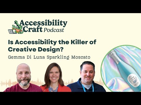
Chris: Yeah, we got Gemma Di Luna Sparkling Moscato. I’m going to try to get this up to the camera. My lights might not quite get it into focus, but it is a miniature bottle of Italian Moscato. Now my camera needs to refocus on my face. There we go. But it’s a sparkling Italian wine.
It should be a little bit sweet. So this is like total mom wine territory,
should be tasty, just a little bit alcoholic not a whole lot. 7. 5 percent by volume. So there’s still some residual sugar, should be sparkling white wine.
Amber: I will say real quick for everybody who is listening or watching that this is episode 100, sort of.
I gave Chris some hassle about that. I think it’s episode 50 of us recording.
Chris: It’s our 50th conversation episode and it’s the 100th episode of the podcast feed, if you count the meetups.
Amber: So it’s kind of exciting. We’re celebrating episode 50 slash 100, whatever you want to call it, with some sparkling wine.
So you can get show notes for this. If you go to AccessibilityCraft.com/100.
Chris: I was gonna demonstrate the proper pour. That I learned a million years ago for sparkling wine.
Steve, do you have a, do you have a flute?
Steve: I do not. I’m gonna do it straight from the bottle.
Chris: Oh, you’re going off the bottle.
Amber: Wait for real .
Chris: Alright. That’s classy.
Amber: You…
Steve: We’re here, we’re here. We’re gonna do it live. .
Chris: Yeah, we’re doing alright. Well, I’ll demonstrate anyway. You do a little, you do a little primer pour and let those bubbles settle…
Amber: Why?
Chris: For a few seconds.
It helps with the whole thing not kind of turning foamy when you do the rest of the pour and so then you do the rest and you can see how it’s not, once, if you do that initial pour, it’s not foaming up nearly as much as it would if you just continued straight from the bottle.
Amber: I always thought that the deal was, because you’re holding yours straight, I always thought the deal was that you have to hold your glass at a 45 degree angle.
Chris: Yeah, that’s if you’re doing it yourself. I was doing like the waiter pour because the waiter isn’t going to pick up your glass that you’re handling from the table and tilt it and pour. So like the waiter is supposed to do a little primer pour and then the full pour if you’re not picking up the glass. That’s the proper way to do it.
Steve: So if I remember correctly, are these your wedding flutes? Is that what these?
Chris: Yeah, these are the only two flutes we own.
Amber: !And they have two little hearts on the stem. These were the, you know, when you do that nerdy, cute wrap your arm, elbows around each other before you take your first sip of champagne at your wedding.
What’s it called? I don’t remember.
Steve: Reception?
Amber: Reception, there we go. I started to say rehearsal and I was like, nope, that’s the party before the wedding. The reception. That’s what these are.
Chris: Kind of minerally on the nose.
Amber: Moscatos are not always sparkling, right?
Chris: Moscatos generally are, I don’t know it’s been so long.
Amber: That is a sweet wine.
Chris: Yeah it’s like only about half the sugar is fermented, judging by the ABV on it.
Amber: I feel like us moms get such lame beverage reputations. You were all like, it’s a mom wine. And I was like, does that mean I’m going to like it? Or does that mean I’m going to feel like moms are lame?
Chris: This is on the upper end for a mom wine, at least. Like that, at least that sweetness is balanced with a little bit of acidity. But for me, this, the sweetness, like I definitely am a dry wine person. So for me, like the sweetness kind of drowns out a lot of the nuances of the grape that you might pick up if it were drier.
So it’s like sweet, acid, bubbles. I’m not getting a whole lot else.
Amber: I get kind of a peachy flavor. Do you get that?
Chris: I could see that.
Amber: So it’s like kind of peachy a little bit.
Steve: So I’m supposed to chug this whole thing? Is that how… Straight?
Chris: Yep.
Steve: You guys count me down.
Amber: All good creativity starts with Steve chugging wine.
Steve: Chugging wine from the bottle.
Amber: Alright, so just in case anyone missed it and they want to go find this on their own, this is the Gemma Di Luna Sparkling Moscato. And we have little single size serving bottles that are teal. They’re super cute. It’s very Breakfast at Tiffany’s. That’s what I think the vibe is that they’re going for with this.
And it is actually from Italy?
Chris: Yeah. I would have this at brunch with I don’t know, a crepe.
Amber: A bellini.
This would be good in a bellini. Like a peach champagne cocktail.
Steve: Right, right. So we did, chris sent a couple of these bottles. We did, me and my wife did share one of these on New Years.
Amber: You cheated, you tried it in advance?
Chris: Busted.
Steve: Hey, it was like, it was New Years. I was like, do we have any champagne?
They’re like, hey, yeah, right here we go. Like a little box.
Amber: I was in bed before midnight. I finished a book at 1030 and I was like, you know what? The kids are watching King Kong vs. Godzilla or something that I had zero interest in with Chris. And I was like, I think I’m going to go to bed.
Steve: This is good. I like it. It’s very sweet though, but thumbs up.
Chris: Totally. So Amber, what are we talking about today?
The WordPress.org Blog Post That Started This
Amber: So I had a whole different episode planned, which I think that we are going to record next time. And then I saw this blog post on the WordPress blog yesterday and started a little bit of a Twitter conversation.
And I decided we need to talk about whether or not accessibility is the killer of creative design. Is it possible to have creative accessible websites? Or is it something that we really need to have, you know, you can’t have accessibility and creativity at the same time. And it really started with, I’m going to share my screen here for a moment, this blog post that was published on January 2nd, WordPress Themes Need More Weird, a Call for Creative Digital Homes.
This is on WordPress.org and I saw this post and I was reading it. I thought, you know, it is kind of interesting. They’re like, they want more creativity. They said that creative themes have a strong point of view, they’re designed for specific use cases, they break some rules thoughtfully, and I’m like, okay, yeah, this is sort of interesting.
And then they talk a little bit more about having personality, and we get down to the bottom. And the examples that they’re showcasing, I’ll just click on one of these here. It’s Psychodeli, which is an Automattic theme that has 20 plus active installs. It might be new, so that might be why it has so few, or that might tell you something about it, and who’s interested in it.
And it’s got these bright green colors, like green, blue, pink, and it has this font that is just so hard to read for all of the headings. It took me forever to figure out that says Perceptions Through Doors on a Wall, I think? I don’t even know, I feel like I have to describe this font for people who can’t see it.
It’s got these very large Serifs that are all like squarish? I don’t know. Only they have rounded corners. And the letters have very thin lines in between them and almost make like X characters. And so it’s very hard to differentiate. Like the W could be an H in the word wall. Like I went wall? Hall? What is that?
The N looks like an X to me. I don’t know. I find this font incredibly difficult to read.
Steve: Yeah, yeah.
Amber: It’s weird, but I, my initial reaction to that was when I look at a theme like this you know, I’m like, what does this do for anyone? And so I tweeted out that when I see the things here, there’s also some themes in that original post that had some color contrast issues, like this Feeling Good one that’s got white text on a light pink background.
So I’m thinking, you know, all I see is accessibility problems. We won’t even get into the snowflakes that are falling on my screen that I can’t stop and that don’t stop even though I have reduced motion turned on my OS because 90 percent of the time it is turned on my computer. And so I wanted to talk a little bit about that.
I think there’s some small questions that would be good for us to start with. And one of the ones that I want to start with is, can you guys think of any websites that don’t need to be accessible? Because when I posted about this on Twitter, there was conversation about the purpose of websites.
And Matt Mullenweg even said to me, he was kind of comparing my thing on the contrast. He said, at what point do you say a Rothko painting isn’t high contrast enough? And my response to him is, well, a painting is art. I suppose there are instances where a website is meant as art, but I think in most cases, they’re meant to communicate information.
Should accessibility ever be optional?
Amber: And therefore, we should let everyone access the information. But I’m kind of curious, what do you all think about this? Can you think of examples of websites that don’t need to be accessible?
Chris: Perhaps a website you’ve built that’s built by you, for you. Like it’s a completely personal website that is not serving any public good and serves no other purpose than as a mechanism for you to self express or self actualize.
That is the one, one of the few exceptions, but I also, I don’t…
Amber: Do you expect people on that website to look at… Are you putting it out there because you want people to look at it?
Chris: Okay, so here’s an example, right? My, my dad has, a small blog where he writes for personal reasons on philosophical topics.
And it’s his interpretation of philosophical writers and things of that nature. And he puts it out there purely for himself. He’s not monetizing it, he’s not promoting it and it’s really only there, and these are his own words, so that after he’s gone, his thoughts and thinkings on various philosophical topics are out there in some way, or are preserved in some way.
Amber: Well, so here’s the question. If he doesn’t care if anyone reads it and he just wants his stuff to be preserved for eternity, perhaps he should write a book and self publish a book. That might last longer than a website.
Chris: Yeah, but is writing and self publishing a book more or less expensive than having a domain and a website on bargain bin hosting, right?
And how proliferated and accessible is that if it’s a single copy of a book versus something that anyone with any kind of device or web browser could in theory go to and navigate to and read or consume. But again, it’s purely for personal use. It’s not serving any public good or function. And to me that in, in essence is maybe some rough definition of what art kind of is.
It’s a form of personal expression that is for you and by you. And the world may choose to engage with that. It also may not. And I think that, that probably in essence is what doesn’t necessarily need to be any more or less accessible than what you, the person that it’s for, needs it to be. That’s just me.
Amber: What do you think, Steve? Can you think of like actual examples of websites that don’t need to be accessible?
Steve: Well, I mean, there’s, you know, there’s a legal, there’s an ethical conversation to be had in all this, right? There are legal requirements by certain, entities certain types of businesses, certain jurisdictions to meet some level of accessibility, right?
And then beyond that there’s, you can take an ethical responsibility to go beyond those guidelines, right? And then beyond that, you get into the exceptions, which is, you know, like Chris, you know, described his father’s, website maybe somebody’s personal photography website that has no business component to it.
They probably have no legal requirement that they don’t exist anywhere in real life, that they’re only a digital entity for their own hobby purposes. Then there probably isn’t any recourse in it not being accessible but should it be accessible, you know, that’s a bigger question, right?
And and to what level and to what resources does the person creating that website have to make it accessible? Right?
And and that can go into a whole conversation about the tooling that companies like us and companies like WordPress provide to make websites and the level of accessibility baked into that to where it’s not really even a thought to that end user.
These weird sites are trying to be weird. Now, I don’t really think they’re that weird. Like they’re really just playing with color and fonts a lot. And I’m going to take a little liberty here. Cause I actually, a lot of people don’t know this.
I actually have a college degree in visual communications. So I can speak on design and creativity a little bit. Now you can be a lot weirder, but it’s you don’t throw the baby out with the bathwater, right? It’s you don’t just be weird for weird sake and say that, because I’m being artistic and because I’m being weird means that I can’t even consider accessibility at all.
Amber: Yeah. And I think we should dive into that more, but I want us to take a short commercial break and then we’re going to come back and we’re going to talk about what it means to be weird and accessible.
Brought to you by Accessibility Checker
Steve: This episode of Accessibility Craft is sponsored by Equalize Digital Accessibility Checker. The WordPress plugin that helps you find accessibility problems before you hit publish.
Thousands of businesses, non profits, universities, and government agencies around the world trust Accessibility Checker to help their teams find, fix, and prevent accessibility problems on an ongoing basis. New to accessibility? Equalize Digital Accessibility Checker is here to teach you every step of the way.
Whether you’re a content creator or a developer, our detailed documentation guides you through fixing accessibility issues. Never lose track of accessibility again with real time scans each time you save, powerful reports inside the WordPress dashboard, and a front end view to help you track down hard to find issues.
Scan unlimited posts and pages with Accessibility Checker Free. Upgrade to Accessibility Checker Pro to scan your website in bulk, whether it has 10 pages or 10, 000. Download Accessibility Checker today at EqualizeDigital.com/Accessibility-Checker. Use coupon code AccessibilityCraft to save 10% on any plan.
Should accessibility ever be optional? (Continued)
Amber: Alright, so we’re back. We’re going to talk a little bit more about accessibility and creativity and whether they can mix. But before we do too much of that, I do want to circle a little bit back on examples of websites that don’t have to be accessible. And me being the, I was a philosophy major, Steve has a design degree, I have a philosophy degree.
And I’m still thinking about this and just the ethical, even the example you provided, Chris, of your dad’s blog and my argument is, I think a book would last longer in the world than a website. Unless I guess he goes and buys a hundred year hosting from Automattic. Then maybe it would last forever.
Or at least for a hundred years, right? But I kind of wonder why would someone put something on the internet if it’s not intended for a public audience? Like I have what for a long time for me was a mom blog and I shared pictures of my kids with our families. And in the beginning, I thought, should I just make this a password protected site that they have the password to?
And in that case, it’s okay, maybe it doesn’t need to be accessible, because I literally know who’s accessing it, and I know what their accessibility needs are. And that is an exception in Section 508 for professors. They don’t have to make all of their course materials and PDFs accessible if they know that all the students in their course don’t need an accommodation.
Right? So, if you have a password protected but I’m wondering this If someone is putting something, even if it’s art on the website, and I’m still having a hard time coming up with what is an example of a website that is art, but if it’s not intended for public consumption, why would you put it on the internet in the first place?
Steve: Yeah, I don’t think he would. I mean, I mean, I think that’s the sole purpose of the internet, right?
Amber: Is you want people to find it and see it or read it or whatever it is.
Steve: Well, and two like back to the art analogy, right? So a piece of art painted by a human that is meant to be displayed in real life and humans are supposed to come by and just absorb it and interpret it in their own way in their own head, right?
Most galleries provide a text and an audio alternative to that art, right? So even in real life, even that painting, they’re making an effort, to make that painting accessible to people that are low vision or no vision, right? So it kind of is, they’re making the painting accessible, right?
Amber: Yeah. Well, and I’ve been to art galleries where with sculptures in particular, where they encourage people who are blind or visually impaired to touch the sculptures.
They wouldn’t let a typically sighted person do it, but they are like, a blind person, yes, because we want you to be able to experience this art, and that is how you’re going to experience the art.
Chris: Yeah. I think what’s interesting about this, and maybe there’s a certain cutoff point, but, If you imagine, you know, someone like my dad or a relative of one of yours who maybe isn’t particularly technically savvy and they’re like, I want to go make something for my family on Squarespace or Wix or on WordPress or whatever it… At what point do they become the ones who are responsible for making the thing accessible when maybe they don’t know the first thing about it, don’t have any sort of perspective on it, right?
And how much of that responsibility should just sit with the platform holders to guide them into making good decisions, or at least giving them the opportunity to make a good decision. I, you know, like I doubt my dad is considering accessibility with how he’s put his blog together. He’s doing what most people do when they’re setting out to create a thing by and for themselves, which is what is aesthetically pleasing and usable to me, right?
I’m not going to consider anybody else in this because I’m not doing this for anyone other than myself. What is aesthetically pleasing and usable to me?
Amber: And to be fair, his website is also not mobile responsive.
Chris: Because he doesn’t look at websites on his phone. So of course it’s not about anyone else and it’s not really arguably for anyone else. And I do genuinely believe that. And I don’t know that we should be, you know, enforcing accessibility with those types of people, those types of people who are putting things out on the internet.
I don’t think that they should be subject to being, you know, publicly ridiculed or called out, but perhaps if there’s something happening inside the platform that they choose to use that is just inherently broken for people of varying abilities, then that should probably be called out.
Websites as a Medium of Pure Artistic Expression
Chris: But also, you know, I think there’s this deeper discussion we need to get to on, should we be comparing websites to paintings? Because to me, they’re much more comparable to a building or a house than a painting.
Amber: Yeah. Store or journal, right? They are information communication technology. That’s what websites are. I don’t think they’re art. Cause even artists like, when I was spending a lot of time thinking about this, I was like, even artists who have art, artistic websites, a lot of times the point of the artistic website is to promote their art and to make people more aware of their art, maybe want to buy their art. It’s not to make, I’ve seen very few, and I can’t even think of them off the top of my head, websites that were literally intended as an art piece and not to teach someone something or inform someone about something.
Steve: Right. And none of these examples you know, from the dot org post are that type of art.
Amber: Yeah. They’re just funny styled blogs.
Steve: Yeah. So they’re still trying to convey information, which, you know, on that Psychodeli with the font, you were definitely having a hard time interpreting the information they were trying to convey. So these are still brochure websites, right? Like you said, an artist will make a website and it’s a brochure for the art or the exhibit, right? So like the art and the website are, it’s not a very strong argument and it doesn’t hold up super great and and it’s, it doesn’t validate a total disregard for accessibility.
Trying to Find a Middle Ground
Amber: I was thinking a lot about this. I’m in the Admin Bar’s email newsletter, and I’ll share this and we can put it in the show notes for people. But every Friday, Kyle sends out an email which is just content for people who are in the email newsletter.
He doesn’t publish it on his blog anywhere. But a week or two ago, he sent this one that was about good enough. And he was talking about how he had gotten into bike riding and there’s all these people that, you know, spend like $2,000 to $4,000 on a bike and they think that’s entry level and he has a way cheaper bike and he says, but my bike is good enough for what I need.
And he drew this parallel to it with websites. He said, our industry is just as guilty as over engineering websites as well. People like get into this whole, like you need special frameworks or you need to use a certain builder and it needs to have totally perfect HTML and all this stuff, but a lot of times maybe a template website or something is exactly what the audience needs.
Which, by the way, I would say, he has a lot of very insightful things in his email newsletter, so we’ll link this. You can go subscribe if you want on the Admin Bar’s website. But I was thinking about this, you know, with this conversation about do they all need to be accessible? Do we want to encourage the themes to all be accessible, or is it okay if there are theme developers that are intentionally making things that are not accessible? Because there are, you know, maybe there are instances where mostly accessible is okay? Right?
Chris: Mostly accessible is better than what most of the internet achieves. So yeah, mostly accessible is better than okay.
Amber: So I don’t think that I’m always advocating for perfection, but I think circling a little bit back to what you said, Chris, about, average people who build websites don’t know. I do think that we within the WordPress community need to create tools or any content management system should create tools that educate or inform, you know, I don’t know.
It’d be interesting because WordPress Core has this color contrast warning, right? So if I were to pick a theme and be like, oh, it looks really nice with like light gray text on a white background and, you pink with white, light pink with white text on the buttons because that, I’ll tell you I’ve had a version of my website that way, and I picked a theme out of WordPress.org and then I put it on my website and then I got a color contrast on everything there. Would that, how would that make me feel about the theme that I picked? You know? So it almost seems should we be encouraging this? I don’t know.
Steve: I think that’s what your original, you know, X post was about, right?
It wasn’t about calling out an individual hobbyist creating a weird website, right? With a font that they find creative, right? It’s about a theme developer making a theme that is for distribution for the whole, for 40 plus percent of the internet without regard for accessibility, without a disclaimer that this theme is a creative, weird theme. It may not adhere to, you know, all the accessibility guidelines. Use, use it …
Amber: Well, or it might not help you achieve the goals of your website.
Chris: I would have received all of this so much better if that kind of disclaimer were stamped on these. Because I can fully appreciate and see that somebody coming to WordPress who maybe doesn’t have the level of exposure that a lot of us professionals do, on conversion optimization and accessibility and security and performance and responsiveness and all the things that we all consider as professionals. They could see something like that and it could just click with them and they’d be like, Oh, this looks so cool to me. And they don’t think about anyone else, but how they perceive it.
And then , they harm their company potentially if they’re using it for the, that means, right?
Steve: Yeah. So, I mean, if the theme was shipped with a, some sort of accessibility statement. Like, I know we have the accessibility flag on dot org themes, right? That meets certain levels of accessibility. I think we’ve had a podcast episode about that, but if themes were required to ship with some sort of accessibility statement, where an acknowledgement is made that, Hey we sided with creativity over accessibility, just so you know, like before you decide to install this theme, know that it’s not going to be accessible because we chose to use this font or these colors, you know.
Amber: I just think it’s sort of an interesting this, like what’s good enough.
And I do think there is a scale, right? A bank, an educational institution, any sort of business that is a multi million dollar business, they need to be 100% WCAG conformant and they need to even go beyond that in many instances. My personal blog is not WCAG conformant. There’s a lot, especially in the past, of images that have no alt text.
I’m way better about that now. I have not invested the time to go back and remediate all of that. But it’s super low priority because I make no money off my website. I don’t even have analytics on it, I didn’t even have SEO plugins on my website, right? Until very recently.
I hadn’t even tried to optimize for SEO. So I do acknowledge that there is a difference. But, I just, you know, from, I don’t I do have a hard time though with the whole some of the examples that were presented because they’re just so bad! And maybe it’s just me and it’s my design eye and there’s someone who loves that font.
Steve: Yeah.
Amber: But I just I am a typically sighted person who reads in a normal fashion and I find that difficult and I just am like, how does that achieve any website owner’s goal, you know?
Is accessibility actually what’s stifling creativity?
Steve: Being weird for the sake of being weird doesn’t really achieve a lot. Yeah, I, like I said I have a degree in visual communications and those aren’t what I would call the most creative website examples I’ve seen.
And if we kind of harken back to is accessibility a killer of creativity? No, I don’t think it is. And can these sites that were created you’re going to have to change colors.
Amber: But but, well, let’s talk about that though, because I actually, this was a comment I made later on in that Twitter thread was there are ways that I think theme developers, like if Matt’s we really need to allow things that fail color contrast.
Okay, it is sufficient to code the theme so that in the header there is a button that enables a high contrast mode and the theme developer could then have a style sheet for the low contrast and have a high contrast style sheet and then a user would have control. You could similarly have a button that’s Enable Sans Serif Fonts that changes the fonts that are being used for the headings, right?
There are ways to do that, where you could still have your weird version. Gosh, I feel like, oh, I need to look this up. I wish I remembered. Alex, I want to say Alex Sandiford, that his personal website, I almost want to go, somebody Google real fast while I’m talking. He has a website that looks normal, but you can toggle 1980s mode and it just makes the whole thing look like that.
Right? That is fun and creative, but it gives users control.
Chris: Is Alex Sanford a player for the Arkansas Razorbacks?
Amber: No…
Chris: That’s what I, that’s what I get in Google.
Steve: But I mean, what I was trying to get at a little bit is that I don’t think accessibility is to blame as the killer of creativity, even though this is the discussion that was had, right?
I think the need or the call for these weird themes is born out of what the root problem of some of the creativity issues with things like the block builder, the page builders, Bootstrap, Tailwinds, right? Those things are the killer of creativity.
Amber: But you know what’s interesting though? Because I totally understand that. And that blog post on WordPress. org said that, like, when everything has a hero that looks like this, but at the same time, when websites start looking the same, then you know what to do when you get on them, or you can expect how you might find the information you’re looking for when you get on them.
Steve: Right, right.
Amber: And there are definitely a lot of websites that benefit, and users who benefit from, they all kind of look the same.
Chris: Absolutely, and this harkens back to the idea of websites as buildings and not as paintings. Right. You want a building to have a predictable flow to get to all the rooms you want to go to.
You don’t want it to be like one of those M. C. Escher drawings, where the stairs, you… Like you, you don’t want that for, if your website is serving any kind of purpose. But I also think, and this is me like kind of putting my old chef hat back on back in my days of running kitchens and writing menus and coming up with specials and all this stuff, but well over a decade ago.
But some of the most creative things that I ever did were done under constraints, whether those constraints were time or limitation of what ingredients were available or having an excess of something that needed to be used up or just something coming into or out of season. Like those sorts of constraints that are imposed upon you end up producing some of the most impressive and cool things.
And so I don’t appreciate, you know, that… And I understand why, because it’s kind of, when we show up in the room as accessibility people that we kind of get known as the Fun Police in a lot of creative teams. .
Steve: Yeah.
Chris: Yeah. Right. Because we are, we’re often brought in at the last second, and all we do is spend time telling people why they can’t do things. Or you know, how they need to change them.
Amber: “You’re wrong.”
Chris: Yeah. Yeah. Or “you’re wrong,” right? And I don’t know how we solve that problem. But , I do appreciate for the people who are in creative pursuits that we can sometimes be seen that way, but also I do think it can, you can easily just change your mindset around it and view it as a creative challenge and not as an affront to your own personal expression.
Steve: Yeah, I think my summarization would be that, accessibility is a component of the creative aspect of creating these themes. Right, just like Chris said and we all share a past like I said, I got that, I obviously was into art at some point in time, if I went to college for graphic design and, but I’ve since moved over, you know, many years ago, moved over to the development side.
And in a lot of respects, that’s creative, just the same. And and because creativity a lot of times is just risk taking, it’s problem solving and, and I think that a small consideration for accessibility in that creative process is worthwhile, especially if you’re making something for others to use.
If you’re making something for yourself, it’s a personal hobby, do what you want, right? I would probably still make some considerations, but I’m in the accessibility space, right?
Amber: Well, and my real intent to behind that post is there are, I don’t know, thousands, a lot, tens of thousands, hundred thousand, I don’t know, themes on WordPress.org I’m not sure that what we’re lacking is themes that look like the ones that were showcased there. I mean, in fact, if they didn’t hide the ones that hadn’t been updated in a while, I’m sure there’d be a lot more that look like that. Because when I looked at them, I was like, a lot of them remind me of the first websites I was building in the early 2000s.
Right? There’s probably a lot of those themes available, but maybe are just hidden because they haven’t been updated recently. But what I think is missing from WordPress.org, like free themes is more accessibility ready themes. And so, so I would like to see us encouraging people to be creative and interesting.
And like you said, Steve, also accessible. I don’t think it has to be the killer of creativity. And I do feel like maybe in the future we can put together a resource that shows interesting, creative websites that are also accessible.
Steve: Yeah.
Amber: We were originally going to talk about our predictions for 2025, but I bumped it in favor of this conversation. Next time, which will be in two weeks, we’re gonna talk about those and how we see it going. We won’t have champagne, we’ll have something else. Well, this isn’t champagne, but sparkling wine. And tune in then.
Steve: Yep. Sounds good. See you guys.
Chris: Happy New Year, everybody.
Thanks for listening to Accessibility Craft. If you enjoyed this episode, please subscribe in your podcast app to get notified when future episodes release. You can find Accessibility Craft on Apple Podcasts, Spotify, and more. And if building accessibility awareness is important to you, please consider rating Accessibility Craft 5 stars on Apple Podcasts.
Accessibility Craft is produced by Equalize Digital and hosted by Amber Hinds, Chris Hinds, and Steve Jones. Steve Jones composed our theme music. Learn how we help make thousands of WordPress websites more accessible at EqualizeDigital.Com.