
In this episode, we talk about the misconception that accessibility primarily focuses on helping blind users, and share a wide variety of things website owners can do that may not necessarily benefit blind users, but that nonetheless greatly enhance overall accessibility.
Listen
Watch
Links Mentioned
Transcript
Chris: Welcome to the Accessibility Craft Podcast, where we explore the art of creating accessible websites while trying out interesting craft beverages. This podcast is brought to you by the team at Equalize Digital, a WordPress accessibility company, and the proud creators of the Accessibility Checker plugin.
And now onto the show.
Amber: Hey everybody, it’s Amber and I’m here today with Steve.
Steve: Hello everyone.
Amber: And Chris.
Chris: Hey, everybody.
Amber: And this is episode number 138 of the Accessibility Craft Podcast. If you want to get a transcript or show notes, you can find those at AccessibilityCraft.com/138. So we always start every episode with a beverage.
Today’s Beverage
Amber: What are we drinking today, Chris?
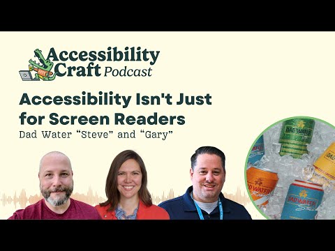
Chris: So, I am walking through the store and people who listen to this podcast, you know, multiple episodes, might remember that we had Mom Water Karen flavor not too long ago. So this time around we’re trying Dad Water, and Amber and I are trying, Gary flavor and Steve is trying Steve flavor.
Steve: Steve Flavor.
Chris: Which is apparently grapefruit. I will just share that I saw it on the shelf and it just said, Dad Water. And I’m like, please let one of the flavors be Steve, please let one of the flavors be Steve, as I’m picking it up. And I was like yes.
Amber: You didn’t want Chris flavor?
Steve: Yeah.
Chris: I would’ve accepted that as a second option. But no, it just seemed like it needed to have a Steve flavor. That was literally what was going through my mind.
Steve: Yeah. Yeah.
Amber: I think we talked about this a little bit ’cause I had looked at the Dad Water website when we did the Mom Water episode. And there was some really funny thing about the Steve Flavor being a throwback to like your amazing life as a football player in high school or something.
Steve: That’s definitely not me.
Amber: No that’s not the right description for the Steve Flavor?
Steve: No, Steve was a rock and roller back in high school, but…
Amber: So I’m curious now, if you were gonna choose any flavor, would it be grapefruit?
Steve: No, not at all.
Amber: What
flavor is Steve?
Steve: A Diet Coke? You cut me open, that’s probably what comes out.
Chris: Diet Coke, running through his veins.
Steve: So on the Steve Water, on the Dad Water, Steve, they’ve got like this logo up for it. Is it the same logo on everything or is that just on all the dad waters? It’s looks like fruits, but arranged to look like you know, like a dad with a mustache and sunglasses on
Amber: Oh, aviators!
Steve: Yeah, aviators and like spiky hair, which is probably like the top of a pineapple, right?
Amber: That’s sort of clever. So the Gary flavor, it’s like this yellow, brown and green design can. It’s so seventies kind of is what I think of when I see like these colors and designs. And even like the font on the logo, like the dad water is kind of a, more of a blocky font, but then they’ve got like the name Gary and script, it fails color contrast. So it’s hard to read here, but very seventies.
Chris: Gary Flavor claims to be pineapple jalapeno, and Steve’s is grapefruit. And I think all of these are mixed with tequila and still water. That’s the difference. Not sparkling.
Amber: The mom water was vodka. So I’m leaning towards, I think I might like this better because I think if I had to choose, I would almost never choose a vodka drink like ever in my life. I remember with the mom water thinking I kind of miss carbonation. So I don’t know about still water with tequila, but we’re about to find out. Should we open it?
Chris: Yeah, let’s do it. Well, it still has the pressurized pop of a carbonated beverage.
Steve: Yeah. Why?
Chris: Oh, I can even smell the pineapple before I get close to the can.
Yeah. I can smell the grapefruit as well.
Amber: Does it smell like grapefruit?
Steve: Not exactly.
Amber: I’m on the, I’m on the fence about this. All right. I’m gonna try it.
Chris: Yeah.
Steve: Oh, get the tequila.
Chris: Yeah, you definitely get the tequila. I get tequila more than I get pineapple or grapefruit. The tequila’s kind of taken it over.
Steve: Yeah. Big time.
Amber: Yeah. So ours is supposed to be pineapple jalapeno, which makes me think it should be a little spicy. I don’t get any spice.
Chris: No, there’s no heat. Not really at all, actually. You know what this tastes like to me? It tastes like a margarita you left sitting out that was mostly ice and you drinking all the margarita and you came back to it like 40 minutes later when it was still cool, but all the ice was gone.
Amber: And all the ice melted. It’s got a tiny bit of margarita flavor, but mostly it’s just water.
Steve: Watered down tequila.
Amber: That’s kind of what it tastes like. I do think I like it better than I remember liking the mom water, but again, I think that I am more friendly to a tequila flavor being the Texan that I now am. Than a…
Chris: The mom water felt a little rougher around the edges to me, like the alcohol burn. But I also like, I don’t mind the flavor of tequila. And the tequila flavor is definitely there, but I’m not getting a lot of the tequila burn, at least in mine.
Steve: I mean, it’s really bitter. Like I wouldn’t think that for… ,
Amber: Or maybe that’s grapefruit though, too, right? Grapefruits kind of bitter.
Chris: Yeah. Especially if they left the rind in for the…
Steve: No, it’s like that, it’s like on the end. It’s like on the end, like when I swallow and it’s like that, like alcohol, vapor, you know, I don’t know how to describe it eloquently, like Chris would be able to.
Chris: Yeah. Not a fan. Not a fan. I mean, I purely got this because of the naming thing, but not because I thought it would be good or amazing. But I don’t know. What do we think? Are we ready to rate this? I feel ready to rate this.
Amber: Wait, can I say one thing though? Sure. So when we took our kids to Disney World this summer and a bunch of my family came and my sister-in-law, she bought Mom Waters to have at the Airbnb. And I was like, wow, you’re a person who actually likes this? She can’t have gluten and she has like soy sensitivities and she has like a bunch of other allergies. So I don’t know, like these would not be my first choice beverages, but maybe, you know, if you have other sensitivities, they are helpful. I don’t know.
Steve: And you still wanna hit the liver with some alcohol.
Chris: It’s the gluten-free bread of the beverage world.
Amber: I mean, now of course, usually you don’t switch between alcoholic and non-alcoholic, but for me, the flavor on this, if you liked tequila flavor, I think it’s fine. I don’t get as much fruit as I would like to have. I probably would like it better if it was sweeter, but then of course it’d have calories. But it tastes better to me than all the mocktails. Those ones have like weird aftertaste. Like this to me just has like a tequila light flavor. I don’t know.
Chris: Because it’s coming out of a can I guess, or I don’t know, I’m just like conditioned to expect carbonation and so I’m inherently disappointed just from that. And I know that we’re getting what they’re advertising, they’re not saying this is gonna be carbonated. So I don’t think I can fault them for it, but I just, I personally just don’t like these.
Amber: That is an interesting thing though. Like the expectation of if it comes out of a can, it’s carbonated.
Steve: Yeah.
Amber: Like I wonder if you would like it better if it was in a plastic bottle, like a water bottle.
Chris: Yeah. Something to think about.
Steve: Yeah. I kind of, I agree with both of you.
I wish it was sweeter and it I don’t even know if, I mean, I probably only had tequila I two or three times in my whole life. So I don’t think I really liked the taste of tequila. It’s just really bitter for me. I don’t like, and it’s, it tastes like it has more alcohol in it than it does. To me.
Chris: Yeah. I didn’t even read the ABV.
Amber: You noticed…
Chris: Oh, it’s 5%.
Steve: Yeah. It’s not that much. But when I drink it, it’s pretty it tastes like it’s got more in it . Or maybe that’s just the tequila.
Amber: Well, I guess it’s time to do the rating. Would you get it again?
Chris: No.
Steve: Two thumbs down.
Amber: Chris is two thumbs down. What do you Steve?
Steve: It’s a, I’m two thumbs down too,
Amber: So I, I give it an in the middle.
Steve: Oh.
Amber: I would probably drink this if I was at a party and somebody had it. I don’t know if I’d go outta my way to buy it.
Steve: Right.
Amber: But I wouldn’t be like, no, because we’ve had other beverages where I would just be like, nah, I’ll take water. Thank you.
Chris: Steve, can you pass me a Diet Coke through the camera?
Steve: There you go.
Chris: I’m lacking chasers. No. Maybe if you like the flavor of watered down tequila it’s a thumbs up for you, but…
Wait, accessibility isn’t just about screen readers?
Amber: All right. So here’s what I wanted to talk about today. While we either drink our watered down margarita or our Diet Cokes. Our topic today is Accessibility Isn’t Just for Screen Readers. And this was inspired because I recently gave a webinar for Green Geeks, which is on their YouTube channel, so we can add a link to it in the show notes. I actually think it came out pretty well.
And, someone commented who was watching that they have low vision and they feel like people with low vision are frequently left out of accessibility discussions. And they’re not the only person I’ve heard say this. I’ve heard a lot of people with cognitive disabilities or other disabilities, or maybe even people from the deaf community say that a lot of times they feel like the work on websites around accessibility is just for people who are blind or about making sure that they work well for screen readers and not other assistive technologies or other things.
And I think it would be helpful for us to talk about things that people can do on their websites that don’t necessarily benefit people who are blind or who use screen readers, but is part of this overall idea of accessibility and making sure your website works for a whole bunch of different groups.
So I think to start, I think I’d be curious to know what you guys think about why accessibility is so often equated with blindness and screen readers in public conversation?
Steve: Yeah, I mean, I think the overarching thing is because vision is the primary sense that we use to experience the web. We look at screens. I mean, just like in the real world, right? Where like you would probably say that, you know, wheelchair accessibility is probably one of the most top of mind accessibility things because walking and moving is typically how we experience the real world. So you see a lot of wheelchair ramps and you see a lot of wheelchair signs and parking spots.
So it’s very top of mind because that’s probably the primary way to access the real world. And I think our eyes are the primary sense that we use to experience the web. Now there’s something behind our eyes that we have to think about our brains, which actually interpret everything going into the eyes.
But I think that’s probably the crux of it. And the reason why we go to complete total blindness is because to be able to like, evaluate the spectrum of visual disabilities out there would be quite complex, right? From a technical perspective.
Chris: So it’s almost like getting both ends of the pendulum swing is what we’re trying to do.
We have visual and totally not visual, and maybe at times there’s this gap in the middle depending on who’s testing or who’s thinking about it. The other big one is on the legal side. I think one of the reasons that this gets so much attention is that, and I honestly don’t know, maybe I’m actually wrong about this, but the impression I have based on the lawsuits that I’ve heard about is that like, the accessibility lawsuits is that the plaintiffs are often blind or low vision and I think there’s a reason for that, right? There’s this way that, with that particular piece, right? That, that they’re using a screen reader, they’re using a piece of technology to try to interpret the website for them, and the website’s not compatible. They can’t do what they need to do.
It is very easy to prove that they have standing and that they could not achieve whatever outcome they were trying to achieve, whether they were trying to order a pizza, buy a pair of shoes, whatever. I think that in the business world, at least, there’s this focus on screen reader compatibility because of the legal stuff going on because it’s often surfaced there.
I also think that to an extent, because a lot of this is just technology and different technologies talking to one another and being compatible with one another, like the way that a screen reader interprets a website, it’s by evaluating its code. And I think that when we’re considering accessibility, we’re often talking about code. And so a lot of it kind of relates or kind of ties back to screen readers again. Although there are other use cases and considerations with how a website responds to other types of devices and other types of technology, but it just seems like it gets so much of the focus for the reasons Steve said and for the legal reasons and just because of how much screen readers just hook into things on the technical side.
It just, it touches a lot.
Steve: A lot of times those are the most , the most extreme case, right? Like total blindness is probably the most extreme case, and probably the person that’s going to encounter the most adversity when trying to surf the web.
Amber: I think. So there, there have been some pretty high profile lawsuits around captions like MIT and Harvard and I think some of these universities that we’re putting out a lot of open educational content on YouTube, but not captioning it, or not captioning it accurately without using just the automated captions from YouTube.
But I think you are right that there’s a bigger presence maybe either in the lawsuits or within maybe the advocacy community. In the US at least, I know that there’s a couple of different nonprofit organizations that support blind people that advocate for them. And so maybe there’s more of that than there is like Epilepsy Foundation or something.
I just think that maybe there is more broad awareness because of these advocacy groups and that could potentially lead to it. It is also possible that it’s a little bit easier to test with screen readers than it might be like a refreshable braille display that a deafblind person would use, or a switch device or like a Darcy USB, which is Morse Code.
How many of us have that kind of hardware that we could test with? That’s pretty difficult. Whereas a screen reader is either built in if you have a Mac or very easy to install if you have a PC. And so maybe that gets some attention as well.
Brought to you by Accessibility Checker
Amber: Maybe we can talk a little bit more about these different groups, but let’s take a quick commercial break first.
Steve: This episode of Accessibility Craft is sponsored by Equalize Digital Accessibility Checker, the WordPress plugin that helps you find accessibility problems before you hit publish. Thousands of businesses, nonprofits, universities, and government agencies around the World Trust Accessibility Checker to help their teams find, fix, and prevent accessibility problems on an ongoing basis.
New to accessibility? Equalize Digital Accessibility Checker is here to teach you every step of the way. Whether you’re a content creator or a developer, our detailed documentation guides you through fixing accessibility issues. Never lose track of accessibility again with real time scans each time you save, powerful reports inside the WordPress dashboard, and a front end view to help you track down hard to find issues.
Scan unlimited posts and pages with Accessibility Checker free. Upgrade to Accessibility Checker Pro to scan your website in bulk, whether it has 10 pages or 10,000. Download Accessibility Checker today at EqualizeDigital.com/Accessibility-Checker. Use coupon code Accessibility Craft to save 10% on any plan.
Types of Disabilities We Can (and Should) Consider
Chris: All right, so let’s talk about the ways that WCAG success criteria and accessibility best practices do or should, address different groups of people. And Amber, I’m wondering if you can start, just list out some of the other types of disabilities that people should be considering when they’re making their website accessible.
Amber: Sure. So, we mentioned low vision already. And that is a whole subset of different kinds of permanent, and then sometimes temporary like cataracts, you might have low vision, you might be able to have surgery, situation.
Colorblindness is also one that I think people don’t always think about, but it’s very common, particularly among men. And I think a lot of people who are colorblind wouldn’t say that they consider themselves disabled. But there is success criteria that relates to that.
Then we have cognitive disabilities. And cognitive disabilities could be things like having dyslexia or some sort of reading disability. Also post-traumatic stress disorders or, memory, like memory loss or other sorts of cognitive decline that might happen over time.
And then motor disabilities. So things where you have limited movement and the most extreme case of this could potentially be someone who has paraplegia and can’t move their arms. And so they’re using either voice control to control their computer or they’re using eye tracking software. And then of course we mentioned as well deaf and hard of hearing. There are a few success criteria that relate to that as well.
I think it might be useful for us to go through each of these groups in greater detail and talk about what would benefit them so that people who are listening that are less familiar with, how can I make my website more accessible for this specific group, have some ideas. Steve, do you wanna start with that low vision group?
Steve: Sure. So, what things can we do to make websites more accessible to this group? So low vision people, you wanna use relative font sizes. So that means like that it naturally scales up and down based on, you know, their settings or using the, increasing the font size of their browser. Like most current browsers, it will size a pixel font up and down. But if you have, like in your settings, if you have it, it set to large font in your settings then some browsers may not respect the, or will not size up the pixel font size. So you want to be using, you know, relative font sizes these days and a less, absolute pixel sizes. We could have a whole episode just on that alone, so I’ll leave that and move on.
I think of course with anything you wanna maintain strong color contrast and color contrast a lot of times does catch those people in the middle that we were talking about. From the fully sighted to the fully blind. And a lot of times you’re designing and you’re like, well, I don’t like this color contrast. It’s too much. I want to make it have this faded, you know, look and stuff. But no, you wanna make that color contrast ratio suitable for most people.
Providing consistent headings and spacing , where you want people to kind of get a feel for your site and expect what sections and what the content breakdown is like.
Don’t disable zooming. I know that was a popular thing for a while to go in there and modify the meta tag for that , but no, let that user choose how they zoom their website.
And then the hit area on buttons. Don’t make tiny little buttons all butted up against each other. You know, give a lot of space and area for for these users to be able to hit that button. ‘Cause the goal is to get ’em to hit the button. You don’t wanna put any obstacles in between that. And quite frankly, if you make it good for these people, it actually will probably net you more clicks on that button in general.
So that’s a few things.
Chris: The one that immediately leapt to mind for me when you mentioned zooming in Steve, is to be really careful about any sort of element that’s sticky and how many of those exist. Various navigations, you know, chat widgets, the list goes on. Because too many of those occupying too much vertical space in a zoomed in environment can very quickly render a website unusable.
And I can think of some instances where Amber actually showed that on screen shares at presentations and in other environments. And it’s always really striking for me. And just customizability in general. That’s obviously good for all users, but if you’re offering options for text resizing or light and dark mode, make sure that those work as expected.
We’re auditing applications quite frequently now where there’s a light mode and a dark mode and you would be surprised or maybe not surprised to learn that usually one of those modes has a lot of contrast issues because people don’t necessarily check how the styles change.
And then the final one that I, that was a friend of mine for me was just any kind of placeholder text or if you’re using forms like error state or error text, that only shows up, you know, occasionally if the user makes a mistake, check your color contrast on that stuff because that’s really important information for the user to have. And you wouldn’t want them to either miss it or just straight up not be able to read it.
Amber: Yeah, on the zoom note, there are specific success criteria in WCAG that require you to test zoom, up to 200% and up to 400%. So for a low vision user, you should not assume that they’re looking at the website with their browser set to 100% Zoom.
They also might have their display resolution set to 150% or 200%. So their whole display on their device is more zoomed in. So obviously watching your reflow is really important and that helps your mobile experience. Making sure that things don’t require both a vertical and a horizontal scroll on the same element in order to see the whole thing.
Another one that is kind of unique, and I see this come up a lot in our audits that fail, is there’s a specific criterion that focuses on content on hover. And so anytime you have something like, for example, a tool tip, that becomes visible on hover it has to be dismissible if, when it hovers, it covers other content.
So that means like without having to move their mouse, they should be able to hit the escape key and it will go away. And they also have to be able to hover over that content with their mouse. And people are like, why? This is for low vision users. Yeah, because some low vision users might have their default zoom level as the normal 100% zoom.
Or they might have it slightly zoomed in, but then they might use a screen magnifier, like zoom text is an example of one that low vision people use where you can actually put a magnification area around your mouse. And that allows you to move your mouse over and make just that section larger because they find that an easier way to navigate. So the tool tip itself has to not disappear when they hover over it. ’cause they might be doing that in order to actually read the tooltip.
Chris: I did not know that
Steve: So I’ll add to that, that is technically not easy. But it underscores going to extra mile for that, for this use case for people with low vision. We have a plugin called the Accessible New Window Warning Plugin. And it’s actually a feature that you can find in our Accessibility Checker plugin as well, where we had, you hover over our link and it, you know, it shows a little tool tip that says, opens in a new window and it was on hover and you un hover and it goes away.
But actually, we’re an accessibility company, we’re making accessibility plugins. We kind of had to go the extra mile and implement that to where, you know, it, it doesn’t move when the cursor moves and that it locks in place and that they can get back up there and they can close it. And the escape key works.
It just, like I said, it underscores going the extra mile to make sure that these things are accessible to people with low vision.
Cool. So another vision issue that is very common but frequently overlooked is colorblindness. Chris, do you want to talk about things that should be considered when creating content on a website to make it work for people with colorblindness?
Chris: Yeah. The number one thing, and this is actually something that I’ve internally had to adjust myself. Both in in some of our internal practices and types of docs that I put together for our team or that I share outside of our team. Is relying on color alone for meaning, because it’s a super common habit, even in spreadsheets, you know, green, good, red, bad, particularly around like numbers or sharing financials.
I’ve had to add additional notes for context or include other contextual information or making sure the right symbols are there so that it’s really clear. The other one is, ensuring error messages are text-based and not just color-based. So if you’re filling out a form, and I’ve seen this before where it’s I’ll be filling out a form, I’ll make a mistake and it’ll just highlight the field red, but not provide any error, text or anything else.
Or change from a red to a green status. Just in color alone. Just basically don’t rely on color alone and you’re generally safe. Is kind of, has kind of been my takeaway, but I’m sure I’m missing some nuance, which you two can fill in.
Steve: Yeah.
Amber: Yeah. I mean, the big one where we flagged this is links missing underlines in paragraph. That’s a failure of color alone.
If your website has charts or graphs on it, this is another area where you can really fail. So you can’t just make the bars on the bar chart different colors. You gotta have one solid one stripe, one with little dots in it, whatever that might be.
So you need to have a pattern and a color on any graph. Or like in our Accessibility Checker audit history that has some graphs and we made one line solid and one line dashed. So there’s a green solid line and a red dash line. I think I didn’t, hopefully I didn’t get that backwards. But that way, if you can’t see, and we did learn this, that we have a person on our team who is colorblind.
So it makes us like have to, like Chris said, we’re internally doing this because you can’t just rely on color when you have that person. And you’re not gonna know that people who visit your website are colorblind or not, so you should just assume. Yeah. Is there anything I’m forgetting, Steve?
Steve: Well, I mean, like, how do we test for this? That’s the hard part, right? So there’s some tools, right? There’s, there was a browser extension, I don’t know if I’ve used it recently, called Color Blindly, is that correct?
Amber: And that allows you to flip to different types of colorblindness and look at the website with the, that mode. One of the things that is interesting is there are some WIC Ag success criteria, which allow it to be color alone as long as there’s sufficient contrast between the two colors.
So there’s a little bit of finessing to this a little bit where you might say it could just be colors as long as in all versions of looking at the thing, there’s like a three to one color contrast ratio between those elements.
But then you also have to keep in mind that, those elements also have to pass contrast with the background. And if they have hover states, there has to be contrast between the active or like the un hovered and the hovered state. So I tend to be like, don’t choose the contrast exception, because it gets really complicated when you have to have certain levels of contrast between five different things.
And then at some point you’re like, what colors am I gonna choose? I don’t know.
Steve: Well, yeah, and there’s a high contrast mode too. Like you can enable a high contrast mode on your site. So if they have high contrast mode turned on in their operating system, you can grab that through a CSS media query and then provide in a high contrast color palette for the website for those users.
Amber: Yeah, actually the WordPress Accessibility Day website is a really great example of this. It has CSS styles for light mode, dark mode, and high contrast. And whatever you have said is your system default, it will present to you. We also have a toggle on the front end that allows people to toggle between light and dark if they wanna see it the other way than what matches their system preference.
But the high contrast, if you put your system into high contrast and you go visit that website, it’ll look a little different.
Steve: Yeah. Very cool.
Amber: Yeah.
Chris: As someone who dark modes all the things I always appreciate and notice when I go to a new website or a website I haven’t been to in a while and it just adopts my preference. And I always notice when that happens and I always appreciate it as a user.
So another group we mentioned is individuals with cognitive differences. As Steve put it the thing behind the eyes. And what kinds of accessibility practices support people with these types of cognitive differences? Like some that Amber mentioned, ADHD, dyslexia, memory challenges, epilepsy. Maybe Steve can start.
Steve: Yeah. What I like about some of these things is that it hits more than one area. So some of the things kind of are similar, like clear and predictable layouts. We keep talking about that. And you want to have things very semantic and very structured visually as well as semantically, you know, the code. So having a clear, predictable layout that people, that is typical of a website and that people can quickly learn. You can use things like plain language and short sentences. I know a lot of time on our businesses we wanna sound super smart, so we use super big words because we’re super smart, but or we think we are, but you really wanna try to…
Amber: That’s how we act smart.
Steve: You wanna try to use you know, plain language. In the Accessibility Checker when, you know, you write posts we evaluate it for a reading grade level, and you wanna try to get it at or below a ninth grade breeding level, is that correct? Yeah.
And what we also do in that plugin is we provide a way for you to present an alternative. So that’s always a thing you can do too is if you do have very complex language that you can’t simplify, you could provide an alternative for somebody that you know has a cognitive disability.
Limiting animations and provide controls, let’s pause things. Let’s allow things to be paused. And quite frankly, I mean, I probably do have some cognitive things, but we all do right. But I really don’t like animations at all, and I would prefer a lot of those to either not be there at all, respect my prefers reduced motion settings in my operating system, or allow those to be paused. And I think, people especially with epilepsy, would probably be sensitive to flashing things and things moving around real fast on the page.
And offering multiple ways. Like we always talk about navigation menus, really is the core of your website. And a lot of times navigation menus is where accessibility falls apart. And you want to provide a good structured navigation menu that’s easy to navigate with a mouse, with a keyboard, with screen reader, and also providing alternatives. So you know, if you go to a parent page, maybe the sub menu items are actually presented in a secondary menu on that page. So that, you know, people don’t have to go back to the main navigation and try to find that fly out again.
It’s just there, like this is the sub information, the information you’re looking at. You just wanna make it easy for people to find these things. And then just breaking content down in smaller chunks, things that are easier to digest. And like I said, this is good for people with cognitive disabilities. And like I said, after 20 years of us using smartphones, the thing on the web nowadays is short, quick information that people can digest real quick. So that’s just a handful of things, but you guys have anything else?
Amber: I’ll say one thing that we put a lot of effort into on our website, and then we’ve actually further refined it when we redid our customer portal on My Dot Equalize. But that really comes into play a lot here in making things readable, is being thoughtful about your font selection.
I spent hours looking through Google fonts, and I think we landed on more recently, we’ve been using Inclusive Sans is a free Google font. But a big thing about it is what I do when I’m choosing fonts is I’ll put similar letters next to each other.
So I’ll have a zero, a capital O. And I’ll have a capital I and a lowercase L and a number one. And then I’ll have a D and a B and a P and a Q. And what you want to be able to do is distinguish from all of those characters. So you don’t want the number one and the capital I and the lowercase L to all look identical, right? And then also with the things like the lowercase B and the lowercase D, they shouldn’t just be a mirror of each other because frequently with dyslexia a challenge there is letters might get reversed when people are looking at them.
And so if you do something where like the B is straight down on the line, the D has a little curve at the end. Well now it’s not a perfect mirror. So it actually makes it easier for people to interpret and read. So I think that is a big thing and that happens before the website even gets built, right?
The other thing that comes to mind for this, which sometimes it’s low vision, but sometimes it is something for cognitive differences, is there’s a success criterion that specifically looks at the website’s ability to support custom text spacing. So there’s specific criteria. It’s 1.4.12, I think. Text spacing. And you have to allow people to be able to add a certain amount of spacing between letters, between lines, like adjusting line height between paragraphs. Without causing a bunch of overlapping or weird styles if they do that in their browser.
And so going back to, I think what you were saying, Steve, about responsive sizing is really helpful there.
Chris: I’m hammering the forms a lot today, it would seem, but another one that just immediately leapt to mind is and I think there might even be a new or a recent criteria around this. Maybe this was a 2.2 one, but basically if there’s information that the user has saved in their OS. Like their phone number or their address or their email, to allow fields to just get that information or have that information be a suggested entry. I think that’s particularly helpful for the cognitive area because it reduces cognitive load.
And I always appreciate when I’m going through a form and I can just be like, hit the first selection. Okay. Phone number. Okay. Email. Okay. You know, XYZ, and it’s just really fast and easy. And I am sure that this probably lends itself to increasing conversions too, because you’re reducing friction and you’re also lowering cognitive load, which are one and the same.
Amber: Yeah. There’s a few others that got added specific to cognitive into 2.2. So one is that if you’re having, like on securities captchas, you can’t do cognitive challenges. So two plus two equals. That’s math, that’s cognitive, right? Choose all buses, right?
That’s a cognitive challenge. So you don’t want those kinds of captchas. You wanna instead use just check a box or even better if you can do invisible. There’s also one related to consistent help, but the actually the real deal with the auto complete is perfect for our next group.
So the reason that exists, I think it’s beneficial to a lot of people, as you said Chris, but the reason why the auto complete attribute there is actually for people with motor disabilities.
Chris: And that, that makes sense.
Amber: Because if we’re thinking about that more extreme group I mentioned where they’re using eye tracking to be able to type on their computer. Kinda think of Steven Hawking, right?
An incredibly brilliant man. Or maybe Christopher Reeves who relied on this very advanced technology to be able to use the internet. It takes a long time to move into a field, move through a keyboard of letters with your eyes and select them. And so having that auto complete attribute on forms is really helpful.
So, I don’t know, do you, is there anything else on web and dexterity that would be good to talk about? Steve, you talked about click size before.
Steve: Yeah, that’s another one that kind of catches both of these. Definitely make sure that those buttons are large and have a spaced out area. Drag and drop can be very difficult, if not impossible for those people.
Like sometimes there’s even timed tasks, so I mean, probably the most common that we see on the internet for a time task is, you know, buy your concert tickets in five minutes. And it creates all this urgency and but for some people that may be hard to navigate a stadium full of seats and check the pricing and all that within five minutes, you know, to secure your seat or even once they make it past that, to just get their credit card information in five minutes might take longer.
Amber: So the timing has to be adjustable.
Steve: Yeah. It should be adjustable or forgiving in some way. Like I could, I see why they do it, because, you know, they don’t wanna lock that seat up for somebody else to buy, but I think we, it should be maybe forgiving after the five minutes, you know, create the urgency for the user. But maybe there’s a way to, to be a little forgiving and and maybe even a technical way to be smart to know if somebody’s actually struggling with that, with those fields, with putting in net credit card information that you could give them more time.
Chris: With the seat selection, I see it sometimes for movie theaters when I’m ordering like movie tickets for me and the kids and stuff.
Steve: Yeah.
Chris: And it hadn’t crossed my mind in the moment because I’m a typical user, how much of a nightmare that would probably be to operate with a keyboard or with an eye tracking device or something like that.
Steve: Yeah.
Amber: Yeah. The other thing that comes up a lot for this group people who are using voice control like Dragon Speech is there’s a specific success criteria called label in name. Which means that the visible text for any interactive element has to match its accessible name. So this can fail sometimes if we have a button that says learn more on the visible text, and then the aria label doesn’t start with the word learn more, they just put go to about page or something. So that would be a mismatch and it would make it really difficult for someone who’s using voice control to target.
Steve: Yeah, totally. And I’ve seen that abused, and I think I’ve seen it abused with good intentions, right? Like where like people think they’re giving, like they think they need to give more context to a screen reader, but in reality you just need to give basically the same context, but let ’em know where it’s going because they can’t really, they can’t always see it, right?
Amber: So we have a last group. Do you wanna…
Steve: Yeah. So that brings us to people who are hard of hearing or deaf who are largely served by the addition of captions and transcripts on a website. This is interesting because these are accessible features that can really benefit users beyond those who identify as deaf or hard of hearing. Do you have any thoughts on that, Chris?
Chris: Yeah, I actually, even my kids. I and my kids use captions quite frequently. I usually use ’em when it’s when I’m like in the airport. Or something like that. And I don’t have my headphones in or don’t feel like wearing them. Like I can, I’ll read the captions on a video.
And frequently just when I’m watching movies these days I’ll have ’em on If I’m watching a movie at night and all the kids are in bed and I don’t like…. I’m, I turned 40 yesterday, so I’m I’m, I don’t hear as well as I used to, you know, and I have to turn the TV up pretty loud and I don’t wanna wake the kids up.
So I’ll have it at a reasonable volume, but I’ll have the captions on, so if I, if the dialogue’s a little quiet for me, I can still catch it. The other thing I’ve appreciated for us at least, like wearing my business hat is how valuable having transcripts, like text, transcripts of spoken word video or audio has been helpful for us just on the content front.
So like being able to give people better ways to skim and get the golden nuggets outta content without having to necessarily watch the whole thing, right? You can search for keywords in the content if you’re looking for information about a particular piece of a conversation and just want to get to what you’re most interested in.
And I, it helps for SEO too, I’ll just be frank, like having those transcripts on webpages is massively helpful as long as you’ve put the effort in to make the transcript accurate and, you know, not having like weird misinterpretations of words from AI interspersed throughout it.
Closing Thoughts on Thinking Beyond Screen Readers
Amber: So we are reaching the end of this podcast episode, I think as just a closing question, I’d be wondering if you guys could each, in an elevator pitch kind of way, talk about how you think organizations can shift the conversation so accessibility isn’t so narrowly defined by, does it work for a screen reader? Are there ways that advocates can go to their clients or within their own organization and say, accessibility is about all of these other people that we’ve just talked about? And I don’t know, Steve, if you wanna start there.
Steve: Sure. Yeah, I mean, I don’t know if I have anything spectacular to wrap it up, but accessibility is a difficult thing and it’s a difficult thing because it isn’t black and white. It isn’t sided and blind. Because we’re trying to be compliant, right? And the compliance actually, you hit a threshold to where you’re compliant and when you’re not in compliant. And a lot of times it’s towards the extremes and it does kind of highlight the importance of thinking about those things in between. And when you put a website together, providing a light and dark mode I is good. But also providing you know, high contrast mode, maybe go another step forward to think about the people that actually kind of exist there in the middle.
And when you’re writing your content and stuff, write it in a way that it kind of hits that, that median of abilities rather than for the extremes. I don’t have a magic bullet to solve this other than, continue educating yourself, continue listening to podcasts such as ours, and continue to study accessibility and considering those little things and it’s just a educational process, I think and something that I probably need to do myself a little better.
Chris: I think from my perspective, it’s important to remember that this is, at its core, a human issue, right? And we think about a lot of this stuff in terms of code and technology and compatibility and, you know, pass fail tests and all of that. Because as people it helps us to put things in categories and in boxes and assign them numbers and severity levels and put them in spreadsheets and blah, blah, blah.
But at the end of the day, this is about the ability of the broad spectrum of humanity to use what you’re putting out there and to consume that information. And if you can engage with people on a human to human level and get feedback, that’s probably gonna get you further in accessibility than a lot of other things will.
I see more often than not, like I see the biggest and the best feedback that we receive usually out of user testing sessions when people get to experience seeing and a user try to use their stuff. And you know, this is another thing where it’s like right back to the beginning of our conversation, because often the user that gets requested is a blind screen reader user.
And even though I will say to people, you know, we can bring in a whole testing bench, right? And people will often say, well, we’re most interested in having blind users test. And so I think there’s some work that organizations have to do as well on this front to appreciate different use cases and different types of users and engaging with those users meaningfully to test. And if you’re advocating in your organization, I think just reminding people that accessibility is not just about blind people. And maybe referring them to this episode in this conversation to help educate them would be a good starting place.
Amber: Yeah that’s what I was gonna say. I think focusing on people and sometimes providing examples. So beyond this, the other two resources that I would recommend if you’re looking for these to share internally or with your clients is there have been some really great talks at WordPress Accessibility Meetup from people with different types of disabilities that are like longer presentations. I know we had someone who had epilepsy give a presentation. We’ve had a couple of deaf people. We did have, I think someone who was colorblind talk about that and some other things. So look, there.
There is also a podcast, which I think it’s just archive. He’s not making new ones anymore, which is sad, but it’s called Accessibility Rules. And they’re very short, like five minute interviews with people with a huge host of disabilities, and he asks them three questions: What is your disability? What challenges do you experience on the web? And what do you wanna tell web developers?
Go find those in your favorite podcast player because they’re like short, easy to listen to and they will, I think, expose you to a lot of different things beyond blindness. So I appreciate you guys coming and everyone who has stayed along with us for this whole episode. We’re going to sign off now and we’ll be back in two weeks for another conversation.
Steve: All righty. See you guys.
Chris: Thanks for listening to Accessibility Craft. If you enjoyed this episode, please subscribe in your podcast app to get notified when future episodes release. You can find Accessibility Craft on Apple Podcasts, Spotify, and more.
And if building accessibility awareness is important to you, please consider rating Accessibility Craft five stars on Apple podcasts. Accessibility Craft is produced by Equalize Digital and hosted by Amber Hinds, Chris Hinds and Steve Jones. Steve Jones composed our theme music. Learn how we help make thousands of WordPress websites more accessible at EqualizeDigital.Com.