
This episode is a recording of a December 2023 WordPress Accessibility Meetup where the CEO and Senior Architect at Kalamuna Agency share tools and tactics that can help organizations of any size become more digitally inclusive, and to start thinking beyond just WCAG compliance. If you want to watch a video recording from the meetup, you may do so on the Equalize Digital website: Beyond WCAG Compliance: Steps in Your Website’s Commitment to Digital Inclusion: Andrew Mallis and Mike McCaffrey.
WordPress Accessibility Meetups take place via Zoom webinars twice a month, and anyone can attend. Learn more about WordPress Accessibility Meetup and see upcoming events.
Listen
Mentioned in This Episode
- Presentation Slides
- vaccinefinder demo
- Anatomy of an Accessible Nav: Steve Jones
- How to Conduct a Heuristic Evaluation
Summarized Session Information
Andrew Mallis and Mike McCaffrey from Kalamuna highlight the significance of inclusion and equity, stressing the importance of digital inclusion. They advocate for a shift from simply complying with accessibility standards to a deeper commitment to creating genuinely usable digital content for a diverse user base. This approach underscores the distinction between nominal compliance and the actual usability of digital platforms.
In their comprehensive site auditing strategy, Mallis and McCaffrey emphasize the use of both automated scanning tools and real user testing to effectively identify and prioritize accessibility issues. This meticulous process extends into the design and development phases, where the focus is on integrating accessibility from the very beginning.
Embracing user-friendly design principles, robust development practices, and sustainable content editing, their approach ensures accessibility is considered at every stage, from initial content strategy through to the final stages of development, culminating in a seamless and inclusive user experience.
The duo also discusses the importance of strong governance, which involves gaining support from top-level management and reinforcing policies to deeply embed accessibility within an organization’s culture. They caution against the limitations of AI, especially in understanding context and emotion, as evident in the generation of alt text.
The session concludes with an emphasis on the need to incorporate accessibility throughout the entire redesign process, using diverse testing methods and being mindful of over-dependence on AI solutions.
Session Outline
- Introductions
- Principles
- Site Auditing & Remediation
- Design & Development Practices
- Governance
- Artificial Intelligence
- In Conclusion & Resources
Introductions
Andrew Mallis, CEO and co-founder of Kalamuna, leads the digital agency based in Toronto and Oakland, California. Kalamuna partners with socially impactful institutions, associations, and governments, addressing significant contemporary challenges. Mike McCaffrey serves as the Senior Architect at Kalamuna, showcasing a comprehensive skill set that includes strategic thinking about business requirements, prioritizing user stories, solving design problems, analyzing metrics, and releasing new features, all with an emphasis on efficiency and clarity.
Kalamuna focuses on working with mission-driven organizations. Their clientele includes nonprofits like the Environmental Defense Fund and the American Foundation for the Blind, educational institutions such as Stanford and UC Berkeley, and numerous public utilities and government institutions, particularly in the San Francisco Bay Area. The agency strongly emphasizes web accessibility, advocating for an internet built for everyone.
Principles
Inclusion and Equity
Inclusion is an organizational effort to culturally and socially accept, welcome, and treat individuals from various backgrounds equally, regardless of race, religion, age, gender, or ability.
Equity is the cornerstone of inclusion, acknowledging that not everyone has the same abilities.
The principle of inclusion extends to accommodating everyone, ensuring they can contribute and participate, and feel respected and valued for who they are.
Digital Inclusion
Digital inclusion entails designing applications and online content to foster self-sufficiency, participation, and collaboration. Digital inclusion is about creating an environment where people feel a sense of belonging and are valued, enhancing their ability to function at full capacity and align with an organization’s mission.
Compliance vs. Usability
There’s a critical distinction between compliance with accessibility standards (like WCAG) and actual usability. Compliance does not inherently guarantee usability. The focus should not only be on meeting accessibility standards but also on ensuring that digital content is genuinely usable for all individuals. This involves considering real-world scenarios, like keyboard navigation and screen-reader compatibility, beyond automated testing measures.
Site Auditing & Remediation
Automated Scanning
Browser Extensions: Tools like WAVE and Axe Dev Tools are used to quickly identify accessibility issues on individual web pages. These are particularly useful for spotting recurring issues across different pages, such as problems with headers, menus, and footers. However, they may flag an overwhelming number of issues, not all of which significantly affect user experience.
Site-Wide Crawling Tools: These tools perform similar tests but on a larger scale, covering many or all pages of a site. They are essential for catching content issues site-wide and can be set to routinely scan, aiding in content governance. These tools often come with a score to indicate accessibility levels, but they can be expensive and might strain an organization’s budget.
Automated scannings have limitations:
- No single tool can find all issues, and they tend to flag different problems.
- Only about 30-60% of accessibility criteria can be tested automatically. The rest require manual evaluation.
- You have to be cautious about focusing too much on clearing the dashboard of minor issues at the expense of overall usability.
User Testing
Process: It involves real people using the website to complete tasks and reporting on their experience. The steps include identifying high-priority user stories, engaging real-life users (especially those who regularly use accessibility tools), and obtaining detailed feedback on the ease or difficulty of completing tasks.
Importance of Diversity in Testers: It’s crucial to include users who represent a variety of accessibility needs and who can provide feedback on deviations from common design patterns.
Results: The output from user testing is often extensive, leading to detailed reports that require prioritization. This method uncovers actual roadblocks in user experience, which automated tools might miss.
Challenges and Recommendations: Not all organizations can afford extensive user testing. However, mission-driven organizations might engage volunteers for this purpose.
Usability/Heuristic Analysis
Concept: This method involves expert evaluators examining the website interface against recognized usability principles (heuristics). It leverages expert knowledge over automated tools or checklists.
Execution: The process at Kalamuna involves a standard worksheet for each client, categorizing various heuristics. Evaluators review the site, noting positive findings and issues under each heuristic category.
Focus Areas: These include visual perception, navigation, robustness (like the site’s functionality without JavaScript), and cognitive considerations (ease of content comprehension and wayfinding).
Heuristic analysis is efficient and focused on usability but requires expert knowledge and multiple reviewers for comprehensiveness. While it’s not as exhaustive as automated testing in coverage, it’s more targeted toward usability rather than legal compliance.
Organizations without the resources for full heuristic analysis can still perform basic checks using accessibility tools and common sense, like navigating the site using a keyboard or a screen reader.
Prioritization & Remediation
Every project has finite resources and time, and it’s impossible to address every single accessibility issue. Prioritization is crucial because there will always be more issues to uncover, and it’s essential to focus on the most impactful ones.
The primary goal is to identify and resolve significant barriers preventing users from completing site tasks. Some user journeys are more critical or frequently used than others and thus should be prioritized.
These small changes can significantly impact the site’s accessibility and usability, offering substantial benefits with minimal effort.
Prioritizing Issues and Fixes
Collaborative Approach: The process typically involves categorizing identified issues in a shared document, like a Google Sheet, along with work estimates. Clients then help set priorities based on user benefits and identify quick wins.
Educating and Empowering Site Owners: The focus is on outcomes for users rather than overwhelming clients with technical details like WCAG criteria.
Common High-Priority Issues
- Keyboard Navigation: Ensuring visible focus states for links and buttons and avoiding keyboard traps.
- Site Navigation: Particularly important in front-end development, including considerations for mobile navigation that should be accessible via keyboard as well.
- HTML Regions: Implementing header, main, footer, nav, and section regions for better screen-reader navigation.
- Heading Structure: Maintaining a clear hierarchy (H1, H2, H3, etc.) for screen-reader users.
- Pop-Ups and Banners: Ensuring they are navigable by keyboard and properly announced to screen-reader users.
- Text in Images: Avoid this practice as it’s not screen-reader friendly, even with alt text.
When to Fix Things
The recommended approach is to first conduct usability and heuristic analysis and automated scanning, addressing most issues in these stages.
User testing should be done last, as it’s time-intensive. By addressing known issues beforehand, user testing can focus on uncovering new problems rather than documenting known ones. This approach ensures efficient use of resources and time in the user testing phase.
Design & Development Practices
The Process
The process begins with the discovery phase, where the key is to understand the ‘who,’ ‘why,’ ‘what,’ and the purpose of the project. Here, defining user types and their goals is essential, especially considering users with disabilities. These user types or personas guide the creation of user stories, such as the ability to navigate the site using a keyboard, which directly informs accessibility goals.
During the design phase, an iterative process, content strategy, and production are aligned with these accessibility considerations. This includes structuring content semantically in its early stages, such as when it’s still in Word or Google Docs before the actual site architecture begins. Wireframes are created with accessibility in mind, considering aspects like labels, menu structure, wayfinding, and crucial interactive elements.
As the project moves into the visual design phase, further accessibility elements are integrated. This involves examining color contrast, UI elements like inline links and focus states, and the application of progressive enhancement techniques. These techniques are particularly important for motions such as animations and transitions, ensuring they enhance rather than hinder accessibility.
Prototyping provides another layer of testing for accessibility. Whether through low-fidelity clickable wireframes or fully responsive HTML and CSS prototypes, real user testing is employed to identify potential issues. In-browser testing is particularly valued for its ability to use assistive technologies and provide accurate feedback, especially regarding navigation, where many accessibility issues are often detected.
Accessibility should not be an afterthought but an integral part of the project from the start. Comparing it to building a skyscraper with an elevator, the idea is that incorporating accessibility late in the process is challenging and inefficient. Therefore, having a team, including content producers, designers, developers, and project managers, with a basic understanding of accessibility concerns or at least one knowledgeable individual to guide the team is deemed essential for the success of the project.
Design Principles
- Design with usability in mind from the start
- Define criteria that the site will meet (often WCAG AA)
- Document and validate design choices to ensure alignment with accessibility goals throughout the project
- Graceful degradation to ensure functionality under limited technology conditions
- Progressive enhancements to build a basic accessible experience that is then enhanced for advanced technologies
- Strategies for motion reduction to address the need to minimize or manage motion in the user interface for accessibility
- In-browser prototypes for ultimate testability
Color Selection Process
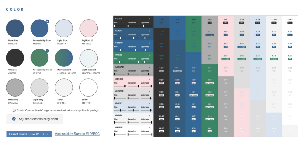
The color selection process involves adjusting inherited color charts and style guides for accessibility, considering not just individual color accessibility but also how combinations perform at various font sizes. You can create a chart to determine which color and font size combinations meet accessibility criteria, providing a foundational guideline for accessible design.
Designing for Developer Needs
- Hover and active states
- Keyboard/screen reader focus order
- Layouts across screen sizes
- Clear heading levels
- Visually hidden headings for sections/menus
- Icon alt/hidden text
- All form elements and common HTML elements
Development Principles
- HTML5 elements with implicit roles rather than ARIA attributes. HTML5 elements generally offer inherent accessibility features, whereas ARIA is seen more as a workaround or a patch for accessibility issues
- Leverage elements for expandable elements
- Pay extra attention to navigation and page structure
- Computers are not good at ensuring accessibility. Overlays and AI often fail to make sites more accessible and can sometimes obscure content or functionality
- Use code that is proven to be accessible, like WordPress and Drupal
- Do not trust common libraries to be accessible
Sustainable Content Editing
- Define sections for proper heading structure to make it easy for content editors to add separate sections wrapped in an H2 tag to provide a clear structure for screen reader navigation. This practice helps screen readers navigate through the page using H2-level headings as landmarks.
- H2 section headings as required fields. There’s a common tendency among content editors and site owners to omit headings for visual clarity, as certain sections, like calendars, may seem self-explanatory. However, for screen reader users, these omitted headings can result in a loss of context. To counter this, the suggestion is to require headings in the content but offer the option to visually hide them, ensuring they are still accessible to screen reader users.
- Restrict the WYSIWYG (What You See Is What You Get) to H3s and below
- Insert images via the media library and standardize the use of alt text, an essential feature for screen readers, and can be set up to require alt text for all images.
Governance
Governance refers to a set of rules, agreements, and conditions tailored to an organization’s size and structure, akin to how governance varies for different geographical entities like countries and cities.
The involvement and support of top-level management is crucial. Leaders at the highest level must openly affirm their commitment to accessibility. If such support is lacking, it becomes essential to educate and create pathways for these leaders to understand and back accessibility initiatives. These pathways are also vital in preventing operational silos, fostering empathy for users, and encouraging a collective effort towards the goals.
Education plays a significant role in reinforcing peer support and nurturing the growth of accessibility practices. It’s important for individuals within an organization to feel part of a larger, caring community. This sense of belonging and mutual care is key to the success of accessibility initiatives.
Policy reinforcement is another important aspect. The culture of accessibility needs to be backed by written policies to ensure its persistence. Similarly, content governance processes must be adhered to for embedding accessibility into organizational practices.
Content Governance Tips
The strategy should include making content accessible to a diverse audience, including individuals with various disabilities and situational limitations.
Emphasizing plain language and using tools like Hemingway and Flesch-Kincaid to assess readability are recommended. Ensuring content is understandable at an eighth-grade reading level can make it accessible to approximately 80% of Americans.
Some practical steps are gatekeeping inaccessible PDFs, creating guides for crafting meaningful alt text, deploying automated monitoring solutions, and preferring manual over automated translation for cultural sensitivity.
Artificial Intelligence
Despite advancements in AI, especially in translation, there are significant limitations due to AI systems’ lack of emotional understanding and contextual awareness.
Several years ago, there was hope that AI could assist large institutions with vast collections of untagged images. However, experiments conducted three to four years prior revealed deficiencies in AI-generated alt text. The primary issue highlighted is AI’s inability to comprehend emotional nuances and context, which are often critical in accurately describing images.
More tools and platforms are now incorporating automated alt text features, like Content Management Systems (CMSs) and even Microsoft Word. These tools often promote their AI capabilities for generating alt text, suggesting a trend toward automation in this field.
However, you should be cautious against over-reliance on AI for alt text generation. This statement underscores the challenges faced when using AI for tasks that require a deep understanding of context, nuance, and emotional subtleties, which are essential for creating meaningful and accurate alt-text descriptions. Find this example below.

Human-Generated Alt Text: Large pink flowers with green leaves and thorny stems digitally manipulated into the side profile of a statue against a black background.
AI-Generated Alt Text: A close-up of a flower.
In Conclusion
- Incorporate accessibility throughout your redesign process
- No one testing method is better than another; multiple are needed
- Every automated test is different, but all are verbose
- Heuristic analysis helps reveal usability-focused issues
- User testing is ideal with specialized organizations
- Prioritize and address accessibility issues once found
- Content governance is foundational
- AI canʼt solve all your problems
Presentation Resources
- Captioned video demo of how the previous VaccineFinder.org website passes automated tests but fails screenreader and keyboard navigation
- PDF of our favorite tools to test and address web accessibility issues
- Kalamuna Blog
Transcript
>> CHRIS HINDS: Welcome to episode 049 of the Accessibility Craft Podcast, where we explore the art of creating accessible websites while trying out interesting craft beverages. This podcast is brought to you by the team at Equalize Digital, a WordPress accessibility company and the proud creators of the Accessibility Checker plugin.
This episode is a recording of a December 2023 WordPress Accessibility Meetup where the CEO and Senior Architect at Kalamuna Agency share tools and tactics that can help organizations of any size become more digitally inclusive, and to start thinking beyond just WCAG compliance. WordPress Accessibility Meetups take place via Zoom webinars twice a month, and anyone can attend. For show notes, a full transcript, and additional information about meetups, go to AccessibilityCraft.com/049.
And now, on to the show.
>> AMBER HINDS: Andrew Mallis is the CEO and co-founder of Kalamuna, a Toronto/Oakland, California-based digital agency that partners with socially impactful institutions, associations, and governments to help them solve today’s most pressing problems.
Mike McCaffrey is the Senior Architect at Kalamuna. Whether he’s thinking strategically about business requirements, tracking and prioritizing user stories, solving complicated design problems, analyzing metrics, or releasing new features, Mike finds the most straightforward and efficient means to pave the path into the fourth dimension.
So welcome, both of you. I had the honor of meeting them at WPCampus this year, and I was excited to chat with them quite a bit there and at a jazz club afterwards in New Orleans, which was nice. And I’m excited to hear you all present.
I’m going to stop sharing. I’ll let you take over. I will be watching the Q&A. If you have any questions, please put those in the Q&A Module. It’s a little bit easier for me to track than the chat, and then we will answer most questions at the end of the session.
I do see someone has their hand up. If you want to DM me in the chat, then I can address your question.
So let me stop sharing.
>> ANDREW MALLIS: Great. That should do it. Yes?
>> AMBER: Yes.
>> ANDREW: All right. Well, it’s great to be here. Thanks, Amber and team, for animating this community and for the opportunity to speak with you today.
The title of our talk, as mentioned, is “Beyond WCAG Compliance,” which most of you know stands for the Web Content Accessibility Guidelines. We’re here to talk about what it really takes to build inclusive experiences, and how we can commit to those goals.
My name is Andrew Mallis, I’m the CEO of Kalamuna. My pronouns are he/him. I’m a six-foot tall man with shoulder-length dark hair, and a short beard, although my avatar still displays a mustache.
I’d like to introduce my colleague, Mike.
>> MIKE McCAFFREY: Yes, I’m Mike McCaffrey, he/him. As Amber said, I am a Senior Architect. I’m also a large man, six foot, three inches, though, slightly taller than Andrew. I’m a white guy. My picture has glasses and a hat. But if you see me in the video chat, I look more tired, because it is 8am here and I haven’t had enough coffee yet.
>> ANDREW: [chuckles] We’ll fix that. Kalamuna is a digital agency, and we’re focused on working with mission-driven organizations, including nonprofits like the Environmental Defense Fund, American Foundation for the Blind; educational institutions like Stanford and UC Berkeley; and many public utilities or government institutions, including a lot of transportation in the San Francisco Bay Area.
Kalamuna cares about web accessibility, and we believe the internet should be built for everyone, not for fear of legal action, but because it’s the right thing to do. Without diminishing the negative consequences of noncompliance, we really invite organizations and individuals to approach web accessibility with humans in mind. And we want to share with you some of what we’ve learned over the past decade-plus of doing this work.
We have a lot to cover today, and we’ve already gone through some introductions. We’ll start with some principles and move through different methodologies for site auditing and remuneration, which will then take us into conversations about design practice, and development practices, and how we can be more integrated in our approaches from the get-go.
We’ll speak about governance. And, you know, what talk these days would be a talk without a section about artificial intelligence, so we’ll touch on that, and conclude with some resources available to you to help empower you in your journey. Then we take some questions at the end, if not some along the way.
I’d like to start with some principles; they’re always important. Principles are foundational. And inclusion, you know, we’re talking about inclusion. Just to be sure we’re on the same page here, inclusion, it’s an organizational effort and practices in which different groups or individuals having different backgrounds are culturally and socially accepted and welcomed and equally treated. And this means that everyone, regardless of race, religion, age, gender, or ability is treated respectfully and equitable; and equity is really the key.
First, we have to recognize not everyone is equal in terms of their abilities. And when we can take steps to ensure that everyone is accommodated so they can contribute and participate, we’re much better off. And accommodations, you know, in the physical world include curb cuts and wheelchair ramps and auditory indicators at busy street crossings to signals it’s safe to cross. But basically, it means being inclusive. It’s about thinking how we can accommodate everyone, and giving the attention and energy required to ensure that people are treated equitably so they feel included in society. And sometimes those differences, they can be self-evident, or they can be inherent, such as, educational background, training, sector experience; or even personality, you know, thinking about introversion or extroversion.
Inclusion, it’s really a sense of belonging. And inclusive cultures, they make people feel respected and valued for who they are as an individual or a group, and that’s particularly important. It’s important to engage individuals.
Evidence has shown that when people feel valued, they function at full capacity, feel part of an organization’s mission. And it helps organizations succeed and soar. So really, we’re focused today on speaking about digital inclusion, which really is about designing applications and online content to enable and encourage self-sufficiency, participation, and collaboration.
Ultimately, I believe that as a society, we’re all richer through the diversity of perspectives. And that inclusivity ensures that we’re all richer in the experiences that we’re providing and that we’re engaging in together.
Compliance. You know, compliance does not guarantee usability. That is really a core tenant to what we’re talking about today. And organizations tend to focus a lot on conformance. So we’re a digital agency; we see this all the time. We get contracts back. And it’s great to see that organizations are more and more attuned to becoming accessible. But they try to sometimes put strict requirements in contracts that would, like, put agencies in breach if they don’t make a website accessible. But sometimes, not to knock the importance of conformance, but if we focus too much on test scores, that can risk descoping usability.
The reality is that no agency can really guarantee compliance. We work an open-source, and software ecosystems sometimes inadvertently can introduce issues on updates. And content editors, they can miss the mark, too. Alt text, it might be there, but really, is it descriptive? And, you know, there’s a button, but does the form submit? And that usability is really core to the experience that we’re trying to create. And we’ll speak a little bit more about why that’s super important.
We’ve previously demonstrated in presentations with our friends at the American Foundation for the Blind how the vaccine finder dot org website was, at one time, WCAG compliant, according to automated testing tools, but failed keyboard navigation and screen-reader testing, and I’ll give a link to that powerful demonstration at the end of this presentation for you. But, really, we shouldn’t let the fear of a lawsuit hold us back from focusing on what really matters, and that’s helping people achieve their goals.
What’s displaying here currently is an animated GIF that has a pink circle representing accessibility issues, a blue circle representing user goals that come together, while an arrow points at the overlap, like a Venn diagram, to indicate what matters most.
I’d like to pass it off to Mike at this point to talk a little bit more about site auditing and remediation.
>> MIKE: All right. OK, hopefully that is a seamless transition. Hi, this is Mike. I’m going to be talking about site audit and remediation.
Most web projects aren’t starting from a blank slate. I’m guessing you have an existing website if you’re looking at a presentation about next steps. And even if websites are built from the ground up to be accessible, we found that best practices tend to evolve over time. So even things that we built with the best intentions and best of knowledge, we find that there’s better ways to do it in the future. So it’s really useful to regularly review all websites in order to find opportunities to improve usability and accessibility.
Our methods for evaluating websites for accessibility tend to fall under three big categories. The first is automated scanning. The second is user testing. And the third is usability or heuristic analysis. I will explain what that is soon.
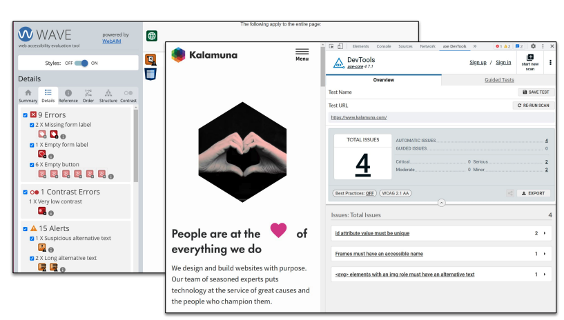
Let’s talk about automated scanning first, since that’s usually the first thing that people will think about when they start to work on the accessibility of their websites. As you probably know, being professionals, there are plenty of browser extensions. Those are some of the easiest ways to determine how accessible your website is, and most of them are free. There’s several popular browser extensions like WAVE and Axe Dev Tools that are great for finding issues with pages on your site. You can visit any page and have them quickly generate a list of things that you need to fix. They’re really great for identifying issues that appear on every part, every favorite page on your site, since you can look at just one page and identify issues with the header and menu and footer.
The downside of the browser scanning is that they might find too many issues. I know everyone’s used accessibility scanning tools and found a whole bunch of items, like hundreds and hundreds of items, and a lot of them are not terribly important. They find things that might be technically incorrect, but perhaps don’t impact any actual users.
My favorite example is, we use visually hidden text that uses some CSS to hide text off the side of the screen inside of a little pixel, but still leaves it available for screen readers. And scanning tools love to talk about the color contrast of the visually hidden text. So it’s one thing that we always have to address if we want to not have those errors in scanning tools.
The second type of automated testing is site-wide crawling tools. Those run the same sort of tests, but on many or all pages of your site. Because site crawling can be so resource-intensive, most of the site-wide scanning tools aren’t free, and they actually tend to be so expensive that they can strain your organization’s budget. These tools are really helpful for catching content issues on your site since they scan every page, and can be set up to do so routinely. They’re also valuable for content governance. They can identify when regressions happen; after things have been fixed, but then they break again. And they also help demonstrate improvement over time.
Most of the tools have a nice helpful score to show where you are in terms of accessibility, and make you feel good when you fix issues and you see the score go up.
We do have some cautions about using accessibility scanning tools. A big one is that no single tool actually find all the issues on your site. All the tools tend to run the test slightly different and seem to flag different issues, so you shouldn’t rely on any one of them. And even then, only about 30% to 60%, depending on different people’s measurements, of accessibility criteria can actually be tested automatically. And all the rest of them need to have time-intensive checklists that you need to go through. And even then, it takes a lot of effort to make all of the issues that automated tools find actually go away. You end up spending a lot of time addressing very tiny little things in order to clear your dashboard. And even after all that, and you’ve reached the total compliance based on the accessibility tools, that doesn’t really ensure the usability of your site at all.
Lastly, I mentioned the score that most tools provide. Scores are usually just some proprietary algorithm that compares your site against others, and it doesn’t actually represent the usability or user experience of your users.
The second group of site auditing practices we’re going to talk about is user testing. User testing is a practice that engages people, not robots, and tries to accomplish tasks. They try to accomplish tasks in your website and report back on their experience.
Just an overview of the user testing process. The first thing that we find most important is to determine high-priority user stories on user journeys. User testing is time-consuming and fairly expensive, so you really want to focus on what the most important things are to your users.
The second thing we stress is, have real-life people try to accomplish those tasks. You don’t want just the project team or highly-technical users evaluating the accessibility of your site. You want to try to get an outside perspective on the things that you take for granted.
The third item we stress is find users who use accessibility tools or require accessible features on a regular basis. Not only are they familiar with the tools and are able to conduct the tests, but they also know how your implementation might be different from common design patterns, and how users expect to see things.
The final thing is, you really want to get detailed feedback on how easy it is or difficult to achieve a goal. That really helps you prioritize your issues and how to fix them. And the most important thing, I think, is to find any roadblocks that keeps some of your users from accomplishing important tasks on your site.
Experience testers who could provide feedback using accessibility tools can be hard to find. Luckily, there’s some companies who provide user testing services.
For example, we’ve recently partnered with UsableNet to evaluate several sites. They’ve been doing a great job finding users who rely on different sets of tools to evaluate the different sites, and provide some very informative feedback.
The screenshot on the screen is an overview showing the overall level of success users found when we conducted a five-user journey test on one of the sites. For those who can’t see, it has a completed and non-completed, showing most of the tasks could be completed by four users, but one of the tasks could not be completed by one user.
Now, on screen, this is an example of a user journey for a project we recently worked on. For this client, having people reach the how-to-apply page and following instructions on their application process was one of the most important tasks that they could do, so we had them test that.
For your site, obviously, the highest priority item would be different. You might have people enroll in a course or donate or pay for something or fill out a contact form. Looking at the testing instructions, it helps to provide a little bit of background on where users are coming from so that testers can put themselves in the shoes of the users that they want to test.
The instructions says, “You’ll spend some time on the website learning all facts about the company. Now you wish to find out how to apply for yourself and your friends. Visit the how-to-apply page where you can find all the info.” And then it also has clear success criteria. “Task is considered complete once users review pages related to their procedures and checklist.”
These user testing tends to have a lot of feedback. For this most recent project, we tested five user journeys, and they generated a 61-page report. That means it’s really good to have a user testing partner who helps you prioritize the feedback. In this case, UsableNet was able to flag some very high-priority recommendations that had the biggest impact on actual users of the site.
Not everyone can afford to hire someone to conduct or participate in user testing. Some organizations might try to offload accessibility testing onto their users. That’s really not a good thing. You don’t want to rely on your regular users to identify or suggest fixes for accessibility issues, since it’s probably easier for them to decide to just not be your users. It also adds additional burden on users who are already having trouble using your site to have them go through additional steps in order to contact you about fixing things.
The one sort of exception to having users help with things are mission-driven organizations. Mission-driven nonprofits can usually ask for volunteers who support the goals of the organization and want to help in order to help review for accessibility. But for the most part, if you’re conducting user testing, it’s really great to compensate testers.
>> STEVE JONES: This episode of Accessibility Craft is sponsored by Equalize Digital Accessibility Checker, the WordPress plugin that helps you find accessibility problems before you hit publish.
A WordPress native tool, Accessibility Checker provides reports directly on the post edit screen. Reports are comprehensive enough for an accessibility professional or developer, but easy enough for a content creator to understand.
Accessibility Checker is an ideal tool to audit existing WordPress websites find, accessibility problems during new builds, or monitor accessibility and remind content creators of accessibility best practices on an ongoing basis. Scans run on your server, so there are no per page fees or external API connections. GDPR and privacy compliant, real time accessibility scanning.
Scan unlimited posts and pages with Accessibility Checker free. Upgrade to a paid version of Accessibility Checker to scan custom post types and password protected sites, view site wide open issue reports and more.
Download Accessibility Checker free today at equalizedigital.com/accessibility-checker. Use coupon code accessibilitycraft to save 10% on any paid plan.
>> MIKE: All right. The third practice that we use to identify usability and accessibility issues is to conduct a usability analysis, specifically a heuristic analysis.
If you think about accessibility in terms of usability, you get access to a whole toolbox of practices that have been pretty common in the user experience community for years that help you evaluate the usability of software and websites.
This quote on the screen is from Jakob Nielsen who came up with the idea of heuristic analysis. And it says, “Heuristic evaluation involves having a small set of expert evaluators examine the interface, and judges compliance with a recognized usability principles, aka, the heuristics.”
I mean, specifically the idea is to leverage expert knowledge, instead of blindly following checklists or recommendations of automated tools.
Heuristic analysis at Kalamuna starts with a standard worksheet that we copy for each client. It has categories with a bunch of items under each of heuristics to evaluate. The slide shows one example: how each item involves the title or name of heuristic, followed by a paragraph with reminders of what to review.
In this example, the item is contrast and text size. “Contrast and size allows text to be read clearly.” And then the paragraph says, “Review common pages to find different text styles and foreground/background color combinations. Ensure there’s enough contrast between foreground and background colors. Identify small texts that is not legible where contrast is even more important. Hover over links and buttons, see if those styles provide enough contrast.”
Note that these reminders aren’t a checklist. This paragraph is just there to jog the memories of people about things that they need to test, and also help the different evaluators know where to put different feedback.
In this process, we have several designers and developers go through the site, viewing through the lens of each one of these heuristics, and they note both the positive findings and the issues that they discover.
Having several people manually go through the site is in some ways less thorough than automated testing, since it obviously doesn’t review everything and look at all the code, but it really is faster and broader, and can cover more pages and features efficiently. The process does require intuition and experience just identifying common issues that people make when building websites.
The broad categories that we look at when we’re doing heuristic analysis. The first is visual perception, like that contrast example. Navigation on the site through mouse, keyboard, mobile, screen reader, and voice control. Robustness, which is something that accessibility audits tend to usually miss, and that’s basically what happens if JavaScript doesn’t run, or some resource on the page is not available, and whether the site is still navigatable and comprehensible. And then cognitive considerations, which is basically looking at both content comprehension, which is a pretty common thing, but also ease of wayfinding, and how easy it is for users to understand how to get through the site, and where they are at any one time.
If you want to conduct your own heuristic analysis, there are pros and cons. The pros is that it’s very efficient. Actually, we found the most efficient use of people’s budgets is to have several experienced developers and designers review the site and find the glaring accessibility issues, rather than trying to run through an automated test that delivers hundreds of things at the same level of priority.
Heuristic analysis is focused on usability, like, you’re trying to use the site, just like with user testing, and discovering usability issues rather than strict compliance issues.
You can use automated tools. When we’re doing heuristic analysis, we do use automated tools to review the site and just see if they find anything, usually browser-based tools, but it doesn’t really depend on any one tool.
The cons of heuristic analysis is that it requires expert knowledge. You need to have someone who actually knows what accessibility entails for websites. It requires multiple reviewers to catch most of the issues. If you have one person look at a site and determine the accessibility, they’re going to miss some pretty obvious things. So we try to have at least two to four people review the website in this heuristic analysis form, and then we compile all the results into one.
I know that in the UX world, there’s been some tests about reviewers, and they found that four reviewers is the ideal; and then after that, it tends to have diminishing returns. But you need at least two to four reviewers in order to catch the majority of the issues. It isn’t comprehensive like the automated tools that review every item on your site and make sure that everything… So it’s less focused on legal compliance, and more focused on usability.
Not every organization can afford to do a full heuristic analysis. You might not have experts on hand or the budget to hire them, but that doesn’t mean you can’t try to do some of it yourself. We encourage everyone to try to use accessibility tools. It’s really easy to just tab through your site using a keyboard. You can look to make sure that there are focus states on all of the links and buttons, and there are no keyboard traps.
Try a screen reader. We use NVDA on Windows and Voiceover on Apple products. It can be intimidating when your computer just starts yelling things on your screen at you, but if you quickly research what the controls are, you can navigate through pages.
You might not be able to find every issue if you’re not an expert in using accessibility tools, but you can definitely find some very obvious problems.
>> ANDREW: I want to emphasize the importance of keyboard navigation. A lot of the tools that are used in assistive technologies have, as their foundation, the same kinds of underpinnings that are inherent in keyboards. And if a site is navigable via a keyboard, there’s a very, very high probability that it will be navigable across a broad range of assistive devices. So really do start with the keyboard if you can.
>> MIKE: All right. So we’ve talked about identifying accessible issues, and now we need to figure out what to do with them. This slide says, “Prioritization and Remediation.”
Why is prioritization important? Well, every project has limited time and resources, and you really can’t fix everything. There’s no end to the accessibility issues that you can find on a site if you keep looking. There’s always another one to uncover. They usually get increasingly small, but it’s basically endless. There’s always improvements you can make to every pattern and component to make it more accessible. It’s really important to identify major roadblocks for some users that might keep them from accomplishing things at all. And some of the user journeys on your site might be used more frequently by users, or might be more important than others. And there might also be some quick wins where small amounts of work can really yield large results.
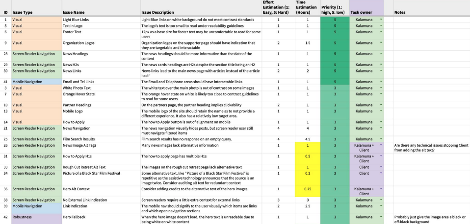
When we’re prioritizing accessibility issues with our clients, the screen here shows we just usually throw all the issues we find into a Google Sheet and categorize them by issue type along with an estimate of the amount of work it needs, and the client helps set a priority based on user benefits and also flag quick wins. And basically, that lets us quickly sort all the usability issues by these various metrics.
When working with clients, we try not to overload them with more technical things like the actual WCAG success criteria. We’re really trying to educate and empower the site owners, and get them to focus on the outcomes for their users.
Just some common high-priority issues that we find that lots of sites have and should really address as quickly as possible. As Andrew mentioned, keyboard is one of the highest ones, and making sure that the focus has visible states and all the links and buttons, and that there are no traps, where you tab through part of the page and then get stuck and can’t get out.
Site navigation. Honestly, when doing themes in front-end development, it feels like working on the site navigation with the menus and dropdowns and links and mobile navigation is like at least half the work. One thing that websites tend to get wrong is that they think of the mobile navigation as something that is just used on mobile devices that use touch. But really, when you think about it, the mobile navigation is also for any device that has a really small screen, a really small window, so keyboard navigation really needs to work on those as well.
Lots of sites miss basic things like having HTML regions for screen-reader users, and it’s really a quick win just to go in there and throw, like, header, main, and footer regions along with nav regions and sections so that screen readers can navigate between them when they’re looking for it. And a really big one, which is really hard to drill into some content editors is, it’s really important to have good heading structure inside of your content. You really need to follow the hierarchy of H1, H2, H3, H4 just so that screen-reader users can tell what contents and what section, be able to navigate the page since heading navigation is one of the primary ways screen-reader users navigate through your website.
Another big one is pop-ups and banners, especially now that we have all the cookie banners and email pop-ups. They aren’t always navigable by keyboard users. Sometimes they have to tab through the entire page to get to that banner at the bottom of the screen. And screen-reader users, they might not realize that there’s been a pop-up, if it’s not announced properly, and might wonder why they’re stuck in some email sign-up form rather than the actual page they’re trying to look at.
Then obviously, the perennial issue of people putting text in images, which is not good, because even if you include alt text that includes the text that you have in the image, there’s usually a better way to present that to users.
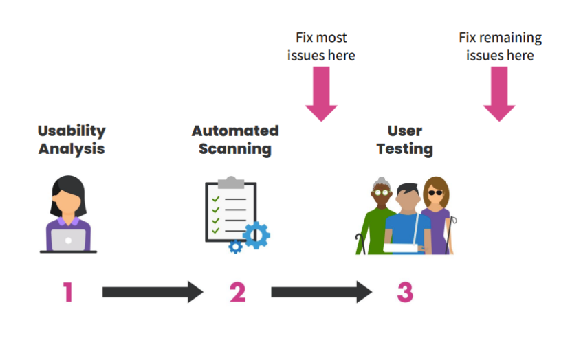
In terms of when to fix things on your site, when we’re doing our accessibility review and remediation process, we tend to do our usability and heuristic analysis and automated scanning first together, and then we try to fix most of the issues there.
Lastly, we do user testing. Since user testing is so time-intensive and requires people to manually write down all the problems that they see with the site, you don’t want to waste their time or your time with them documenting issues that you already know exist. So if you’re going to be user testing, it usually pays to do a round of automated scanning or internal usability testing first, and to resolve those issues so you don’t revisit the same thing again and again.
This is you, Andrew, now.
>> ANDREW: Thanks. All right. Now, what if you are building a new website from scratch? It does happen. It happens every day. How should you approach accessibility?
This diagram describes the different phases of our client projects and may reflect many similar types of website project experiences. Incorporating accessibility considerations into your process ideally starts at the very beginning. This works best for new projects like site redesigns, but it can also work for new features. So during a discovery in which we’re trying to derive insights, like the who, the why, the what, and really the purpose of what we’re trying to achieve, we want to define our user types and their goals, and this is super important. It sets the stage for the entire project. It’s really critical to incorporate user goals that identify accessibility concerns.
For example, we might have a user type or a persona that represents people with disabilities with specific goals that turn into user stories, like navigate the site using a keyboard. And during the design phase, which is an iterative process, this also includes content strategy, and often content production. We find that incorporating those concerns… Where we incorporate those concerns we previously identified.
For example, content can be structured semantically while it’s still in Word or Google Docs before the site is getting architected. And wireframes can take into account things like labels, menu structure, wayfinding, and important interactive elements. And once we get the visual design, we look at things like color contrast, UI elements, like inline links, focus states, and consider progressive enhancement techniques for any motion, including animation and transitions.
Then when we’re prototyping components, we have another opportunity to test our designs. Whether it’s a low-fidelity clickable wireframe or a fully responsive HTML and CSS prototype, we can test with real users to flag potential issues before building them into the final product. And we do really like the in-browser testing because it uses the native medium of the web, which allows for the use of those assistive technologies and the ability to get really accurate feedback, particularly for navigation, where many of the accessibility issues can be found.
Now, the end of the project is not the time to start thinking about accessibility. Think about it like if you’re building a skyscraper and you wanted to put an elevator in it. The thing about adding that at the end is it’s pretty hard, right? You want to think about your accommodations and your accessibility goals much earlier and build them in from the start.
It’s also really useful if everyone on the team, including your content producers, and your designers, your developers, your project managers have a basic knowledge of accessibility concerns; and if not, then at least one person should really be knowledgeable on the team to help guide people through this process.
Design follows certain principles as well. We want to make sure that we are designing with usability in mind from the start. It’s useful if you are targeting a certain level of compliance or a general set of ideal outcomes. To identify an accessibility target like WCAG AA is most often what we see used, and of course, higher when possible.
Documenting and validating design choices along the way, very important. Graceful degradation, progressive enhancement principles, and how those are approached. And having strategies for motion reduction from the start, also really, really key.
You don’t want to build a whole thing and then figure out how to make it accessible later. Really think about those things from the get-go.
This is an example of how design can be approaching accessibility early on. We often inherit, like, color charts, color, style guides. Less so now, but still, some colors are not accessible on their own and so we need to adjust those. But even if those colors do become accessible on their own, it’s not a given in combination at all font sizes they will be legible. And so we put together this chart that shows what combinations at what font sizes pass different criteria and what fail, and this allows for a general set of guidelines from the beginning in how designs are being approached. Certainly, you can test for these things in the browser later, but understanding, foundationally, how to approach design is very important.
We also want to design with developers’ needs in mind. That means designers need to think about what the hover and active states are going to look like, and how keyboard and screen-reader focus order is going to manifest. Thinking about how layouts are going to move across different screen sizes. It may not be obvious. And leaving that for developers to improvise could be very impactful.
If you have a sidebar, it may drop below, but where that renders in the document object model, the order of how the screen reader is going to approach things should be defined earlier in the design stage as well.
As Mike mentioned, clear heading levels, making sure that our sections and menus all have headings. Some of them can be visually hidden, but we want to identify these landmarks and consider, in the design process, what alt text is going to be needed for any iconography that is used as well, not sort of leaving that till later. Make sure we’re defining all those common HTML elements.
From a development perspective, I don’t know, Mike, if you want to speak to this a little bit? It’s more your backyard.
>> MIKE: Yes. I mean, this is just sort of a random assortment of development principles that we’ve put together.
A big one is just when you’re writing HTML, try to use HTML5 elements rather than relying too much on ARIA attributes. ARIA, in my view, sort of is a band aid or a duct tape on your code to try to make things accessible when there’s lots of HTML5 native things that are automatically accessible. We tend to be leveraging the details element a lot for a lot of functionality just because it works without JavaScript, and hides and shows content very well. It behaves like a button.
As Andrew said, we want to pay extra attention to navigation and page structure, just so people can obviously navigate the site. And we’ll get to this in questions and answers because there’s a lot of AI things, but computers are not great at ensuring accessibility. Overlays tend to not work at making sites more accessible. They just tend to obfuscate things. We encourage people to not build things from scratch whenever possible, and that’s where using open-source software like Drupal and WordPress really helps because accessibility is baked into them.
The other big thing is, when you’re using custom frameworks, especially things like JavaScript slide shows and stuff, don’t trust them to be accessible. Even if they say they’re accessible, they’re often not accessible. We’ve had terrible times finding an accessible slide show or accessible widgets, just because they all seem to miss some very, very basic functionality, like labeling the “next” and “previous” buttons. So any recommendations on accessible slide shows are always welcome.
>> ANDREW: Yes. We brought some accessibility improvements to Bootstrap back in the day. So when we do find those issues, it’s important to contribute them back to the community so all can benefit.
>> MIKE: You want me to do this one as well?
>> ANDREW: Sure.
>> MIKE: Yes. I’m not a WordPress expert. [chuckles] I’m more of a Drupal person. When I’m building Drupal sites, I want to make sure that, in the content editing experience, it’s really easy to add separate sections to help ensure proper heading structure, and you’d wrap each section in H2 where it requires that a title be set. So each screen readers have, like, H2 levels to go through the page. I’m not sure if there’s an easy way to require that in WordPress as well.
Content editors and site owners tend to want to omit headings in some parts of their site because, visually, it’s very clear on what the thing is. If there’s a calendar, you know, it’s like upcoming events, but screen-reader users don’t have that context. So if you’re going to have a way for users or content editors to omit headings, sometimes it’s better to just require headings, but allow them a checkbox or something to visually hide the headings.
We also tend to restrict any whizzy wigs to, like, H3 and below so that under each of the H2 headings, they can only put H3s and below. It doesn’t ensure that they follow H3, H4, H5, but it at least helps, again, make sure that those H2 levels navigate through the page. We have them insert images via media library whenever possible, rather than just pasting images individually, just so you can ensure that there is common alt text, and make alt text required when adding images to the page.
>> ANDREW: Well, how do you make all this happen, or keep it from falling apart? Governance is really key. Governance is a system of rules, agreements, and conditions that we set to ensure success. And governance characteristics are dependent often on your organizational size. You know, the way that we govern country, cities, and states, provinces are very different and so, too, how organizations are put together.
One thing that I would just really emphasize is that we always require a champion for accessibility to be successful within an organization. Anyone that’s worked in perhaps a corporate setting or an office building may know there’s usually a fire marshal who’s designated. Maybe they have that little fireman’s hat on their desk, and you run the fire drill, and they’re kind of the champion of these safety efforts, and so, too, is an accessibility champion required internally.
You also need buy-in from the top. That’s really key. At the very top of the organization, it’s very important for someone to affirm commitment to accessibility. And if you don’t have that, and you do have an internal champion, it’s really worth spending the time and energy to educate and create pathways to knowledge that will allow leadership to get behind these issues. Those pathways to knowledge are important as well to avoid silos, and empower everyone in understanding the goals and outcomes that are being sought to build empathy for users and motivate people to speak to them.
Education can also reinforce peer support and the growth of a practice. And everyone likes to feel a part of something larger, and as we’re getting better knowing that others care about our success is really valuable.
All of this intent, it needs to be reinforced. The culture needs to be reinforced through policy. And having words and writing, that’s really key.
Content governance processes as well needs to be followed in order to enshrine accessibility into those practices.
A few tips in your content governance strategy. Really making accessible content means having a wide range of people being able to use it, including people with physical and cognitive disabilities, from reading disorders, attention deficit disorder, memory disorders, and accessibility as well. It can also be situational, like, in a crisis, or someone’s just in a library and they can’t listen to sound. So that’s really, really key.
When you’re writing, emphasize plain language. Tools like Hemingway can help you visualize this. Looking at Flesch-Kincaid, which is an algorithm for the grade reading level of your content can be really valuable. If you’re able to hit an eighth grade reading level, that reaches about 80% of Americans, and that’s super important. Again, it takes that buy-in from the top and those policies to reinforce this.
I was talking to someone in government, and they had written a whole bunch of stuff, and it came back to their manager, and they were, like, “You have to rewrite this. It’s not government-y enough.” They’re deliberately trying to make the language less accessible. And that’s just a hard thing to combat in a reporting structure unless you have some of these foundational principles to draw upon.
Right for inclusivity. And that includes inclusivity of gender and all kinds of broader principles as well.
Institute gatekeeping for posting inaccessible PDFs. You might have some bad stuff up there, but just stop it today. Don’t allow PDFs to go up on your site if they aren’t accessible. And try to fix what you can, take down what’s unnecessary. Have guides and documentation for crafting meaningful alt text and more. Deploy some automated monitoring solutions that can report on changes if it’s possible. That will allow you to catch things before others experience them. And invest in manual versus automated translation whenever possible. It introduces more cultural sensitivity.
AI has improved vastly when it comes to translation, but there’s still a lot that it misses. And speaking of artificial intelligence, I’d like to bring a little bit more focus to what’s been emerging here, particularly when it comes to alt text. We had much ambition many years ago that we’d be able to use AI to help large institutions that had a plethora of images that were unaltered. And so we did some experiments three, four years ago, found some deficiencies. And because AI lacks emotion, it’s missing context. And more and more tools are introducing automated alt text now.
Digital asset management systems, CMSs. Microsoft Word now has this stuff baked in, and sometimes it tries to push it on you. You know, there are other opportunities here. We’re doing some cool stuff with AI, but I wanted to just focus a little bit on a few examples of where alt text can fail with the robots.
So in this photograph, the alt text that a human had written says, “A fashionable person with style, white hair, wearing bright makeup and dark blue clothing walks in front of a brick building [Inaudible 00:57:30].” And the AI says, “A person in a garment,” which represents virtually everyone on a website. Well, not some websites, but the websites that we work on. And fortunately, the AI didn’t assume anything about a person’s gender, which is positive, but it’s just so bland that it really doesn’t describe anything.
There are a lot of optical illusions; that picture of, like, “Is it a face?” “Is it a rabbit?” Here’s a similar example. A human has described this image as large pink flowers with green leaves and thorny stems digitally manipulated into a side profile of a statue against a black background. The AI sees “A close-up of a flower.” So all that context is missing that nuance. If you saw the silhouette, AI didn’t.
In this photograph, human alt text says, “Steve Jobs at Macworld 2008, unveiling the new MacBook Air.” And the AI thinks it’s “A man in front of a crowd.” Again, very generic.
Now AI is evolving, and the right model could certainly leverage facial recognition, perhaps grow in this context. But today, your mileage may vary.
One last example, this one drawn from Duke University Libraries. This is a rare 18th century Ethiopic scroll presented partially unfurled from its archival storage. But Microsoft Word and all its goodwill has identified this as a roll of toilet paper. I do not think that’s accurate. And so the university has decided to disable this feature more permanently. And that isn’t to say there isn’t opportunity here. Don’t get me wrong. But personally, I would like to know, as a user, what’s been generated and what hasn’t.
Things are moving so quickly that everything gets flattened. Once we use AI to generate Alt Text, it gets put into code, and we can’t really tell what’s human, what’s generated. I feel like we need some more declarative features on our websites to be able to say, “Hey, this was generated.” And it might give an opportunity for another plugin to regenerate something using a newer technology. But we’re anchoring a lot of these solutions as we’re hungry to fix things perhaps in a way that, two years from now, might be like a real setback.
So again, not to dissuade people from exploring these technologies, but do so mindfully, looks at the real outcomes, and move beyond compliance to think about usability.
In conclusion, we’ll get to some of the questions here. Incorporate accessibility throughout your redesign process. It’s very important. Don’t just wait till the end. And remember that no one testing method is better than another. Multiple are needed in combination to get as broad and efficient coverage as possible. Every automated test is a little bit different, but all of them are verbose. And an antidote to that can be heuristic analysis, which helps reveal usability-focused issues. User testing, it’s ideal with specialized organizations. And again, when many issues have already been addressed, prioritize and address accessibility issues once they’re found. Don’t just let them sit there; engage actively in that.
Content governance is foundational. And once again, AI can’t solve all your problems. At least not yet.
We’d like to share some resources available to you. This is a bitly link, at slash A11Y-VFD of a demonstration. It’s a nine-minute long video on YouTube that is captioned of the Vaccine Finder dot org website at a point in time. They have since improved the usability and accessibility of this website. But it demonstrates really clearly how a mouse-style navigation of the site works, where keyboard traps exist; and lastly, how a screen reader moves through and has difficulty in some areas that might be unexpected to you. All along, the automated tools report very little wrong with this website.
This can be a very compelling demonstration for you to show, if you’re looking for that buy-in; how someone who might be higher up who just thinks, “Well, we just need to make everything pass the tests. That’s my level of accountability.” And once they can build empathy for that user experience, then we can move beyond that compliance piece.
We’ve put together a little PDF, which you can get at “Hello.kalamuna.com/a11y-tips.” It’s a little slow to load. It was built in some open-source stuff that’s getting a little long in the tooth. So please be patient if you’re looking to download it. But in this PDF, it compiles a number of resources, and tools, screen reader tools, plugins, contrast-testing tools, a cornucopia of various methodologies that you can leverage as well for making PDFs accessible. It’s a useful resource, we hope, at least.
Lastly, if you visit our website at “Kalamuna.com,” and you are design-oriented or even design-curious, we recently published a very comprehensive article on our blog that lists a number of free plugins for Figma, which is a wonderful collaborative design tool that we and many other organizations leverage. So free Figma plugins for accessibility design. This was authored by our director of design and user experience, Crispin Bailey; and a senior UX/UI designer, Eugene Park.
I want to thank everyone for your thoughtfulness in our accessibility journey. And we’ll bring it over to, I guess, the questions at this point.
>> AMBER: Yes.
>> MIKE: Can I start while you review the questions, Andrew, since you’ve been talking?
>> ANDREW: Yes, yes.
>> MIKE: OK. We have one question in the chat that I want to get to first, and then we can go through the question and answer in the interface.
Marine [phonetic] asked: “Can Mike explain again the contrast issues that arrive in WAVE for icons, i.e. Facebook, that tells me it’s a contrast issue I cannot find?”
We have basically started to avoid using, I guess, the other thing. Yes, we’ve basically started, at least personally, to avoid using images anywhere but in the content. Anything like icons, we tend to use SVGs for, and then put visually hidden text next to it. That tends to avoid some issues around all text. So we encourage that. I’m not sure why your specific thing is flagging the color contrast, but again, there usually is… And this is where automated tools are kind of annoying, is that they would flag something as, like, an icon is not having enough contrast, even though they obviously do.
>> AMBER: One thing that I’ve noticed sometimes is some automated tools, they check what’s in style sheet, but they don’t always know what’s actually… Like, if you have multiple instances, it might be, like, well, the first one was white on light gray, and that would fail. It was actually overwritten by another instance of CSS lower. But it’s going to flag the first one, which you can’t see, just because it happens to exist in style sheet because it doesn’t know which styles are actually being output on the page. I’ve seen that with some tools. So that might be why she can’t see it, even though it’s flagging it in WAVE.
>> MIKE: Yes. Another question that’s kind of very detailed is Mark asked about the recommendation for using the details element, specifically around the recommendation that you shouldn’t use it because headings aren’t navigable in it on some tools? That’s pretty much been resolved. People are saying not to use details elements because if you put a heading like an H2 inside the summary tag, some tools would not go to it if you’re navigating by heading. And that’s been increasingly less of an issue over time, and most tools now will go to the heading if it’s in a summary. So I would say that reason for not using details elements are not there.
In fact, details elements have just gotten better and better, and now browsers will actually open details elements automatically if you’re finding text within a page. And that is if your user is searching for a text in a page and it’s inside a details element, the browser will just open it and jump down to it. Whereas if you have any sort of manually activated disclosure element, the finding page won’t work for it. So it’s like I see the advantage of the details element over other disclosure elements or disclosure patterns. It’s clear now; just use details. [chuckles]
>> AMBER: Great. Here. I can run through some of the questions. There were a few related to AI, and I think maybe it makes sense to start there, since that’s sort of where you ended, and then we’ll go back through.
So Marcia had asked: “Do you think AI will increase the percent of issues found?”
I’m thinking on like automated testing. As it gets smarter, will it find more problems in automated testings, do you think?
>> ANDREW: Sure. But what do you do with the problems is the question, right? And how did those problems arise to begin with? So again, this question of compliance, it’s very useful to know. But it’s like saying, “If we put speed cameras up, will it catch more people speeding?” Well, yes, but the origin of the speeding is the person behind the car driving. And so if the behavior changes, then maybe the monitoring may not become necessary in the same way.
I think AI is getting more and more sophisticated. And the more that we can train it into identifying false positives, the more useful it can be. I think there are many tools that are overly verbose, and they can be imposing for end users, especially trying to get into things. And that’s a really valuable endeavor. We can’t expect expertise out of the gate. And the entry point into addressing accessibility issues, the on-ramp needs to be smooth. And I think AI can really help assist people in navigating and understanding the root causes of things, or potentially how to go about fixing things. And it can get more intelligent once it connects the origin as well of how that HTML and JavaScript and CSS was produced.
A lot of scanning tools are agnostic as to the platforms that they came from. And it makes it a little bit hard for potentially a content person to go back and speak to a developer in a way that’s giving them some pointers about where maybe to look or where things may originate from. So there’s definitely opportunity there, but it’s still going to take some work. And the speed of AI processing is also getting more and more impressive, and that can be a huge boon to more sophisticated crawling. But reaching 100%, again, I don’t think we should stay focused on the scores so much as the goals and usability. If we do that, the scores will take care of themselves.
Again, WCAG is a series of guidelines, and they’re guidelines deliberately for a reason, because we all understand that sometimes there may be certain sets of conditions that create exceptions to rules.
>> AMBER: Yes. I think it’s almost like if we wanted to be able to say, “Well, automated tests can, you know, increase that percentage from 30% to 85%,” we’d have to train AI, if AI were going through and doing that to understand and be able to interpret a website like a user does, which is very different from, you know, just following literal HTML rules and checking against them, right? So if I encounter this thing, my next step would be to do why, right? And I think until we do get AI to do that, it’s hard to imagine removing a human from the testing process.
>> MIKE: I was just going to say, we have three different questions about alt text, and what you should write for alt text and guidelines. I think we have some tools, which I don’t know what they are off the top my head, that we sent to some content editors and stuff about doing alt text. But I’d say, my personal recommendation is to think about why you’re adding the image to the page.
I know that people are asking about, like, screenshots, and what do you describe. And really it’s, you know, when you learn to write in middle school, they’re, like, “Write a newspaper article,” like, write the most important things or least important thing, and the same thing works with alt text. So think about what the most important takeaway is when someone actually looks at an image, and then perhaps some additional details rather than trying to describe everything. I would say context is important.
Like Andrew had that image of Steve Jobs giving a presentation. And it might be important if it’s an article about the history of Steve Jobs, like, delivering something, like, “This is the first time Steve Jobs showed this computer.” Whereas if it’s an article about how Steve Jobs got himself killed by not getting cancer treatment, you wouldn’t really care what computer he’s holding.
>> AMBER: Yes. So a follow up question on that, and maybe you can share your thoughts. So FJ [phonetic] had asked specifically about using colors, vantage point, texture. And FJ said: “My thinking is that such descriptions might be meaningless to a blind a or low-vision or a color blind person,” although a color blind person is probably not engaging with all the text. And so they’re wondering, are they overthinking the issue?
Do you have some thoughts on that, about describing color in alt?
>> MIKE: Yes, specifically because I’ve seen some people who were visually impaired actually answer this question. A significant number of people who are blind were not always blind and remember what colors are. So obviously it helps them to visualize it if they were previously sighted. But then, yes, I saw someone answer the question who’s been blind from birth, and basically just describing how they understand color. And they have a nuanced understanding of color as a concept and what color means. So yes, include color. I don’t think anyone minds it. I don’t think you’re wasting anyone’s time. I think it’s helpful for everyone.
>> ANDREW: That’s a matter of equity as well, right? If everyone understands they’re wearing a blue sweater, but then someone who’s blind does not; and then later, there’s a reference to a blue sweater, then they’re sort of lost. So it’s important to create that kind of context.
>> MIKE: At the same time, you don’t have to describe everything on the off chance that someone mentions it. Like, Andrew has a very nice orange sweater on that we haven’t mentioned. It has kind of an asymmetrical collar, and looks very chic.
>> AMBER: [laughs] But maybe it’s not relevant to your understanding of him as a presenter in this situation.
>> MIKE: Yes. Look at those buttons.
>> AMBER: So on the alt text topic, Mark was following up on your comment that you had suggested perhaps requiring alternative text in the CMS. And Mark said: “I’m sure you know that requiring alt text can lead to people including unnecessary alt text for decorative images such as icons, or putting bad alt text in to avoid the requirement.” He says he’s seen, “image before” with a sad face emoji.
Do you just feel like it’s better than missing alternative text? Or do you add a checkbox that people can check to indicate that it’s decorative? How do you approach that if you’re going to require alternative text?
>> MIKE: My recommendation was specifically for content images and content editors. So images within the main body of the text. And if…
[crosstalk 01:15:55]
>> AMBER: Yes. I mean, that does get a little dicey in WordPress, though, because if you’re using the block editor, nowadays the direction WordPress is going is everything is in the content editor, right? And so there would be a lot of icons or even background images that are added that don’t really provide any visual importance, but are decorative.
>> ANDREW: It’s about kind of structuring that content in the block structures, where that material is going to be used. Requiring something, again, it comes down to content governance and education, requiring or not requiring it. You can get terrible alt text. So the act of requiring it is an opportunity for education and reinforcement of a policy.
It’s a broader governance question as to how to get the quality of that alt text improved. And simply requiring it, as people are going about things really quickly, it’s helpful from a governance perspective, not so much from a compliance perspective, right? But yes, the decorative nature, there are other ways of including decorative images. And starting to consider those helps to build a more semantic website and it helps to treat those differently from a programmatic perspective.
A lot of what we value in content management systems and in websites in general is a separation between presentation and content. That’s kind of come a bit full circle, again, with more live-editing features. And so we do need to think mindfully about how we’re approaching those matters, for sure. And it’s something we’re working through as well to help improve the editor experience and how we’re doing block editing here.
>> MIKE: One thing about decorative images also, [chuckles] it’s important to realize that being visually impaired isn’t a binary. There’s lots of people who can’t see very well. And there are some tools that let people mouse over items to see what they are. So even if your image is decorative, people might still be trying to access the alt text to see if it is important or not. For instance, if an image doesn’t load and people don’t know what it is, it usually is helpful to have the alt text there. So I would say, yes, include all text whenever possible, and structure your page in a way that images aren’t too obtrusive.
One great example is cards. Like, you got your little teaser card for a blog post or something like that, and usually the image is on top. And, you know, there is the recommendation that the content on the page should be the same as the content in the DOM so screen-reader users can see things in the right order. The one time that I don’t do that is for images and cards. So when screen-reader users end up on a card, they see the heading first, the text, and then it reads the image description afterwards.
So if images are kind of descriptive, but they might be important, just have them read out to screen-reader users after, like, the heading to deemphasize them.
>> AMBER: Yes. I think the last question about alt text was Gary had asked: “If the necessary alt text is too long, for the two to three sentence guideline, where would you provide that longer description? Do you use a long, discreet field, or linked text on the website, or put it below an infographic, like C text equivalent?” And he’s specifically referencing infographics.
>> ANDREW: Yes. Infographics are tricky, like, putting that in the long description is not as…
>> AMBER: And there’s not full browser support for that, is there?
>> ANDREW: And it’s not as great an experience. I think from an equity perspective, too, like, other users may be interested in what the alternative experience is, right? And so providing an alternative experience… We’ve seen this before. You have like a lot of complex data, and then it’s, like, see a more accessible experience, and, like, I was really interested in that because they showed, “Oh, well, actually, you know what?” These other users are getting a really small subset of the data, and so this is what their experience is. And then I can understand better how to communicate with users that are having that experience. Whereas if it’s kind of buried in that longer description, it can be less accessible to everyone.
Plus sometimes people are curious in the same way that they like to look at captions on video, an alternative experience to something that’s interactive.
Maybe you’re in a moving vehicle, you know, you can do the thing, and maybe you get the browser to read you the stuff. And people use different modalities for accessing information, so we try not to use too much of the long description if possible, and provide a different experience.
>> AMBER: Yes. I think a good solution for an infographic is, have very short alt text that literally says “infographic described below.” [chuckles] And have a written description on the page. If for some reason, you don’t want it to be visual text in the article, you could even put it in a keyboard accessible accordion so that it can open and close below the image. But honestly, if you think about SEO and all that… And a lot of people create infographics because they want people to share them, and they want them to be found in search…Having a full written explanation of everything that’s visualized in the infographic is only going to help you for making it available to everyone, I think, and not just people who are blind.
>> MIKE: Yes. Switching topics a little bit, Marine is asking about, “Many themes have H1 page totally hidden. If the H1 page title is displayed in the site tab and not on the page, can screen readers see the H1?”
I’m not sure about the implementation details of it, but there are ways to visually hide text. So obviously just inspect the element and see how it’s being hidden. If someone puts “display none” in the CSS, obviously, screen readers or visibly hidden screen readers usually can’t. Unfortunately, there is no display visually hidden property in CSS. I feel like that is one of the gigantically oversighted parts of CSS: not being able to set something to visually hidden. So we have like a little snippet that we use that basically shrinks the element down to a pixel, and hides the text and stuff like that, and leaving it available to screen readers. But yes, it really depends on the implementation.
>> AMBER: Yes. So there’s a really handy browser extension that I use called HeadingsMap. I don’t know if you all use that in your practice. But I would say, if you have a WordPress theme where you’ve turned off your heading or set it to be hidden, I’d just go to the front-end of that page and you can use the HeadingsMap tool. And what it does is it outlines all the headings, and it will tell you if the H1 is still on the page or not. Because sometimes that result, it’s literally not on the page. Other times, people have it set and it’s just screen-reader text. So it probably depends on the theme there.
>> MIKE: Someone just asked about dropdowns being a nightmare for screen-reader users.
Yes. Like I said, site navigation is at least half of the work in developing a theme. It really depends on the number of items in the dropdowns. If you have like a heading with maybe two or three items under some of the items, it usually is fine when you’re tabbing through it to tab down into the dropdowns. That’s for screen-reader users and keyboard users. If every item in a menu has a bunch of items, items below it, you don’t want to have to tab or navigate through them all. So we do recommend having those hidden by disclosure element-like details. You know, when you get to a section, you actually have to toggle open the menu on keyboard, then you can actually not go through all those items if you don’t want to.
>> AMBER: Yes. I’ll put a link in the chat. There’s a meetup recording that was all about navigation, and how to handle those dropdowns with separate buttons and stuff, because I’m sure it would take a whole hour just to talk about that right now. [chuckles]
>> MIKE: Yes, it’s very complicated.
>> AMBER: We have time for maybe one or two more questions. I can send these questions to you also if you all want to write them out. We just have our captioner until… 15 minutes after, we’re supposed to end as our buffer.
Marcia had asked: “Is there a list of personas available for heuristic analysis?” Maybe that’s a quick one that you could answer kind of lightning-round style?
>> MIKE: Yes. No is the short answer. When we’re doing heuristic analysis, we’re tending to just look at the page and see what things are broken or not. We’re sort of having experts test it. It’s not the same as user testing. With user testing, it’s more important to think about the specific journey your user would take. When we’re doing heuristic analysis, we’re more looking at a heuristic, you know, what’s on the page, what’s accessible, and basically try to click on everything, and try to go everywhere and see where things break.
>> ANDREW: But from the usability perspective, you know, as we’re trying to build empathy for the user as well, right? So the personas and the user types and goals that we talked about earlier in the discovery phase, those have already been defined. And so the team that’s approaching it are bringing those with them, and that’s going to vary project by project what those different user types are.
>> MIKE: But I would say, again, with heuristic analysis, basically everything on the page should be accessible. [chuckles] So the goal is to find anything on the page that isn’t accessible, because every feature put in the site should be accessible. So there really needs to be a focus on everything. This is the answer.
>> AMBER: Let’s see. One more. Maybe we try and get through these fast. Let’s see.
Bellamy asked: “What is the criteria for legal action when everyone agrees that accessibility is a process? Where is the line drawn between in progress and unwillingness to comply? And I know you’re not attorney so maybe you have no comment on this, but I figured I’d pose it just in case you have thoughts.”
>> ANDREW: I think it depends on the perspective, if it’s internal or external, you know, where is that line trying to be drawn if we’re trying to bring internal pressure, external pressure.
I’d like to understand the question a little bit better. But if internally, you know, people agree there’s a priority and no one does anything about them, then how you motivate that change internally is a different matter than if you’re external and saying, “Hey, will you guys make your website accessible?” And they say, “Yes, yes, yes,” and they don’t do anything about it. Then what do you do, right? How do you file with the DOJ?
I don’t know if it’s been lifted, but they did put a moratorium for a little while on some things because people were abusing the system a little bit. But I think it’s a it’s a matter of individual conviction ultimately, and how much you’re willing to put into pursuing things, like anything else that’s sort of wrong out there.
>> MIKE: Well, I think we’re lucky. We tend to have a lot of nonprofit clients, a lot of people who care about the world. And they’re into accessibility because they want to make their sites more accessible, not because there’s any sort of legal action. So maybe we’re speaking from a place of privilege because we have good clients who want to do good in the world. But yes, we’re not lawyers.
>> ANDREW: The carrot is always preferred with these matters. And then occasionally, maybe a carrot stick, and then a stick.
>> MIKE: On a related note, John Homs [phonetic] asked: “It seems like some website builder and sites are better than others in maximizing accessibility and how to work with people who…” And the answer to that is find people to build your site who actually care about accessibility. And if you’re working with someone who’s building your site who doesn’t care about accessibility and you’re having trouble getting them to build an accessible website, please give us a call. We’re always looking for additional clients.
>> AMBER: Yes. And I think, too, like, the question on tools, I think the reality in all of these, like you were talking about during your presentation, is there are some JavaScript libraries that are just not accessible. And so at some point, I think you have to examine the tools that you’re using to build your website and decide to abandon and go to a different alternative, especially if the developer behind that tool is not interested or willing to make the fixes necessary.
>> MIKE: Yes, absolutely. We’ve recently had to stop using several Drupal modules because the maintainers have been, not only about accessibility, but generally recalcitrant about being accountable to the larger community.
>> AMBER: Yes. And so our last question then was ending on AI: “I know we talked a little bit about whether or not we could get fewer false positives. Do you feel like a co-pilot…” Which I think is referring to ChatGPT or an OpenAI “…is helping engineers?”
>> ANDREW: I’ve heard the opposite. I’ve heard the opposite that it is skimping on accessibility concerns and, you know, generating components with less attention to that these days.
>> MIKE: I would say that AI tools are trained on all the stuff that is out there. So it’s very good at giving you the average way to do things. And so if you’re less good than average at doing things, AI can really help you. But if you’re, like, you know…AI will probably give you an average solution to a thing with an average amount of accessibility. And the average isn’t great out there in terms of accessibility.
The average website isn’t very excessive. So if a tool gives you the common answer, what people are mostly using, that’s not actually what you want because you actually want something that’s more accessible than the average website. So yes, you can’t really rely on those AI tools.
>> ANDREW: At least not yet.
>> MIKE: At least not yet.
>> AMBER: Thank you both so much. This has been a phenomenal presentation. I appreciate you staying long to address all of the questions.
How can people get a hold of you? If you want to share Kalamuna’s website again, or if either of you are on social media, and there’s a primary place if someone wants to follow up?
>> ANDREW: Sure. I’ll share my screen again, and it’s got some connections. You can visit us at “Kalamuna.com.” There’s a contact form there. Or you can email us at “Info@Kalamuna.com.”
We’re on Twitter, now X, and LinkedIn, Kalamuna. Google Kalamuna. We’re everywhere.
>> MIKE: We are now on Mastodon as “Kalamuna@Mastodon.social.” We need to update the slide to remove the X site.
>> ANDREW: Yes, we do.
>> AMBER: [chuckles] Yes. I’m still using the bird icon.
All right. Well, thank you so much, both of you. I’m going to sit for a second because I got to make sure our transcript gets fully updated with everything. So this is the awkward part where we just smile and wave at the end, and then I will end it.
>> ANDREW: Bye
>> CHRIS: Thanks for listening to Accessibility Craft. If you enjoyed this episode, please subscribe in your podcast app to get notified when future episodes release. You can find Accessibility Craft on Apple podcasts, Google podcasts, Spotify, and more. And if building accessibility awareness is important to you, please consider rating Accessibility Craft five stars on Apple podcasts. Accessibility Craft is produced by Equalize Digital and hosted by Amber Hinds, Chris Hinds, and Steve Jones. Steve Jones composed our theme music. Learn how we helped make 1000s of WordPress websites more accessible at equalizedigital.com.